Tree House
Grounded in Nature: Metaphor defines a well-crafted home in Tokyo.
Architects & Firms
Tokyo
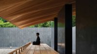
Inspired by that magical space sheltered beneath leafy, deciduous branches, Tree House, designed by Mount Fuji Architects Studio, revolves around a single column measuring 4 feet in diameter that supports frames (aka “branches”) of engineered wood. While these “boughs,” which radiate outward, hold up the structure’s spiraling roof, the trunklike pillar firmly roots the rustic one-room dwelling to the ground.
Maintaining a connection to the earth was essential to the clients, a husband and wife with a green thumb. Yet their flagpole-shaped parcel amid a Tokyo suburb was not ideal for plant cultivation. Hemmed in by existing buildings on all four sides, the “flag” portion of the property hardly had enough room — or sunshine — for a garden. And the 49-foot-long “pole” tethering it to the street was not much help since it acts as emergency vehicle access. But the 1,744-square-foot plot’s separation from the busy road appealed to the architects, who saw its dark, cramped condition as an opportunity for invention.
“Usually we put the house on the north and the garden on the south,” explains Mount Fuji principal Masahiro Harada. “But that arrangement doesn’t work on flagpole sites.” So he and his design (and marriage) partner, Mao Harada, saved a small strip of land along the property’s south edge for a modest deck and an existing persimmon tree, then concentrated the majority of the outdoor space on the fully accessible roof. This strategy provides an herb garden on top of the house and maximum living space within it.
Following the gradual slope of the site, up 5 feet between the middle of the “pole” and the rear of the “flag,” the architects devised a tiered, tradition-inspired floor plan. From the front door, which is placed at a diagonal to the access road, the plan resembles the historic ta no ji layout, shaped like the Chinese character for “rice paddy.” It is divided in fourths by the column — serving as a daikokubashira, or main pillar — at the intersection. Each quadrant steps up 8 inches as it winds around this central point and corresponds to one of the home’s four main domestic functions: cooking, dining, living, and sleeping. The floor is made of concrete (the area of the traditional doma, usually composed of compacted earth) in the busy kitchen/entrance area. It then transitions to oak on the raised surfaces where wear is less of a factor. A second-floor study loft sits atop the bath and storage areas — the only places concealed by doors.
Indoors, the column’s position and the level-shifts around it distinguish the physical character of the individual spaces. The architects located the column off-center, in response to utilitarian and structural requirements, and made its core out of a hollow paper tube normally used for concrete formwork. Assembled from laminated veneer lumber beams connected with hidden steel pins, it has 32 rectilinear frames covering its outer surface. Though uniformly spaced, these frames vary in length to accommodate the building’s wedge-shaped footprint, and in height to support the roof’s incline. In most places where the frames abut the unfinished wood walls, they support open shelves, some of which double as lateral braces. “Normally we use a Cartesian structural grid, but this system is much stronger against earthquakes since it counters forces from multiple directions,” explains Harada.
Bridging the gap between the highest and lowest frames, an operable clerestory window marks the starting point of the roof’s ascendant, spinning shape. Visible from inside, the roof conceptually connects the indoor and outdoor realms, according to the architects. Accessed by an exterior stair and an interior ladder leading to a narrow loft in front of the clerestory, the continuously curving plane wraps around the opening created by the column, incorporating the herb garden planted on its north side en route.
Located in the middle of the roof, the column acts as a funnel. Secured by foam insulation, a downspout inside the column directs rainwater to an underground drainpipe. Forming a smooth, impenetrable, waterproof surface, polyurethane gum covers the entire roof, including the top of the column. Applied as a liquid, the rubbery coating seals any joints and easily accommodates the complex geometry.
Like the roof, most of the outer walls are painted with gritty paint whose rough texture is reminiscent of sandstone. In terms of architectural expression, though, interior and exterior could not be more different. In deference to the neighbors, the color of the house is a neutral tan that quietly blends with the scenery. But this humble wrapping conceals a remarkably dynamic interior. Japan’s traditional, timber-frame houses may have incorporated nature, but Tree House resurrects it as architecture.
Architect:
Masahiro Harada+MAO/MOUNT FUJI ARCHITECTS STUDIO
Akasaka heights 501
9-5-26 Akasaka,Minato-ku
Tokyo 107-0052
*tel+fax
+81(0)3-3475-1800
Completion Date:
October 2009
Gross square footage:
847.765 ft²


