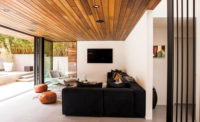
Hired to revive a worn midcentury property in a leafy Los Angeles subdivision, architecture firm Assembledge+ strove to preserve its period glamour. “The house was an awesome example of 1960s Modernism—it hadn’t been touched since it was built,” explains principal David Thompson, who completed the project with partner Kevin Southerland and project manager Brooks Dunn. “The goal was to enhance and capture the spirit of that era with a suitably swanky design that’s still contemporary; we dubbed the style ‘Martini Modern.’ ”
Sources
Meike Construction (cabinets); Viking (cooktop, range, hood, refrigerator); Blanco (sink, faucet); Bosch (dishwasher); Caesarstone (counter)
The crux of the project entailed unifying the kitchen and living areas as well as adding an adjacent family room and guest suite, charting a more languorous floor plan to better support the clients’ indoor-outdoor lifestyle. “There’s a huge yard and pool, which makes this a great family house and a great entertaining house,” explains Thompson.
To establish a fluid connection between the kitchen and sunken living room, Assembledge+ blew out an existing fireplace wall and replaced it with an L-shaped span of built-ins. The architects chose a rich, quietly grained walnut to match the main hall’s curvaceous wood-and-steel partition, original to the ’60s scheme. Within the new kitchen, a low datum line reinforces the airy expansiveness: The architects eschewed a range hood in favor of natural ventilation (“opening the sliding glass doors invites a cross-breeze,” notes Thompson), while tall cabinets are relegated to a side wall anchoring the refrigerator and ovens. By keeping sight lines open, says Thompson, “the formerly closed-in kitchen ties together the living and family rooms and improves the flow of foot traffic.”
Despite the absence of upper cabinets, the kitchen offers plenty of storage, including an L-shaped cooking peninsula that demarcates the boundary between kitchen and family room, plus a prep island with a dishwasher and single-basin sink. Walnut millwork unifies the lofty, free-flowing spaces: Above a stretch of low bookcases, a soffit extends from the kitchen’s cabinet wall into the family room, framing a huge window overlooking the lush hillside. A trio of bar stools provide front-row views of this verdant landscape.
Poured terrazzo flooring and thick quartz-composite countertops in a similar creamy hue round out the sleekly organic palette. “We chose simple, elegant materials that instill a sense of warmth while modernizing the look,” says Thompson. The vanilla-colored countertops wrap the ends of the walnut cabinetry to meet the floor, a gesture that intensifies the Jetsons-era chic; indeed, you half expect to find George and Judy themselves, sipping filled-to-the-brim martinis.


