Los Gatos, California
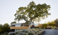
With an expansive glazed facade and warm wood ceilings that subtly reflect light, the Los Gatos Public Library emits a soft glow at all waking hours, but the best time to see it is at dusk. That's when the lighting program switches on and slowly sends a wash of amber (or blue or purple) across a band of frosted-glass panels tucked at the base of the second-floor windows. The color change, which spreads from the center of the facade outward, takes about 40 minutes to complete and happens almost imperceptibly. It's the kind of touch that helps the already lamplike library advertise itself as a beacon for this small, mountain-edged city south of San Francisco Bay. The stretch of glass that houses RGB color-changing LEDs was originally meant to be empty, a leftover space from the raised-floor ventilation and electrical system. “We were just going to put a blank thing there,” recalls Chris Noll, principal of the Berkeley, California'based firm Noll & Tam Architects. “And I went, 'Oh, I want to do something with that. Why don't we have some fun?' ”
Working with Illuminosa lighting consultants, the architects chose the concept of a lantern in the woods for the usual associations between knowledge and light, but also to help the public see the building on a site with a large setback and ample tree cover. They designed the steel-frame building as a long, transparent rectangle and oriented the facade to capture northern light. At two stories and 30,250 square feet, the LEED Gold'certified library triples the size of its old quarters inside the neighboring civic center. The new building, which opened in February 2012, includes stacks and storage for the library's 120,000-item collection, a children's library, a reading room, a computer lab, and a community meeting room, as well as a teen center and a local-history section that pop out from the north and south facades, respectively, in a matched pair of cantilevered bay windows.
In keeping with the woodsy setting, the architects surfaced the facade with a natural palette of stone veneer, wood-veneer composite paneling, and ceramic tile. These choices, though, almost read as the backdrop for the interior of the library, whose light-washed maple ceilings seem to push out through the windows and become part of the exterior. “You don't see the vertical surfaces when you're approaching the building; you see the lit ceilings,” says Alice Prussin, principal of Illuminosa. “If there's light bathing those surfaces, that is what reflects through the windows.”
Though the wide site gave the architects an ideal north-south orientation, the designers needed to bring light all the way through the 175-foot-long building. They solved this problem by inserting a tall central spine along the length of the structure, 35 feet above the ground floor. Then they lined the length of the raised roof with clerestory windows that bring daylight into the core. Lower wings on either side provide cozy dropped ceilings over the stacks that enable the light from recessed fluorescent strips to reach the bottom shelves. Along the north and south faces of the building, the ceiling kicks back up a foot to boost the amount of daylight at the perimeter. As dusk approaches, additional fluorescent ceiling fixtures, on dimming and sensor controls, gradually illuminate the extended window walls. “You need a space that's filled with light to make the building glow,” says Noll. “If we brought the stacks out to the edge, it wouldn't work as a concept.”
Punctuating the rows of stacks, large, loopy wood-veneer fixtures by Spanish designer Miguel Herranz hang from the ceiling. “With such a long spine, you want to help people be aware of the whole volume but not make it seem too narrow,” says Prussin. On the ground level, the children's library gets even more playful. Because of structural beams above the ceiling here, the architects couldn't jack up the height the way they did on the floor above. Instead they captured the space between the beams with a custom-fabricated undulating aluminum ceiling. Cutouts of spaceships and galaxies, backlit by yellow pendant fixtures, give the room a celestial theme.
It was the library-as-lantern approach that helped sell the tradition-minded town on a modern building, says Noll. “They were going, 'Ahh! It's going to be steel and glass and stone; it's going to be cold and modern and not inviting,' ” he recalls. “The lighting is a big part of achieving that warm and welcoming feeling. So we got a very modern building past the design-review people.”
People
Formal name of building:
Location:
Completion Date:
Gross square footage:
Total construction cost:
Owner:
Architect:
Personnel in architect's firm who should receive special credit:
Architect of record:
Engineer(s):
Consultant(s):
Other:
General contractor:
Photographer:
CAD system, project management, or other software used: |
Products
Structural system
Exterior cladding
Windows
Sliding doors:
Interior finishes
Paneling:
Solid surfacing:
Special surfacing:
Carpet:
Special interior finishes unique to this project:
Chairs:
Tables:
Other furniture:
Lighting
Energy
Photovoltaic system:
Other unique products that contribute to sustainability:
Add any additional building components or special equipment that made a significant contribution to this project: |


