The Broad Museum by Diller Scofidio + Renfro
Los Angeles


Architects & Firms
Time-lapse courtesy of EarthCam, Inc.
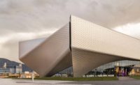
Los Angeles has a reputation for unabashed architectural eclecticism, and The Broad Museum, by Diller Scofidio + Renfro (DSR), next-door to Gehry's Disney Hall, is a radical example of such contrasts. While the iconic concert hall is sculpturally exuberant, metallic, and reflective, the museum is boxy, with a deeply perforated cementitious wrapper, almost a honeycomb, lifted at two corners for its entrances.
Inside, The Broad lobby is equally unexpected: dimly lit, gray—sculpted like massive rock formations. Though the facade forms a porous screen between streetscape and lobby, the space feels like a crypt or subterranean cavern.
From the lobby, you board an extreme—105-foot-long—escalator that threads through a narrow sloped tunnel, resembling a shaft bored into boulders by the elements. Exciting yet incongruous, this straight shot up to the third-floor galleries recalls such improbable juxtapositions as the escalator in Perugia, Italy, rising to the city’s upper precinct through archeological ruins, or the belief-suspending exhilaration of a theme-park ride. With decidedly greater ambition, The Broad is also built on narrative—and the ultimate expression of its metaphors embodies both its strengths and its shortcomings.
DSR won The Broad commission in 2010 with a compelling scheme. (It overtook OMA and Herzog & de Meuron, among others, in a private competition that left the final selection to client Eli Broad, the billionaire who’d already spent years developing designs, with star architects, for his museum’s multiple potential sites.) For the coveted downtown parcel on Grand Avenue beside Disney Hall, DSR devised its vault-and-veil concept, envisioning the “vault” as a repository for the contemporary-art collection of Broad and his wife, Edythe—2,000 works, from Warhol to Murakami, that constitute a “lending library” to arts institutions. The “veil” would be a light-filtering exoskeleton, loosely wrapping the opaque vault, with public areas in between—including, atop the archive, a vast skylit gallery displaying selected works. “At first,” Liz Diller recalls, “we found the brief paradoxical, with its unusually high storage-to-exhibition ratio and its great urban aspirations for a prominent site, paired with enormous emphasis on warehouse functions. Then we realized we could make the storage a visible asset at the building’s core.” It was a very clear diagram.
Visitors would experience the vault’s sculptural and symbolic heft without actually entering it. And the exoskeleton allowed for a luminous, column-free, 35,000-square-foot gallery that, says Diller, “we envisioned as sublime.”
But then came the challenge of translating the “honeymoon” concept, as she calls it, into reality—with seismic codes, engineering conundrums, soaring costs (ultimately reaching $140 million for the 120,000-square-foot building), and a 15-month delay.
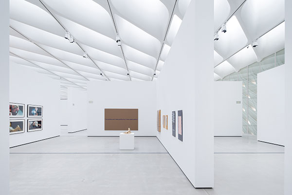
Finally, The Broad is opening on September 20. And whether you ascend by escalator or the Jetson-like cylindrical glass elevator that rises like a rocket in its silo, you land at nearly the same spot: in the midst of the crowning floor. And emerging from the darkened, tightly choreographed sequence—as you arrive beneath the daylit diagrid—is sublime.
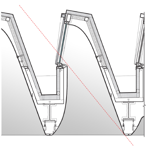
“The journey focuses you,” says Broad director Joanne Heyler, “preparing you to look at art.” Yet the strong overhead diagonals—glazed 9-foot-deep light scoops, skewed 45 degrees and contoured for even, indirect illumination—are both dramatic and slightly distracting (complicated by track lights for nighttime viewing). And the vast “plaza” beneath a celestial ceiling seems eclipsed by partitions, the inevitable concession for hanging two-dimensional art.
Last February, when The Broad invited the public for previews, many found the veil, particularly its exterior, disappointing, nicknaming it “the cheese grater.” Even with the understanding that buildings need to develop beyond seamless, glowing renderings, this critical element seemed more rigid, repetitive, enclosed, and boxy than expected. With its rear facade embossed rather than perforated, and its sides only partially porous, it appeared value-engineered into submission.
In realizing the veil, DSR explored two options: cast concrete and concrete-clad steel. Early on, the team pursued cast concrete, but, Diller explains, meeting seismic code demanded “structural gymnastics,” with far more beefiness and steel than anticipated. And that option’s price tag was soaring, Heyler recalls. Worked on by multiple engineering firms and fabricators (with a lawsuit still pending for the delays), the veil ended up as a tubular steel web encased in hollow glass-fiber-reinforced-concrete (GFRC) panels. It also acquired a dominant joint grid that accentuates the cladding modules, detracting from the sculptural qualities and, arguably, cheapening the appearance. (Compare DMJM’s deft joints in Los Angeles’s 1964 American Concrete Building.)
A welcome deflection is the monumental dimple, midway up The Broad’s front facade, marking the only publicly accessible second-floor space (in a vault otherwise dedicated to storage and administration). This palpable intrusion into a lecture hall is a powerful scale play (but also another stage set: a hollow fiberglass bulge against the glazing, masquerading as exterior veil penetrating from outside).
A slow, orchestrated, dimly lit descent winds from the top floor to the lobby, with access to the lecture hall and, finally, token glimpses into the illuminated vault. It’s a remarkable, if idiosyncratic, trove—and The Broad’s position directly across the street from MOCA brings together a phenomenal concentration of art within a short stretch.
The competition brief called for strong connections to that streetscape, and The Broad—with its lobby at grade and no admission fee—conceptually extends the sidewalk inside. Yet the museum seems oddly introverted, its skin less than convincing as an inviting, permeable screen. Veils can be contradictory—open and closed, revealing yet enveloping—and here, it seems more barrier than filter.
Once you exit, there’s a feeling akin to stepping out of a cinema at midday. Of course—as with movies—you’ve just passed from near-darkness into a luminous place of escapism and back, transported by narrative devices, however illusory, before re-emerging into the light of day.
PeopleClient/Owner: The Broad
Architect:
Personnel in architect's firm who should receive special credit: Zoe Small, Plaza Project Manager
Zachary Cooley – Interiors Project Designer Executive Architect (Plaza): Adamson Associates Executive Architect (Garage): IDG Parkitects Landscape Architect: Hood Design Construction: MATT Construction Structural Engineers (Museum and Garage): Nabih Youssef and Associates; Leslie E. Robertson Associates Structural Engineers (Plaza): Saiful / Bouquet Structural Engineers
Mechanical, Electrical Plumbing Fire Safety Engineers: Vertical Transportation: Lerch Bates Associates
Collection Storage: Solomon + Bauer + Giambastiani Architects Size: 116,000 square feet Cost: $140 million Completion date: September 2015 |
Products
Structural system
Exterior cladding Metal Panels: Pohl Europlate Metal/glass curtain wall:Seele; Walters & Wolf Moisture Barrier: Grace Perm-a-Barrier
Exterior Plaster: Parex OmniCoat Lighting Downlights: Nulux, Lucifer Gallery lighting:LSI, Lite Lab Exterior: WeEF
Conveyance
Plumbing Water Fountains: Haws
Interiors Skylight GFRG: Moonlight Molds
|


