Bruce C. Bolling Municipal Building
A home for Boston's school district preserves historic facades and breathes new life into a corner of the city's Roxbury neighborhood.


Photo © Anton Grassl/Esto

Photo © Anton Grassl/Esto

Photo © Anton Grassl/Esto

Photo © Anton Grassl/Esto

Photo © Anton Grassl/Esto

Photo © Anton Grassl/Esto

Photo © Anton Grassl/Esto


A sign on the door of Dudley Dough, a soon-to-be opened cafe on the ground floor of Boston's recently inaugurated Bruce C. Bolling Municipal Building, advertises 'pizza, coffee, and economic justice.' This improbable menu gives a clue to the larger goals behind the construction of the 215,000-square-foot, six-story structure completed this past spring. The $96 million building, which is the administrative headquarters for Boston Public Schools (BPS), was first conceived about a decade ago by the late mayor Thomas Menino to help rejuvenate Dudley Square—the once-thriving commercial center of the city's Roxbury neighborhood.
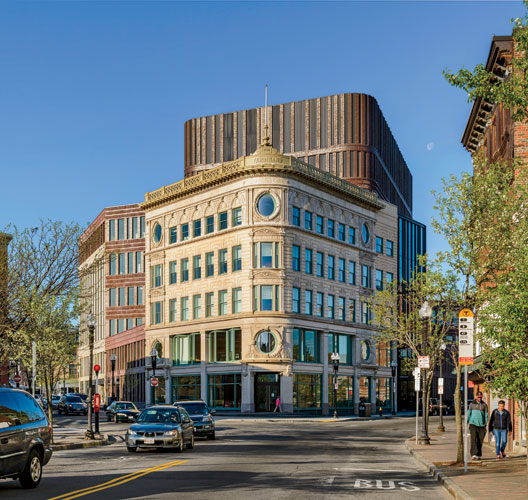
One could hardly imagine a more challenging spot for such an urban-revitalization project. The client's roughly triangular block is bordered on two sides by traffic-filled streets and by a busy bus station on the third. And until it was rerouted in the late 1980s, an elevated train rumbled through the site. Although the tracks had been demolished long before Netherlands-based Mecanoo and local firm Sasaki Associates were hired as the architects in 2011, leaving the lot largely open, it was not a clean slate. Three late 19th-century structures occupied the property. At the northern corner was the five-story Ferdinand Building'a landmarked former furniture store with a graceful, but severely deteriorated, bowed facade of blond brick, granite, and terra-cotta confections. Two more modest four-story storefronts'the red brick Curtis Building and the granite Waterman Building'sat at the southwest corner.
Originally, the Bolling project, named after the first black president of the city council'a champion of investment in Roxbury'encompassed only the Ferdinand. But the team convinced the city that, in order to achieve the kind of transformation it envisioned, it was important to incorporate the other two.
The team opted to retain only the facades of the three historic buildings, in part to satisfy BPS's desire for open and flexible interiors but also because the structures were in very poor condition. At the Ferdinand, for example, stomping hard enough could have created holes in its shallow-arched floor slabs, says Jimmy Su, senior structural engineer with Arup. Saving the facades meant maintaining their stability during demolition and carefully weaving in a new permanent structure of steel framing and composite slabs on metal deck. The restoration work also entailed removing decades of grime, matching mortar, and recreating or repairing damaged ornamentation.
As the primary material for the new parts of the building skin, the architects chose a subtly reflective brown iron-spot brick in three different textures'smooth, a rough wirecut, and an almost bumpy artisan.
The new brick meets the old facades but steps back at angles, curving around corners as the building rises and culminating in a mechanical penthouse that is dramatically illuminated at night. This brick is laid in several patterns, including stacked bond between the windows and subtly corbeled spandrels of running bond and angled soldier courses. 'The older buildings have a tremendous amount of detail,' says Victor Vizgaitis, a Sasaki principal. 'We wanted to respect that idea of craft.'
Given the brickwork's complexity, the team placed relieving angles at each floor. The strategy provided bricklayers with much-needed adjustability. It also allowed the architects to stagger the windows'which range in width from 16 to 40 inches'so that neither the windows nor the two-brick-wide piers between them line up from level to level. The resulting skin has a delicacy sympathetic to the historic facades but with a 'jazzy' rhythm, says Francine Houben, Mecanoo's creative director.
Less successful is the treatment of the building's south and southwest corners. There the architects chose rough ashlar granite from the same quarry that the 19th-century craftsmen used on the Waterman. Sasaki and Mecanoo combined the stone with large glazed openings and smaller ones that mimic the rhythm of the windows on the new brick portions of Bolling. The intent was to assert, or 'grab,' the site's three corners and then tie them together 'in a sculptural way, with the brick as cement,' explains Houben. However, the new stone facades look like a mash-up of traditional load-bearing masonry and Modernist fenestration.
These caveats shouldn't detract from the design team's considerable accomplishments, including creating flexible and comfortable workspace for the BPS staff. The offices have basic finishes, like carpet tile and suspended ceilings, but are intelligently laid out to make the most of the odd-shaped footprint: easily reconfigurable cubicles are placed near the building perimeter, while conference rooms, private offices, and small enclosed spaces for collaborative work are located within cores. Cove lighting washes the walls'enlivening the few areas with little access to daylight.
The office floors, on levels three through six, are reached through the handsome double-story lobby, with its black terrazzo floor and a ceiling of birch-wood slats. A generously proportioned stair that doubles as informal seating leads to a mezzanine level with a school-committee room that can be reserved for cultural and community activities, as well as to the Roxbury Innovation Center, a business incubator. The top floor also features spaces for both the public and BPS staff, including meeting rooms and, at the prow of Ferdinand, a roof deck with a view of downtown Boston.
Arguably, the public amenity that has the potential to make the biggest impact on the vibrancy of Bolling's surroundings is its street-level retail. So far, five of the six spaces have been leased to businesses that include an optician, a clothing store, and Dudley Dough. This caf' will be run by Haley House'a nonprofit with a bakery training program for underemployed men and women. Houben says she was worried at first that Bolling would be 'just an office building.' But with its social justice goals, preservation of history, and revival of craft, it appears poised to become much more.
Boston Bricks with a Dutch Touch |
| Courtesy Mecanoo |
|
|
PeopleClient/User: Boston Public Schools Client/Owner: Property & Construction Management Department, City of Boston
Architect:
Mecanoo architecten Personnel in architect's firm who should receive special credit: Francine M. J. Houben, Friso van der Steen, Fedele Canosa, Marta Maria Roy Torrecilla, Luuk van Wijlick, Richard Hagg, Louise Bjørk, Eduardo Garcia Diaz, Conxa Gene Garcia, Ines De Almeida Lourenco, Alberto Seller, Mecanoo project team; Fiske Crowell, Victor Vizgaitis, Elizabeth Meek, Steve Hamwey, Sasaki project team Architect of record: Sasaki Associates, Inc. Associate architect(s): Mecanoo architecten Interior designer: Sasaki Associates, Inc.
Engineers Structural: ARUP MEP/FP: ARUP Geotechnical: McPhail Associates
Consultant(s): Historic Preservation: Building Conservation Associates Environmental: Weston & Sampson Lighting: LAM Partners Acoustical: Cavanaugh Tocci Associates AV: ACT Associates Construction Manager at Risk/General Contractor: Shawmut Design and Construction
Photographer(s): Size: 215,000 square feet Construction cost: $96 million Completion date: March 2015 |
Products
Structural system
Exterior cladding
Metal/glass curtain wall: Moisture barrier: Carlisle Fire Resist 705FR
Other cladding unique to this project:
Roofing
Windows
Metal frame:
Glazing
Doors Metal doors: Curries Wood doors: Eggers Industries Sliding doors: Stanley Dura-Glide 3000 Fire-control doors: Won-Door Fireguard 90 Security grilles: Wayne-Dalton Overhead Doors: Cornell Folding Partitions: Hufcor
Hardware Closers: Sargent Exit devices: Sargent Pulls: Rockwood Manufacturing Security devices: Continental Access w/ HID Card Readers
Interior finishes Suspension grid: Armstrong Silhouette XL ¼” Reveal 9/16” Bolt Slot Demountable partitions: KI Genius Walls Cabinetwork and custom woodwork: Beech finish, millwork manufactured by Legere Woodworking Paints and stains: Sherwin Williams Paneling: Beech finish, millwork manufactured by Legere Woodworking Plastic laminate: Pionite Solid surfacing: LG Hi-Macs (in open office); Formica (in bathrooms); HanStone Contempo (in pantries) Floor and wall tile (cite where used): Casalgrande (Bathroom floors and accent wall); Daltile (Bathroom walls, Pantry wet walls; upper public floor); Crossville Laminam (elevator lobby walls) Resilient flooring: Forbo Flotex (open and private offices, conference rooms) Armstrong Bio Based Tile (circulation spaces); Johnonsite Slimline + Roppe Pinnacle (wall base) Terrazzo: DePaoli Mosaic Company
Furnishings Reception furniture: Landscape Forms – Chipman Chair and Parc Centre Table
Chairs:
Tables:
Upholstery:
Lighting Downlights: BASYS LED; Bruck Track lighting Accent Rails: Architectural Lighting Works Task lighting: Knoll Copeland Light Exterior: Bega; Lumenpulse Lumenfacade
Conveyance
Plumbing
Energy |


