North Atlanta High School
Open for Business: A visionary plan transforms a former IBM office complex into a high school that’s anything but textbook.


Architects & Firms
Atlanta
At a time when many K'12 architects are designing neighborly clusters of classrooms and modest buildings that open onto the landscape, the students at North Atlanta High School are pushing elevator buttons and riding to class in a concrete tower. From the top floor, eleven stories up, a bay of lockers overlooks the treetops and, in the distance, the Atlanta skyline. More floor-to-ceiling windows across the corridor command views down to the small lake this 1970s-era high rise straddles. Downstairs, parents drive through what is probably the city's most corporate-looking school drop-off loop, watching their teenagers disappear through glass doors, past a large spiral staircase and an imposing wood accent wall, where a North Atlanta High School sign has replaced the IBM logo that once hung there.
The Brutalist campus offered plenty of amenities: an L-shaped plan with two long, narrow towers (the second added in 1987, linked to the original by a glass atrium), a four-level garage, and a surfeit of surface parking. Leaving much of the hilly, forested site undisturbed, the architects shoehorned the school's functions into the existing built footprint. They adapted the 1977 post-tensioned, cast-in-place concrete structure as the main academic building, demolished the 1987 tower and replaced it with a smaller but wider gym and performing-arts center, and repurposed the parking lots as sports fields. The school's 1,520 students moved into the academic building this fall; the performing-arts and gymnasium wing opens this month. At 507,093 square feet, the finished complex can accommodate 2,400 students.
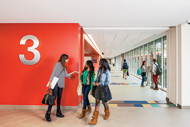
Schools tend to sprawl out as they grow, not up. 'The trick was, how to adapt an office building for use as a public school,' says Cooper Carry chairman Jerry Cooper. The design team needed to turn a high-rise defined by long, bland corridors'ideal for cubicles, not so much for social interaction'into a place where you'd want to show up every day without being paid to do so. 'When we came in here, it was really austere,' recalls Perez. 'We wanted to introduce some energy while keeping it sophisticated.' The architects concentrated the public spaces on the lower floors and divided the upper floors into four academies of two stories for each grade. In each academy, they removed a section of the top floor and inserted a broad staircase to open up the corridors and render activity more visible. Between classes, students making short trips scurry up and down the stairs to avoid piling into the elevator. Color schemes assigned to each grade enliven the hallways and make every floor recognizable for elevator passengers. To lessen gridlock, the design team used destination-elevator software, which prioritizes groups going to the same floor, directing passengers heading the same way to a particular car.
Beyond practical interventions'such as detensioning and retensioning the structure to carve out a central stair and replacing all the floor-to-ceiling windows with roughhousing-proof, high-performance laminated glazing'the architects let the views do the work. They lifted classroom ceilings 10 inches, to 9 feet, by routing ductwork through hallways. For Cooper, giving those breathtaking views to students represents an important shift for public school kids, who aren't often treated as clients. 'The skyline is a visual gift,' he says, though his team made the calculated move to turn the desks away from window walls to curb distraction.
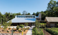
With its base forming a bridge 30 feet over the lake, the academic building is largely cut off from the landscape. But the new wing, clad in white metal panels and wrapped with a poured-concrete trellis that echoes the tower's facade, opens onto an outdoor plaza that faces the lake. The architects used the existing glass-box atrium to link the academic wing's third floor with the main level of the addition, which is situated uphill from the original. 'We wanted to make the transition seamless,' says Perez, 'so you don't feel as if you're stepping out of one building into another.'
Despite the novelty of sending high schoolers to class in an office tower, it could be seen as doubly retrograde to insert a traditional classroom layout into an outmoded office template. But as an adaptive reuse that gives existing building stock new life, North Atlanta High School is as forward-looking as they come.
PeopleOwner: Atlanta Public Schools
Architect:
Personnel in architect's firm who should receive special credit: Architect of record: Cooper Carry, Inc. Associate architects: Collins, Cooper, Carusi Architects, Inc., Paul Cheeks Architects, LLC Interior designer: Cooper Carry, Inc. Landscape: Cooper Carry, Inc.
Engineers: MEP Engineer: Barrett, Woodyard & Associates, Inc. Civil Engineer: Eberly & Associates, Inc.
Consultant(s): Lighting: CD+M Lighting Design Group Elevator: Newmont Elevator Analysts Theatrical: Barbizon Lighting Company Food Facility Consultant: Camacho Associates, Inc. LEED and Commissioning: Energy Ace Envelope: Morrison Hershfield Corporation Code: Rolf Jensen & Associates Hardware: Assa Abloy Door Security Solutions Construction Manager: JE Dunn Construction Company
Photographer(s):
Aerial Photography: Size: 507,093 square feet Cost: $87 million (construction only) Completion date: August 2013 |
Products
Structural system Fire-control doors, security grilles: Won-Door Corporation Special doors: (Elevator Door Smoke Containment System): Smoke Guard Corporation
Hardware Closers: LCN Exit devices: Von Duprin
Interior finishes Suspension grid: Armstrong Cabinetwork and custom woodwork: Mark Products of Georgia Paints and stains: Sherwin Williams Plastic laminate: Wilsonart Solid surfacing: DuPont Corian
Floor and wall tile: Daltile Identity & Porcealto Porcelain Tile (Main Street) Resilient flooring: Armstrong Carpet: Shaw Contract Group, Interface
Special interior finishes unique to this project:
Furnishings
Other furniture:
Lighting Downlights: Halo Exterior: McGraw-Edison Dimming System or other lighting controls: Cooper Controls
Conveyance Accessibility provision: Garaventa Lift
Plumbing
Energy |


