OFFICE KGDVS uses Simple Geometry to Accommodate the Growing Needs of a Library in Belgium
Sint-Martens, Belgium

Architects & Firms
“Our buildings tend to appear very simple, which is both a winning and a losing factor in competitions,” laughs architect Kersten Geers, founding partner, alongside David Van Severen, of Brussels-based OFFICE KGDVS, a 2009 RECORD Design Vanguard. “When we lose, the judges say, ‘We don’t trust you. A figure that simple cannot settle all the issues.’ And when we win, they say, ‘This is weird—you wouldn’t think a figure that simple could resolve all the problems!’” Among the basic shapes OFFICE uses to compose its plans, quadrilaterals loom large, but circles also appear from time to time, often enclosing a square. An inversion of the classic motif of a circle inside a square—found, for example, in Palladio’s Villa La Rotunda, Hardouin-Mansart’s Dôme des Invalides, or Louis Kahn’s National Assembly of Bangladesh—this combination first entered OFFICE’s repertoire in its 2006 competition proposal for an annex to Gunnar Asplund’s Stockholm Public Library: in response to the Swede’s Palladian drum-on-a-box, OFFICE imagined a cylinder enclosing a square courtyard. In 2017, the firm returned to this motif, albeit at a far more modest scale, when competing to build the village library at Sint-Martens-Latem in Flanders.

1
Looking like the biggest house in town, the building nonetheless gives a peek (1) into its many linear feet of books (2 and top of page). Photos © Bas Princen, click to enlarge.

2
Today a suburb of Ghent, Sint-Martens is a paradoxical place: Belgium’s richest municipality in terms of per-capita income, it is among its poorest in terms of public services, since residents pay very little tax. As a result, cash for the library was short—construction cost was just $2.7 million—and the building, located next to the village primary school, had to work hard: in addition to 2,500 linear feet of shelving (almost three times the capacity of the cramped and unsuitable library it was to replace), the brief requested an outdoor reading space, as well as two small classrooms and a school dining room that could double up as a small village hall.
Since there was talk of rebuilding the primary school, OFFICE made its building a cloistered, autonomous object, circular and compact, with “no front or back or any kind of clear orientation,” as Anne van Hout, the project architect, explains. At the center of its 98-foot-diameter circle, OFFICE drew a square, one half of which contained the dining hall, with classrooms above, and the other a courtyard garden. In this way, open-air reading could occur without building fences, and the grounds outside the library remain entirely accessible for public use. Since the building’s raison d’être was books, OFFICE combined shelving and structure, with the envelope’s timber frame carrying both bookshelves (515 feet more than required) and the roof. For the latter, the architects chose a classic pitched gable, because, explains Geers, “a public building in a rural context is not the same as in a city, where libraries tend to be transparent glass boxes. We imagined ours as the biggest house in the village.”

3

4
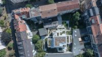
A rectangular cutout at the center of the round building’s roof creates a glass-enclosed reading garden (3-5). Photos © Bas Princen

5
The competition jury was convinced, aside from one practical issue: rather than floating in the middle of the building, the dining room should connect with the perimeter. To achieve this, OFFICE inserted another simple figure—a circle sector, a portion of the disk delimited by two radii—into their plan so that, on the ground floor, it creates a space for the dining hall and, where it intersects with the central square, two triangles, one of which contains staff offices and the other bathrooms and a kitchen. “This change made the project stronger,” says Geers with a smile, “and much more interestingly complex.”
At once strange and familiar, as though Japanese contractors had built an American round barn and dropped it in Flanders, the completed library exhibits typical OFFICE idiosyncrasies in the use of metal—zinc for the roof, aluminum for doors and external window frames—and in a certain blankness of detailing, which is in fact the product of extreme attention to detail (hats off to the contractor who prefabricated the envelope’s frame with its curved shelves). While one senses that functions have been shoehorned into predetermined shapes, the proportions are generous enough that you never quite feel the squeeze, space appearing to expand thanks to the reading room’s soaring volumes and to the generous courtyard, which floods the building with daylight, proving its worth even on the dark fall afternoon I visited. Though it may appear to a certain extent universal, this deceptively simple project is the product of conundrums inherent in a very particular time and place.
Click drawing to enlarge


