Design Vanguard 2009: Office Kersten Geers David Van Severen

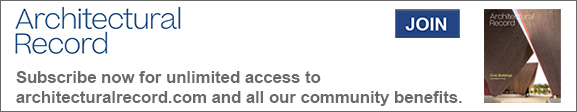
In 2003, Office KGDVS won its first commission — an entrance vestibule and reception area in an 18th-century aristocratic town house in Antwerp. Confronted with a windowless room, the architects tried to make the room’s sole inhabitant — a receptionist — forget the bleakness of the original space by inserting a mirrored glass pavilion that acts as visual echo chamber. Geers recalls, “At the time, we were fascinated with the idea of a glass house — like Philip Johnson’s — or any late Modernist ideal of a building made of simple glass and almost no profile.” With contemporary sustainability and insulation requirements, such a structure would be irresponsible today, but with this space, Geers says, “we thought it would be possible to build an almost utopian version of [the glass house] as an interior.” He then describes the ethereal quality of the space: “Because of the mirror foil, the lamps are slightly cloudy. So you have this deep space — you yourself are not so much reflected as much as the lamps are reflected.
Photo © Bas Princen

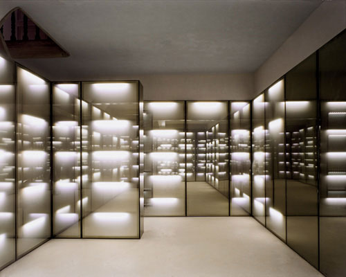
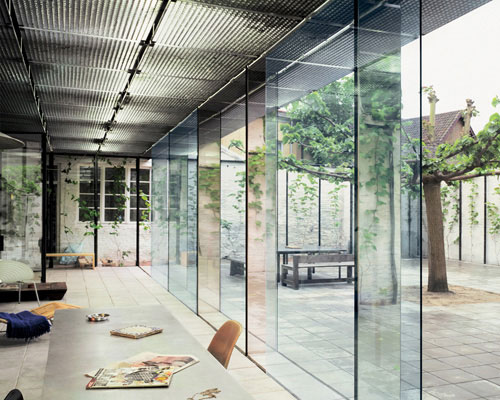
In a 19th-century town house in Ghent, a mid-20th-century addition had obscured a rear courtyard. Removing the addition and moving its kitchen back inside the old house allowed the architects to develop the recovered space free from constraints. Circumscribing the courtyard with a frame of black steel posts, between which grapevines hang, the architects turned the typical arrangement sideways — so plant life is on the walls, instead of underfoot. They also made a strip of space next to the house into an intermediary zone that can be closed off with single-pane sliding glass doors. These doors, along with mirrored glass at the courtyard’s corners, provide a visual echo within, creating an immersive environment entirely apart from the existing structure
Photo © Bas Princen

In a 19th-century town house in Ghent, a mid-20th-century addition had obscured a rear courtyard. Removing the addition and moving its kitchen back inside the old house allowed the architects to develop the recovered space free from constraints. Circumscribing the courtyard with a frame of black steel posts, between which grapevines hang, the architects turned the typical arrangement sideways — so plant life is on the walls, instead of underfoot. They also made a strip of space next to the house into an intermediary zone that can be closed off with single-pane sliding glass doors. These doors, along with mirrored glass at the courtyard’s corners, provide a visual echo within, creating an immersive environment entirely apart from the existing structure
Image courtesy Office Kersten Geers David Van Severen

In a 19th-century town house in Ghent, a mid-20th-century addition had obscured a rear courtyard. Removing the addition and moving its kitchen back inside the old house allowed the architects to develop the recovered space free from constraints. Circumscribing the courtyard with a frame of black steel posts, between which grapevines hang, the architects turned the typical arrangement sideways — so plant life is on the walls, instead of underfoot. They also made a strip of space next to the house into an intermediary zone that can be closed off with single-pane sliding glass doors. These doors, along with mirrored glass at the courtyard’s corners, provide a visual echo within, creating an immersive environment entirely apart from the existing structure
Photo © Bas Princen

This project, developed with the Italian office Dogma, won first place in a master-planning competition for a new city of 500,000 residents. The architects developed a building code that calls for continuous, 100-foot-high structures, creating a series of 590-by-590-foot open public squares. Rather than a prescriptive urban plan, this framework of buildings serves as a catalyst for the activity that happens between them.
Photo courtesy Office Kersten Geers David Van Severen

Office KGDVS was given the commission in 2006 to design a footbridge to a concert hall in a neglected area that had become more active thanks to planning efforts. Even though an existing bridge stood just 70 feet away, the client asked Geers and Van Severen to design a new bridge leading directly to the hall. Geers says the area was perhaps becoming too dense with public space, so the client wanted a bridge that would assert a domain of its own. “We made a bridge that is an expression of its architecture by defining its space, instead of one that’s an expression of its structure, which is so typical of bridges.” The notion of clearly framing the space, combined with the need to negotiate a grade change from one side of the canal to the other, led the architects to narrow the bridge at one end and slope it at the same time, creating a fantastic, trompe l’oeil false perspective. Even the gate at one end of the bridge (top) enhances the sense of enclosure.
Photo © Bas Princen

Office KGDVS was given the commission in 2006 to design a footbridge to a concert hall in a neglected area that had become more active thanks to planning efforts. Even though an existing bridge stood just 70 feet away, the client asked Geers and Van Severen to design a new bridge leading directly to the hall. Geers says the area was perhaps becoming too dense with public space, so the client wanted a bridge that would assert a domain of its own. “We made a bridge that is an expression of its architecture by defining its space, instead of one that’s an expression of its structure, which is so typical of bridges.” The notion of clearly framing the space, combined with the need to negotiate a grade change from one side of the canal to the other, led the architects to narrow the bridge at one end and slope it at the same time, creating a fantastic, trompe l’oeil false perspective. Even the gate at one end of the bridge (top) enhances the sense of enclosure.
Image courtesy Office Kersten Geers David Van Severen

This 2005 competition asked entrants to address the treacherous problem of a border station for pedestrians between the United States and Mexico. Working with Wonne Ickx, a Belgian-born architect who is a partner at the Mexico City—based firm Productora, Geers and Van Severen created a severe rectangular frame of 30-foot-high walls, with a single opening on either side of the fence. Inside, they imagine a desert oasis with a grid of palm trees and pavilions for passport control and administration “spread around here and there, becoming a part of the garden.” On a politically untenable site, Office KGDVS offers a solution of willful blitheness, calling into question the problem-solving potential of architectural form.
Photo courtesy Office Kersten Geers David Van Severen

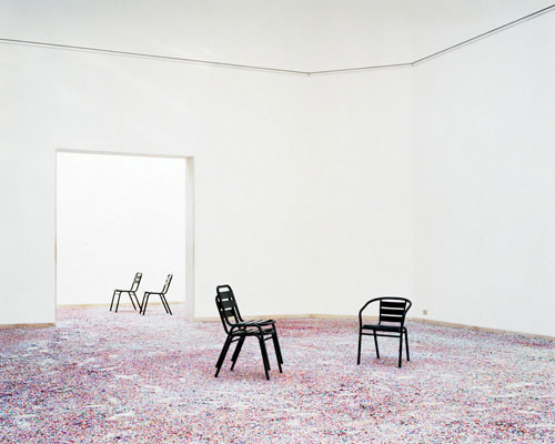
The winning entry in a competition staged by curator Moritz Küng, this project features a 23-foot-high double wall that aligns the Belgian Pavilion’s rotated siting with the prevailing geometry of the street. The walls close off the space from the rest of the Biennale while recasting the existing building as an unusual object within a new frame. The architects spread confetti on the ground in and outside the pavilion, evoking a “party” and creating an unbroken, continuous landscape. Skylights in the building obscured with screens were uncovered to allow daylight in, further diminishing the difference between inside and out.
Photo © Bas Princen

The winning entry in a competition staged by curator Moritz Küng, this project features a 23-foot-high double wall that aligns the Belgian Pavilion’s rotated siting with the prevailing geometry of the street. The walls close off the space from the rest of the Biennale while recasting the existing building as an unusual object within a new frame. The architects spread confetti on the ground in and outside the pavilion, evoking a “party” and creating an unbroken, continuous landscape. Skylights in the building obscured with screens were uncovered to allow daylight in, further diminishing the difference between inside and out.
Image courtesy Office Kersten Geers David Van Severen

The winning entry in a competition staged by curator Moritz Küng, this project features a 23-foot-high double wall that aligns the Belgian Pavilion’s rotated siting with the prevailing geometry of the street. The walls close off the space from the rest of the Biennale while recasting the existing building as an unusual object within a new frame. The architects spread confetti on the ground in and outside the pavilion, evoking a “party” and creating an unbroken, continuous landscape. Skylights in the building obscured with screens were uncovered to allow daylight in, further diminishing the difference between inside and out.
Photo © Bas Princen

The winning entry in a competition staged by curator Moritz Küng, this project features a 23-foot-high double wall that aligns the Belgian Pavilion’s rotated siting with the prevailing geometry of the street. The walls close off the space from the rest of the Biennale while recasting the existing building as an unusual object within a new frame. The architects spread confetti on the ground in and outside the pavilion, evoking a “party” and creating an unbroken, continuous landscape. Skylights in the building obscured with screens were uncovered to allow daylight in, further diminishing the difference between inside and out.
Photo © Bas Princen
Architects & Firms
The work of Office Kersten Geers David Van Severen (KGDVS) demonstrates the firm’s search to uncover the essence of architecture — testing the limits of what it means to be a boundary, an enclosure, an entrance, an opening. Often, that line of questioning leads to stark, abstract forms. “Of course there is abstraction in our work; it’s hard to deny that, although I sometimes try,” says partner Kersten Geers, laughing at his own contradiction. “But for us, abstraction is more a matter of being precise. I think when you get too many things going, you can become very imprecise.” Geers cites the architectural work of O.M. Ungers and Aldo Rossi, and the urban work of Alison and Peter Smithson and Auguste Perret as precedents. These are old questions — they are arguably the heart of architecture itself — but they have gone unconsidered for some time.
The project that displayed this agenda most clearly was the firm’s installation for the Belgian Pavilion at the 2008 Venice Biennale. Not content simply to design an architectural piece, Geers and Van Severen responded to the prevailing architectural (and architectural exhibition) culture of the past 15 years. Geers explains: “We thought, after 10 years of relentless bombarding with nonsensical diagrams and showcases of half-interested journalistic surveys of countries, it was good to show architecture in the most simple, visible, and radical way.” Their answer consisted of a 23-foot double wall, clad in galvanized steel, which created a new courtyard in front of the existing pavilion building. Visitors had to pass through the wall to access the courtyard and pavilion. After doing so, they found that the ground, inside and out, was covered in an even carpet of strewn confetti, with movable black metal chairs here and there. The architects titled the work After the Party, a reference to the celebration of the 100th anniversary of the Belgian Pavilion, but also a direct rejoinder to the pervasive architectural strategy that attempts to reduce complex cultural and historical terrain to a simplistic diagram. Office KGDVS practices in another, more elemental language. After the party, they seemed to say, there is only architecture.
But why must “only architecture” sometimes appear so cold? A photograph of a notary’s office entrance and reception designed by the firm in Antwerp (opposite), for instance, depicts a space that looks more like an art installation than a workplace. For that project — the first completed work of the firm — the client asked the architects to convert a dank, windowless space into a suitable entrance for the office, which takes up the rest of a historic town house. Office KGDVS’s solution consists of a mirrored pavilion with a series of fluorescent lights placed in the cavity behind the glass, producing an endless, deep space. But what would it be like to work there? Geers admits that the room was seen more as a manifesto of their architectural vocabulary — the client was lenient and allowed them to explore ideas that they would develop in subsequent work. Geers adds, “In our defense, the secretary is apparently very happy,” laughing again.
That humor is an integral part of Office KGDVS’s work. The partners are asking serious questions but are unafraid to undermine their own solutions. In their work, there is always a moment when the carefully constructed sense of order is uncloaked. At the Venice Biennale, this happened when visitors walked between the perimeter’s metal double wall, showing the scaffolding holding up the structure. In the notary’s office, the entrance from the hallway allows one to see the back of the glass, revealing the series of materials — cavity, then light, then foil, then glass — that creates the drifting, borderless landscape on the interior. Geers describes this sense of ambivalence: “On one hand, there is the desire of the architect to make the perfect universe. On the other hand, there are all of the tricks you have to perform to make that happen and that, in a sense, fail.” Creating that tension between reality and illusion makes the work of Office KGDVS so alluring, allowing us to see both sides of the curtain.