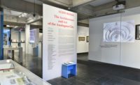
First published in 1976 as a series of three essays in Artforum, artist and art critic Brian O’Doherty’s “Inside the White Cube” took stock of modern art’s relationship to the ubiquitous white gallery. In short, the context of the gallery had become, in his view, the actual content of the art. To view art was no longer to stroll through a 19th-century salon packed with painted scenes, but to experience the relationship of art to its conditions of display. Marcel Duchamp’s 1,200 Coal Bags (1938)—with coal bags on the ceiling and a chandelier-like lamp on the floor—was a primordial example of the antagonism: it turned the artwork into the experience of occupying a room upside down. Rather, in the presence of the work, there were effectively two galleries: one where observers were standing upright, and another, inhabitable by kinesthetic imagination, where spectators were pinned to the ceiling. The coal bags and lamp, pretty much worthless in themselves, were valuable because they created a distant vantage from which the spectator could interrogate the real physical scenario.
Devastatingly powerful questions could be launched from this newly made place. How should galleries be oriented? Who makes spaces for art—the gallerist or the artist? For whom? And what are this subject’s capacities? While asking these questions carried the spark of new agency for the gallery-goer, O’Doherty thought a series of purifying exclusions had to be made as a price for the gain. Galleries had to stay white, blank, and sealed up against the intrusion of life from the outside. Art had to jettison content in order to produce a proper meditation on context, leaving a void to be filled by art’s new tendency to physically engage walls, floor, and ceiling.

Photo © Marten Elder
O’Doherty meant “Inside the White Cube” as a critique, but his essay’s description has become prescription and is now fully naturalized as rule of thumb for designing exhibitions of all kinds, not just private spaces for modern art in New York. In this expanded domain of the white cube, architecture for art is measured against the presumption that it should be rectilinear and blank; when it deviates from cube standard, it’s criticized as “too present” or “competing with the art.” While architects like to debate this presumption as appropriate or as disabling constraint, I would argue the question is not whether to keep the white cube but how to reconcile it with the requirements of a contemporary curatorial program. The imperative now is to survey global culture and bring its artifacts into the museum and gallery with maximum fidelity to their source. Crafts are as likely to be displayed as “art” or modern art, and the notion of excluding an artifact because the dirt of its terroir would mess up the museum—that now feels almost illegal. As a model for architecture, can the white cube be repurposed to center artifacts, be earnest, include things that originate outside the exhibition, and allow those things to represent themselves as entities separate from the context of the institution? Further, can it do this while retaining something of its power?
This was the basic situation of our office’s exhibition design for Eternal Medium: Seeing the World in Stone at the Los Angeles County Museum of Art (LACMA). Curator Rosie Mills conceived a global survey of hard stone carving, which is a technique of making pictorial illusions that lean equally on the shape of carving and a rock’s as-found properties. An image advertising the exhibition, for instance, shows a pug dog carved out of moss agate, where mineral inclusions in the rock look like furry spots. While specific at the level of technique, hard stones are culturally and chronologically expansive. Carving flourished in Florence, Mughal India, and Qing dynasty China in the 17th and 18th centuries, but examples date back at least to the second century BC, and artists like Richard Blow and Analia Saban have carried it to the present. If all of this work across epochs, cultures, and geographies converges neatly in one medium, diversity explodes again in the sheer variety of formats for artifacts in the show. The pug dog is actually a snuffbox, only 3½ inches long. Also in the gallery is an entire tabletop, about 4 feet long, covered with hard stones depicting flowers and a parrot. The first assumes close contact, as though the snuffbox could be grasped or tucked away in the cabinet, while the second imagines a whole scene in the round, with the horizontal tabletop an accessory to other objects and goings-on.
This diversity of format became the logic for making the show coherent. Instead of inventing cases to position each artifact in a simulacrum of its intended viewing situation, we would give the artifacts a double life. All their idiosyncrasy of size, position, and orientation would be scrupulously observed, but would also locate them as physical lynchpins in the assembly display. The first life of each artifact would be real and information-driven, the other imaginary and physical. Exhibition would come very close to construction. We would paint everything black to suppress any lingering differences.
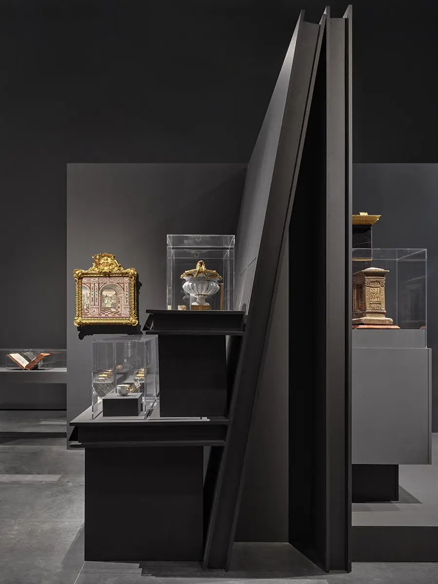
These double lives of artifacts play out together as the construction details in an assembly of walls. The walls themselves are 8-foot panels, withdrawn from the perimeter of the existing museum, organized in a nine-square grid following the curator’s nine thematic categories—groupings of pictorial content like “Flora and Fauna,” and material properties of the stones like “Sourcing Specimens.” Artifacts fasten the corners of these walls and buttress their edges. At the far corner, a 17th-century jade bowl from the Mughal empire pins in place the intersection of two walls. It is effectively a piece of blocking that secures two perpendicular planes, but it is also thrust out toward its viewer, cantilevering from the walls for maximum visibility at a height to accommodate visitors either standing or sitting in wheelchairs. To either side of this, a continuous display table of snuffboxes and carved chalices obliquely skewers both walls as lateral support. It is construction bracing, but it also suspends a series of tiny snuffboxes above the floor and just below chest height, where visitors can bend slightly to get within breathing distance of the lids. A bit farther to the right, a hard stone desk weights a thick plinth, arresting the downward slide of an inclined wall. It is a joint secured by friction—the desk imitating a paperweight—but also a technique of superposition: the plinth recesses the desk just far enough from people to eliminate the need for a plexiglass shield; it sits in the open air, just under the cantilevering snuffboxes, so one can see desktop and box tops bear nearly identical scenes of still-life flowers.
Although each artifact retains these two lives, sometimes alien to each other, black-on-black brings them together in composites of imaginary-on-real and physical-on-informational. In these combinations, the disquietingly powerful questions enabled by the white cube can return, without excluding or destroying the artifacts. Thinking of the oblique display table as a support gives it permission to pass, continuously, like a train, through three distinct compartments of the exhibition. Like Duchamp’s swap of floor and ceiling, the table, seen as a brace, creates a physical vantage opposite the organization of the plan. From this point of view, one can ask: What is included? What are the rigors of curatorial sorting? Who decides?
These questions flow from the architecture of the exhibition, but also in the other direction, back toward the stuff of the museum. The large panels in “Stone for Stone” rest on flat display pads that in turn rest on a leaning wall—not as static wall pictures but the last in a series of thick surfaces that accumulate toward the flat surface of the picture plane. A stone trompe l’oeil portrait of Pope Clement VIII stares back from this. Seen in one direction, the whole machinery of the institution mobilizes, plane by plane, so the portrait can hang there, offered as far forward as possible, like a stabilizing counterweight that locks the arrangement in a posture of maximum generosity. Looked at from the other direction, the habit of seeing rocks as illusions gets tested out on the walls, so the black planes resolve into something like furniture—maybe a cabinet or an altar. Questions pour from this newfound perspective. What should the museum furnish? Is blankness an analogy for being maximally open? Or can its dark walls construct goods?


