A Malmö Theater Basks in the Limelight Following a Revamp by Haworth Tompkins and White Arkitekter

Ringed by vivid frescos, the once-obscured timber gridshell roof of Malmö Stadsteater's auditorium plays a starring role in a major refurbishment project led by London's Haworth Tompkins and the local office of Sweden's White Arkitekter. Photo by Åke E:son Lindman
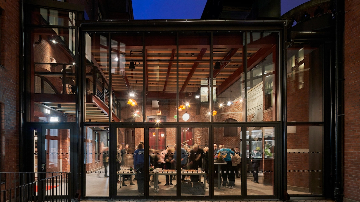
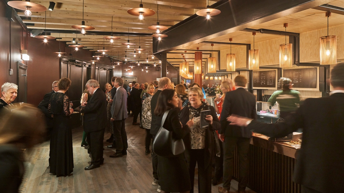
Situated beneath the auditorium's sloped stage, the theater foyer features a bar and coat check. Photo by Åke E:son Lindman
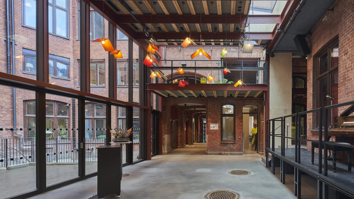
The new interior courtyard "link" is envisioned by the architects as a "town square." Photo by Åke E:son Lindman

Image courtesy Haworth Tompkins


Architects & Firms
The best theaters allow audiences to be in two extraordinary places at once. Characterful foyers and auditoria create a sense of occasion as playgoers move from street to seat, but after the lights go down the architecture must also allow the world of the play to emerge, evoked by stagecraft and completed in the imagination of the spectator. It’s a balancing act that has been pulled off with finesse by London-based Haworth Tompkins, joined by Swedish practice White Arkitekter, in the remodeling of Malmö Stadsteater, one of Sweden’s leading city theaters.

Exterior of Malmö Stadsteater. The Swedish city's largest theater company has been housed in the old Malmö Hippodromen since the mid-1990s. Photo by Jenny Baumgartner
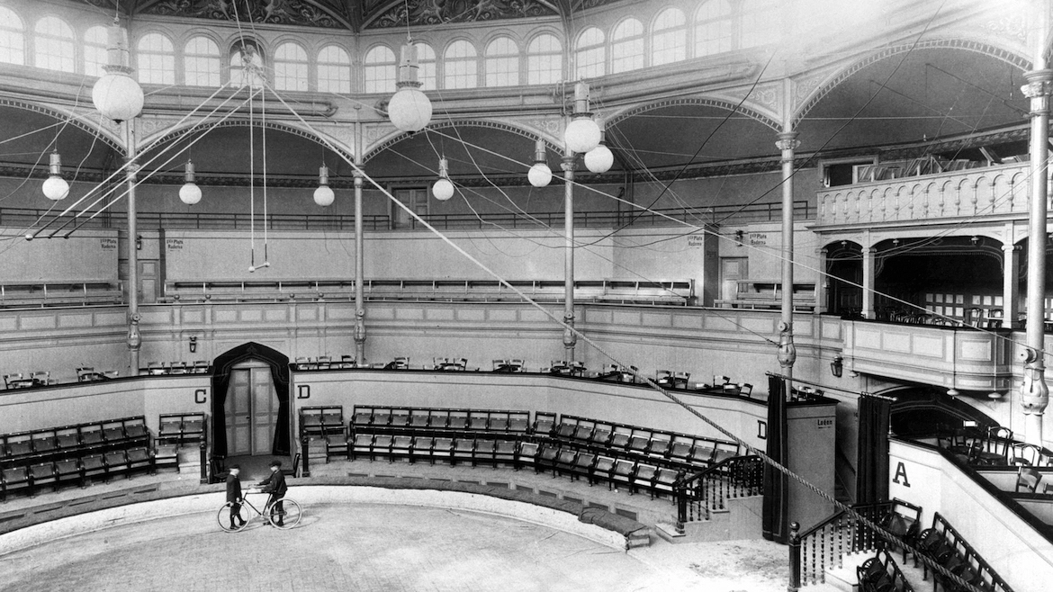
For almost 30 years the company has occupied the Hippodromen, a late-19th-century red brick building, designed by Theodor Wåhlin, whose original purpose as a circus venue produced a distinctive 12-sided auditorium encircled by cast iron columns, with a timber gridshell roof that suggests the lightness of a big top. The building was much loved but had drawbacks: it provided little space to gather before shows, and its conversion—while technically successful—had obscured much of the historic shell and didn’t support the ambitions of the theater’s new artistic director, Kitte Wagner. Moreover, as the “Hipp” is buried in the middle of an urban block, it was largely invisible within the city.
“It’s especially important for theaters that produce new work to have that connection to the local population,” says Haworth Tompkins director Roger Watts. “Front-of-house spaces that are visible and open to everyone help to build an audience.” The architects’ solution was in the words of Watts, a “cheeky” proposal that the Stadstheater should take over a neighboring wig shop to make a new main entrance and an all-day café on Kalendegatan, a busy Malmö street. The municipal authority that owns the block could see the logic and agreed. An adjacent space formerly used as a box office has also been converted into a studio for rehearsals, recitals, and children’s workshops.

1

2

3
The refurbished 12-sided auditorium (1); street view of Malmö Stadsteater with St. Peter's Church in the distance (2); a performance underway in the 520-seat venue (3). Photos by Åke E:son Lindman (1,3); Henrik Rosenqvist (2)
Set behind large, ornate windows, these spaces are compact but sufficiently bright, open, and animated to give the theater a welcoming face. Original Art Nouveau features blend with new glazed tilework, copper countertops, blonde wood furniture, and pendant light fixtures whose vivid colors were taken from murals in Wåhlin’s auditorium. Although the architectural language is distinctly Scandinavian, inspiration also came from the popularity of the bar at Haworth Tompkins’ Young Vic theater in London. “It’s unpretentious and democratic,” says Watts, “bringing people into a theater who might otherwise be put off.”
By happy coincidence, an existing mezzanine in the new café echoes one at the Young Vic. The two-tier arrangement is particularly effective in theater bars, says Watts. “It can take a crowd before a show but can also accommodate a few people having coffee without seeming empty and lifeless.”

Just off the foyer is a light-filled social space set within a courtyard. Photo by Jenny Baumgartner
From the entrance and café, the route to the auditorium passes through a new pavilion set into a small courtyard deep within the urban block. Described by the architects as a “town square,” the airy glass-walled room doubles as an adaptable space for ad hoc performances and an extension to the adjoining foyer, which sits beneath the seating rake of the auditorium and contains the bar and coat check.
Haworth Tompkins’ insertions within both the courtyard and Wåhlin’s building have a robust, almost industrial character intended to evoke the craft of theater-making and the raw energy of live performance but are subtly complementary to the historic fabric. Bolted and welded connections are visible in exposed steelwork, painted a deep oxblood red. Dark wood floors and plywood paneling are married with exposed timber beams that fan out to negotiate the irregular geometries of the plan, interspersed with strips of black, sound-absorbing felt.
The rich colors and soft textures create a warm, intimate ambience that helps to prepare audiences for a show and, more importantly, sets the right mood for the intermission and eventual departure. “When people come out of a darkened auditorium into over-lit foyers with hard, sound-reflective surfaces, the spell of the play is broken,” says Watts. “We like to bring light levels right down and tune the acoustic for quiet conversation; it brings the audience together, forming them into a single body of people, but also allows individuals to feel a close connection to the people immediately around them.”

The old box office is now a dedicated space for rehearsals, workshops, and more. Photo by Henrik Rosenqvist
The architectural atmosphere has been recharged most powerfully within the auditorium. Its earlier conversion had seen most of the interior painted white, and the insertion of straight rows of seats occupying one half of the room facing a wide proscenium stage in the other. Haworth Tompkins’ arrangement is closer to that of the original circus, where spectators encircled a central ring. A steeper seating rake and a new balcony level above are configured in a horseshoe, increasing capacity from 400 to 520 and improving sightlines to the stage. An adaptable, demountable proscenium can accommodate either end-stage, thrust or flat-floor performances. The installation expands theatrical opportunities in other ways, too, from retractable bleachers to “vomitoria” between seating blocks that allow actors to run on and off stage through the audience, using the foyer bar to circumnavigate the room.
“Theater is constantly evolving, and today’s directors and designers want the ability to shape spaces to suit the production,” says Watts. “One show might happen in the room with the audience, while another needs to be viewed through an aperture in the manner of a traditional theater.”

4

5

6
A spacious new café looks out into the street (4); the refurbished auditorium features improved sightlines and an adaptable proscenium (5); the theater bar is tucked beneath the seating rake (6). Photos by Åke E:son Lindman
This malleable framework is grounded by its relationship to Wåhlin’s historic shell, whose distinctive form and rich detail have been discreetly amplified. The new proscenium stops short of the conical timber roof, revealing its full extent, and a dense cloud of acoustic baffles that hung beneath has been swapped for flat panels nestled neatly between the rafters, giving a clearer view of the rough-sawn woodwork and a dozen vivid frescoes that ring the room at high level—now picked out by house lights directed upwards. Color and texture have been drawn down into the room, too. Original columns are again resplendent in deep red, and the walls lined in slatted wood. Old and new cohere so neatly that it’s hard to tell where they meet.
A dodecagonal circus hall with a ring of columns is not the ideal starting point for a contemporary theater. “Quite often the quirks and eccentricities of places like that are destroyed in pursuit of flexibility,” says Watts. “But they make what we think is one of the most beautiful rooms in the world.” Within the auditorium, and from the cramped courtyard and the former wig shop, Haworth Tompkins has instead celebrated the richness of found spaces, making a charismatic setting for events while giving the storytellers of the Stadsteater an inspiring stage on which to play.


