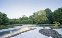
The Plaza at Kanagawa Institute of Technology by Junya Ishigami + Associates
Kanagawa, Japan

The Plaza at Kanagawa Institute of Technology. Photo © Junya Ishigami+Associates
Architects & Firms
Thirteen years ago, Junya Ishigami astonished the architecture world with the completion of the Kanagawa Institute of Technology (KAIT) Workshop, a glazed parallelogram supported by a staggering 305 sliver-like columns. Now Ishigami has done it again with the Plaza at KAIT. Instead of columns, the main motif this time is thin sheets of pure white steel. Perforated with windowlike openings, the panels enclose a versatile semi-outdoor space—the main place on campus where students can kick back and cut loose.

Under the right conditions, the scattered openings in the steel-plate roof (above) create patches of sunlight on the Plaza’s irregularly sloping ground surface (top). Photo © Junya Ishigami+Associates, click to enlarge.
As with the Workshop, the Plaza sits comfortably within KAIT’s gridded master plan, but its unique geometry relates to local site adjacencies. Devoid of right angles, the structure’s 43,000-square-foot, roughly trapezoidal footprint curves slightly inward, acknowledging the arched plan of an adjacent baseball diamond, but comes to a sharp corner near its own main entrance, opposite the Workshop. Two additional doorways are located on the opposite and adjacent walls respectively.
Blanketing its site, the low-slung building has a column-free bowl-shaped floor plane that gradually descends 16 feet, slanting in at different angles from each side. It flattens out near, but not at, the building’s center point. “The lowest part is as far as possible from the entrance, so you can enjoy the approach,” explains project architect Masayuki Asami. Ishigami compares this artificial landscape to a sloped riverbank. Instead of water, however, the eye is drawn to patches of sunlight, sky views, and, in the distance, an artificial horizon where the curved floor and ceiling appear to meet. While fixed windows punctuate the walls, 59 unglazed rectangular apertures overhead admit rain, breeze, and daylight, the only interior illumination. Echoing traditional Japan’s love of shadows, the play of light and dark recalls the interaction between sun and clouds on an overcast day.

1

2
The bowed roof, with its apertures that frame the changing clouds (1), loosely follows the dip of the floor to define an approximately 8-foot-tall space (2), similar to the ceiling height in a typical Japanese house. Photos © Junya Ishigami+Associates
But the Plaza’s elegant simplicity belies the complexity of its construction—a signature of Ishigami’s architecture. Spanning a maximum of 295 feet, the bowed roof loosely parallels the ground, consistently maintaining a low ceiling height of about 8 feet, akin to that of the typical Japanese house. “How to create a smooth roof surface was the most difficult part of the project,” says the architect. Working with Jun Sato Structural Engineers, he achieved this by enlisting both robots and construction workers to weld the ½-inch-thick panels on-site. Because of this remarkable thinness, constant checking by the contractor was required to prevent distortion. “Even robots aren’t perfect,” jokes Ishigami.
Another engineering feat was supporting the roof just with 10-inch-thick sandwich walls. Composed of steel sheets and ribs, they are both skin and structure. At the building perimeter, movable pin joints connect the walls and roof while accommodating expansion and contraction due to heat gain. A 10-foot-deep ribbed compression ring helps carry the roof’s weight. Triggering a system-wide ripple effect, seemingly minor adjustments, such as thickening the walls’ steel plate, were needed to offset loading inconsistencies generated by the building’s irregular shape and scattered roof openings. Below grade, the walls are supported by 20-foot-deep reinforced-concrete piles and 62-foot-long steel anchors, both secured by a massive concrete foundation beam. Ishigami likens the Plaza’s support system to a suspension bridge in the round. “In this structure, the force comes from all directions,” he explains.
Unifying the entire building, the steel surfaces are all painted different white tones. To mollify undulations caused by the wind, the roof is topped with water-permeable asphalt whose white color limits heat gain. Similarly, the grayish white floor is also made of water-permeable asphalt, enabling students to sit directly on its sloped surface even on rainy days. “I wanted to make a close relationship between the body and the building,” explains Ishigami. Abstract yet intimate, scaleless yet human-sized, the Plaza offers that possibility.
Click plan to enlarge


