Kanagawa Institute of Technology Workshop
Junya Ishigami distills architecture to its bare minimum at the Kanagawa Institute of Technology Workshop.
Architects & Firms
Kanagawa, Japan
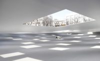
Occasionally a building emerges that seems to transcend architecture’s inherent limitations. Tokyo designer Junya Ishigami’s Kanagawa Institute of Technology (KAIT) Workshop is one of those buildings. Articulated with minimal means—exterior walls of thin glass and interior clusters of slender white columns—Ishigami’s ethereal structure is barely a building at all. While the transparent enclosure exposes everything inside, the delicate steel columns define scattered oases of open space, each one a different functional component. Awash in soft daylight admitted by glass bands overhead as well as the building’s transparent envelope, Ishigami’s meandering interior landscape creates the ambience of a tree-filled forest, not a college classroom.
Additional Information:Jump to credits & specifications

A stellar debut, KAIT Workshop is the 34-year-old architect’s first realized building after launching his practice in 2004 following a four-year stint working for Kazuyo Sejima. More recently, he authored Japan’s pavilion at this year’s Venice Biennale (page 77). Like the pavilion, the 21,410-square-foot workshop is modest in scale. Yet this single-story glass box is the centerpiece of the school’s 32-acre campus, whose 40-year-old buildings are currently being replaced one by one. When this ambitious makeover is complete, the workshop will be visible from KAIT’s main gate, where its 5,000 budding engineers and scientists pass each day. Located in Atsugi, an exurb 20 miles west of Tokyo, KAIT, like most Japanese universities, is a commuter school. Though Ishigami’s parallelogram-shaped building gently challenges the rectilinear grid of pathways uniting the campus, it fits comfortably within the existing walkways encircling its site. The building has openings on all four sides, but its main entrance, indicated by an indented doorway and thin steel canopy, is closest to the campus gate.
Open to all KAIT students, the workshop accommodates nonacademic, creative pursuits ranging from molding silver pendants to assembling solar-powered cars. Daylight floods the building during school hours, while ceiling fixtures and task lamps enable the factory-like facility to operate long after classes end for the day. The one-room building contains 14 freely arranged, open spaces. These include a check-in area, denoted by an Ishigami-designed, donut-shaped counter, as well as specialized areas for pottery, woodworking, computer graphics, metal casting, and other media. There are also four multipurpose work spaces, a small supply shop, and an officelike alcove for the facility supervisors. Ishigami eschewed organizational devices, such as structural grids, proscribed circulation paths, and even walls (the closest lavatories are next door). Instead, he used rectangular columns, furniture of brown wood or white steel, freestanding HVAC units, and potted plants to modulate the whole 16-foot-high space.
“I wanted to create a building where it isn’t clear if there are any rules at all,” explains Ishigami. Yet it took a lot of work to reach this objective. In response to the client’s request for many small spaces instead of one big studio, the architect started with a 13-foot grid of rectilinear columns but quickly found this framework too limiting. So he made incremental modifications to the pillars’ positions, dimensions, and orientations. This enabled him to focus on qualitative criteria—such as the size and distribution of open areas and their relationship to one another—and to sculpt the space as if it were clay.
A labor-intensive process that went on for three years, Ishigami’s rigorous design phase required endless iterations involving 1,000 study models of various scales and drawings—both CAD-generated and, especially, hand-drawn—that enabled the fine-tuning of multiple variables at once. The completed building’s 305 columns appear randomly distributed and arbitrarily shaped—290 variations of a quadrilateral—but were, in fact, very deliberately designed.
“Due to the complexity of the columns, it was important to keep the structural system as simple as possible,” says structural engineer Yasutaka Konishi, a contemporary of Ishigami’s who worked on SANAA projects during his five-year tenure at Sasaki Structural Consultants. It consists of three main steel components: a conventional two-way roof frame, 42 compression columns for vertical loads, and 263 post-tensioned columns that carry horizontal loads like mini sheer walls. Though both types of columns are anchored with simple concrete footings, the compression and tension members connect to the roof frame with welded and pin joints, respectively. Because many of the supports do not align with the roof’s 5-by-3-foot girder grid, Konishi inserted extra beams to bridge the gaps.
Despite their separate roles, the tension and compression members look the same to the naked eye. “I was striving for ambiguity even among the columns,” explains Ishigami. But due to their oblong shapes, individual columns may appear different depending on the visitor’s viewpoint—an illusion that compounds the intricacy of Ishigami’s composition. Coated with white paint, each column is actually a slice of steel plate. Cut in various widths from slabs of three different thicknesses, each was tailored to the architect’s exacting specifications. This unusual fabrication technique accommodated every permutation from the thinnest tension member, measuring 0.63-by-6 inches (16-by-145 mm), to the thickest compression member, measuring 3-by-4 inches (63-by-90 mm).
Construction was equally unorthodox. After workers put compression members and the roof frame in place, they suspended tension members from the girders but did not attach them at the bottom until after weighting the roof to simulate the snow load. “No one had ever built like this before,” says Konishi. “I thought the building might sink or fall over.” But when the weights were removed, the taut steel planes snapped into place and the roof popped up as expected. Made of steel deck with wire-reinforced-glass inserts, the roof tilts slightly to drain rainwater, and weighs as little as possible to handle earthquake forces. The designers put the exterior glass skin on a similar kind of materials diet. It’s a mere 0.39 inches (10 mm) thick, but does require beefy glass ribs for vertical stability.
To blur the boundary between indoors and out, Ishigami eliminated all openings on the glass walls except for doors and a few small floor vents that draw fresh air supplied by roof vents. Like traditional Japanese borrowed scenery, the surrounding landscape serves as the backdrop for the interior. Inside, the columns function as abstract trees and potted greenery—each plant carefully selected by the architect—serves a bona-fide design role, not just a decorative one. By blending architecture and nature in a remarkably fresh and dynamic way, KAIT Workshop plants Ishigami solidly among those Japanese designers striving to reduce buildings to their bare minimum.
CreditsArchitect Motosuke Mandai
Engineer(s)
Consultant(s) Lighting: Izumi Okayasu CAD design: Tomonaga Tokuyama
General contractor: Kajima corporation
Photographer: Iwan Baan
|
SpecificationsStructural system Steel Exterior cladding Metal/glass curtainwall: Asahi Building-wall Co.,Ltd Roofing Built-up roofing: Lonseal Corporation Glazing Glass: Asahi Building-wall Co.,Ltd Skylights: Asahi Building-wall Co.,Ltd Doors Entrances: Asahi Building-wall Co.,Ltd Hardware Locksets: Miwa Lock Pulls: Union Corporation Interior finishes Paints and stains: Furnishings Reception furniture: Minerva Chairs: Kodama Tec Tables: Kodama Tec Lighting Interior ambient lighting: |


