Bayhouse by Studio Rick Joy
Northeast U.S.

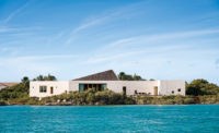
The granite-walled house, with an asymmetrical hipped slate roof, includes a “car porch” at the entrance.
Photo © Jeff Goldberg/Esto

At the rear, the living and dining areas face the water.
Photo © Jeff Goldberg/Esto

The detailing of the stone corners and recessed windows of the screened porch deftly articulates the thick planar walls.
Photo © Jeff Goldberg/Esto

The entrance to the house admits visitors into the vestibule before they take a turn and enter the living area.
Photo © Jeff Goldberg/Esto

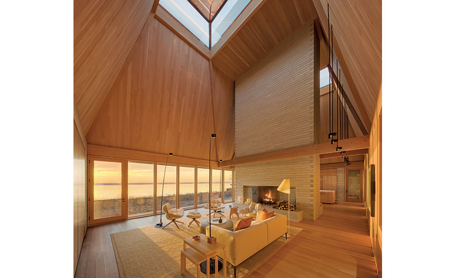
The Douglas fir–clad living room, with its pyramidal skylight and granite chimney, brings to mind the vocabulary of Louis Kahn. The space is all the more dramatic because of the water view.
Photo © Jeff Goldberg/Esto

The dining area and kitchen is topped by a pyramidal skylight, similar to that of the living area.
Photo © Jeff Goldberg/Esto

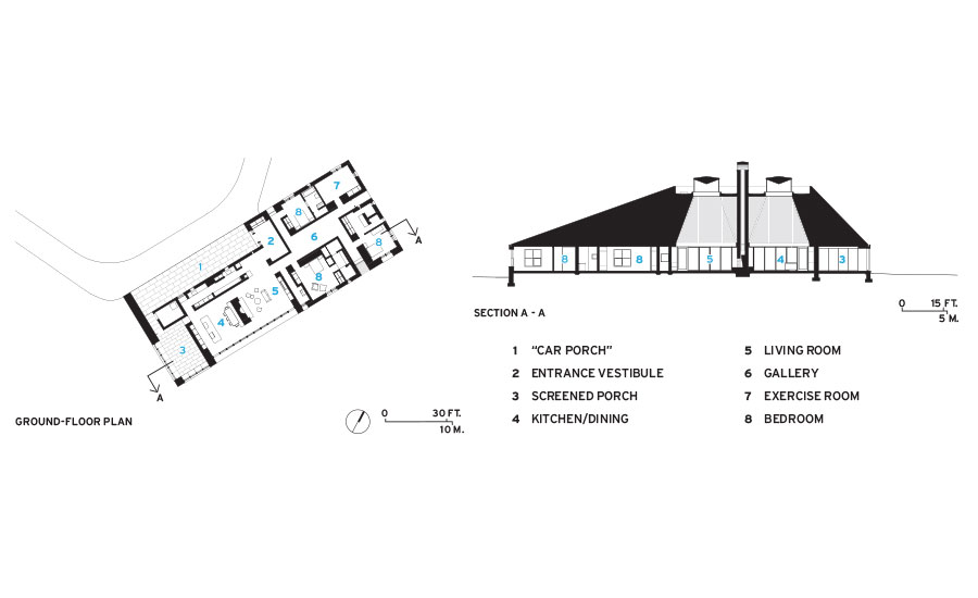
The architects connected the living room with the dining and kitchen area by circulation paths on both the entrance and the water sides.
Photo © Jeff Goldberg/Esto

Image courtesy Rick Joy

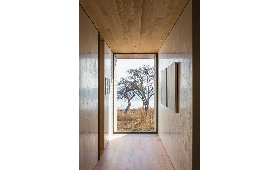
In the bedroom wing, a hall with Venetian plaster walls frames the view of the bay.
Photo © Jeff Goldberg/Esto


Architects & Firms
Since Rick Joy started his practice in Tucson, in 1993, he has been creating buildings that deftly balance modernist formal rigor with sensitivity to place. His houses have ranged from rammed-earth desert structures such as the Adobe Canyon house in Patagonia, Arizona (2005), to a Vermont farmhouse in Woodstock, a RECORD house (April 2009), where the shingled roof and side walls contrast with the stone shear walls at each end—a striking yet seamless blend of contemporary form, rich materials, and local tradition.
Additional Content:
Jump to credits & specifications
That approach is at the heart of his recent Bayhouse, a spacious single-story residence set on two acres of waterfront property in a small coastal town known for its picturesque charm. The clients, a mature couple, wanted a modern house, but the town favors traditional architecture for new buildings. “I knew that Rick would design something modern that would be a good neighbor,” the wife says. So Joy and his studio looked for cues in the historic houses of the Northeast, with their clapboard or shingled walls and pitched roofs that shed snow, but didn’t take them literally.
Rather than use painted clapboard, for example, the architects clad the house in varying lengths of 4-inch-high, 5-inch-deep white granite, with flush vertical joints and raked horizontal ones to evoke clapboard’s forms and rhythms. (The clients also wanted stone for its ability to insulate the house from the noise of summer boating activities.) The steeply pitched slate roof is another reference to the past, but its asymmetrical hipped form and exaggerated height are contemporary moves, Joy explains, that were ultimately based on “a desire to create daylit spaces for the living and kitchen/dining areas.”
To achieve that, the architects created two light monitors with clerestory windows surrounded by a parapet at the top of the roof. These belvederes bring light into the lofty, open-plan public areas within. An inverted copper pyramid inside each monitor reflects daylight onto the pitched, 28-foot-high wood ceilings. Joy is not a fan of direct daylighting: “Don’t light up the architecture,” he says: “light up the life.” (Electrical lighting was designed by Claudia Kappl, Joy’s wife and associate, and a partner with her husband in Concept Lighting Lab.)
The granite chimney of the fireplace separates the living room on one side and the kitchen/dining area on the other, with both looking out to the calm waters of a bay. Adjacent to the kitchen at the west end of the house is an enclosed porch, while the east end contains three bedrooms and three and a half bathrooms. In contrast to the soaring spaces of the living and kitchen/dining areas, this wing, with its walls of troweled white plaster, has 9-foot ceilings. The bedrooms are laid out in a pinwheel plan around a central gallery, which displays works by contemporary photographers. This space offers a view through the living areas, while the corridors that branch off it look to the outdoors.
The house’s front facade was carved out to create what Joy calls a “car porch” at the entry, with a bronze railing, like a ballet barre, running along the wall to aid passengers who need a little help getting out of a car. That exterior alcove’s Spanish cedar wall, says project senior designer Matt Luck, “reveals the soft core” of the house, with its sustainably harvested Douglas fir–lined entry, living, and kitchen/dining areas.
As dramatic as the house’s outlines and main interior spaces are, its details are what make the building “an exercise in refinement,” as Joy puts it. At the corners of the exterior, the ends of the flame-finished granite pieces are burnished and buffed, creating a subtle contrast of textures, while the top surfaces of the granite window sills slope toward their centers in a gentle V to help drain water. The asymmetrical angles of the roof became “a self-inflicted design challenge,” says Joy, with conventional courses of slates impossible.
Instead, the architects created eight different shingle sizes and devised a set of patterning rules that produced a seemingly random effect. Combined with the slate’s natural color variations, the resulting surface is both subtle and complex. And then there is what can’t be seen: gutters hidden between the edges of the roof and walls, revealing themselves only when they span the stone walls (water drains into pipes that are concealed in the house’s corners) or the entirely invisible geothermal pumps that provide air-conditioning and heat for the radiant floors.
The plantings, by Michael Boucher Landscape Architecture, are natural and informal, reflecting the desire of both the architect and clients that they fit into the beachfront setting. Though the house clearly stands out from its more conventional neighbors by virtue of its unusual roof and the precision of its materials and detail, the design “attempts to be a good citizen, identifying with the spirit of the place,” notes Joy, without trying to imitate them. Not only has he created an elegant but unpretentious house, he has met his own goal of making architecture that is “at once emotional, existential, and super-well crafted.”
CreditsArchitect: Studio Rick Joy — Rick Joy principal; Matt Luck, senior designer; Natalia Zieman Hayes, project manager; Bach Tran and Oscar Lopez, team
Engineering: Silman (structural); Altieri Sebor Wieber (m/e/p); Daniel Falasco Consulting Engineers (civil)
Consultants: Michael Boucher Landscape Architecture (landscape); Concept Lighting Lab (lighting)
General contractor: Dowbuilt |
SpecificationsCedar siding Alan McIlvain Company
White granite Granites of America
Copper belvederes Cedar Design
Cedar-frame windows and entrances; Douglas fir doors Duratherm
Steel-frame windows, Copper clerestories Hope’s Windows
Solarban glass Vitro Architectural Glass
Bird-protection glass Arnold Glas
Plaster USG Diamond
Locksets Baldwin
Lighting controls Lutron
Toilets/Bathtub Duravit |

