Qatar National Library by OMA
Doha, Qatar

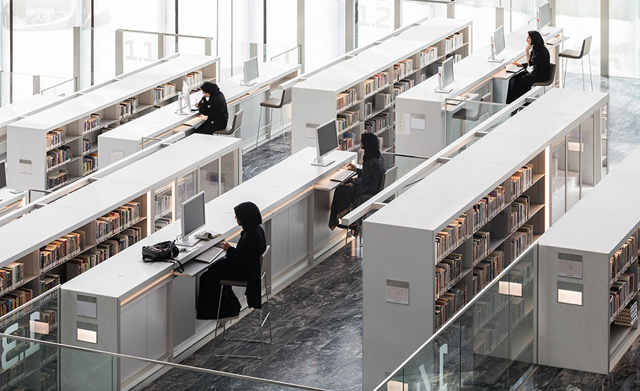
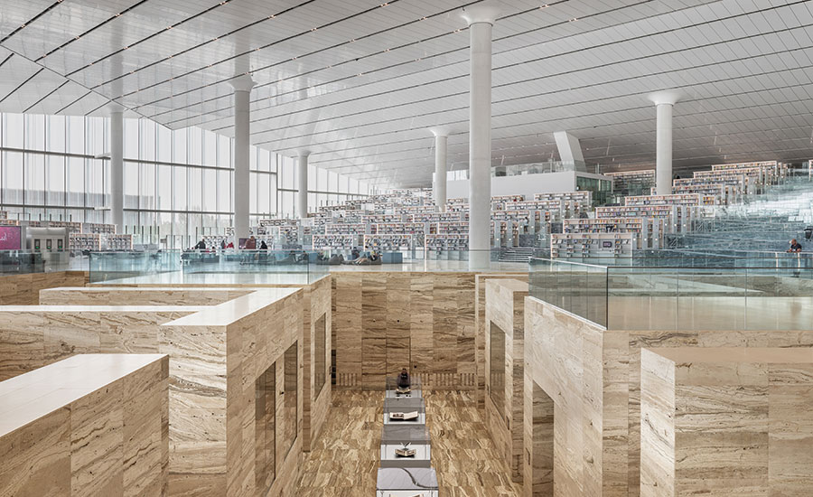
The terraced stacks conform to the ramping interior.
Photo © Delfino Sisto Legnani and Marco Cappelletti

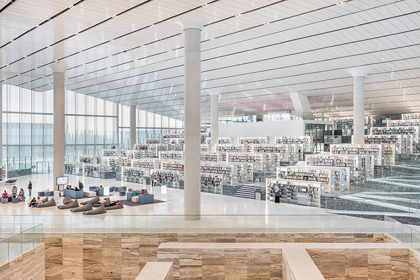
The vast interior, which soars to 48 ½ feet, features a glossy white ceiling that spreads daylight.
Photo © Delfino Sisto Legnani and Marco Cappelletti

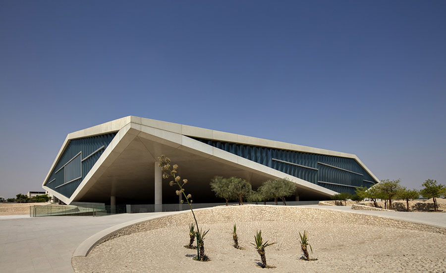
The landscape was done by Dutch firm Inside Outside.
Photo courtesy Qatar National Library

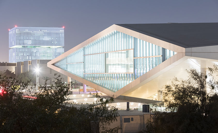
OMA’s Qatar National Library on the campus of Education City in Doha, with OMA’s Qatar Foundation Headquarters in the background.
Photo © Iwan Baan

The sunken Heritage Library is completely clad in travertine.
Photo © Delfino Sisto Legnani and Marco Cappelletti

The Qatar Foundation Headquarters, also designed by OMA, is just several hundred feet from the library and features a perforated, precast concrete façade.
Photo © Delfino Sisto Legnani and Marco Cappelletti

The self-supporting corrugated glass is insulated and includes panels as tall as 18 feet.
Photo © Delfino Sisto Legnani and Marco Cappelletti

An 82-foot-wide bridge offers flat open areas for study and incorporates a flexible auditorium.
Photo © Iwan Baan

A model of the arena-like main space.
Photo courtesy Qatar National Library


Architects & Firms
There’s no mistaking that the new Qatar National Library was designed by the Rotterdam office of OMA. Like a lot of OMA’s built work, it is slightly odd, slightly off-putting, but impossible to ignore. And the building quite literally borrows from earlier OMA projects, most conspicuously from the Casa da Música in Porto, Portugal with its unusual crystalline geometry and large swaths of corrugated glass, and, inside, from the Bibliothèque Alexis de Tocqueville in Caen, France—though Rem Koolhaas would say otherwise about that.
As Koolhaas described the design during a recent tour of the building, “We started with a square then lifted two corners.” The resulting structure appears like a rocky outcrop amid a bizarre hardscape of craters and faux mounds—by Dutch design firm Inside Outside—that might fit as easily on the moon as in this desert setting. Massive columns, nearly four-feet wide, protrude from the building’s concrete underbelly—where the main entrance is—to support the entire structure and its 80-foot-long sloping spans. Circling the exterior, the library changes appearance from different angles—the “pinched” corners are unquestionably the most intriguing aspect; where the building meets the ground opposite those corners, not so much.
The 485,000-square-foot building started life as a university library in Education City, a 3,700-acre campus, master-planned by Arata Isozaki about six miles from downtown Doha. But it evolved to serve the general public as well. In a hot desert city full of expatriates, from South Asia, North Africa, and other Arab nations, where air-conditioned public space is limited to shopping malls, OMA’s design needed to cater to varied cultures and activities—around 500 workshops and events will be held here each year—even if its main purpose clearly remains as a center of learning and research. “You enter and are completely surrounded by books,” says Koolhaas. “Everything is evident.”
Despite the books, the vast, pitched main room feels more like an arena than a library. In fact, one of OMA’s early plans for the lower central space included programming for sporting events. It now houses the heritage library where rare manuscripts are kept and exhibitions mounted—its exposed sunken, mazelike, travertine-covered walls suggest the excavated pit of the Colosseum in Rome. As in the OMA design for Lab City outside Paris, parts of this pit are covered with platform-like expanses accessible to visitors and, since the building opened last November, where musicians play during recitals.
This building’s primary allure is this light-filled main space. The reflective ceiling, which reaches 48 ½ feet at its highest point, is clad in glossy white glass fiber reinforced plastic panels that bounce daylight coming from the expansive areas of glass on three sides and skylights. The over 1 ½”-thick wavy glass of the façade (offering hazy, mirage-like views of the outside), is self-supporting though it includes horizontal steel shelves connected to interior columns to brace against wind loads. The glass panels—insulated against temperatures that regularly surpass 100 degrees Fahrenheit—are as tall as 18 feet. They feature a 50 percent silver frit but no shading option. “The client wanted solar blinds but we said no,” recalls OMA’s on-site architect Vincent Kersten. “You never know how it will work until it’s there. We took a risk.” It paid off. The effect is glorious.
The sheer scale of the space is astounding. Where you might expect bleachers there are terraced levels with stacks and stacks of books; where you might expect carpeting, boldly patterned stone. Where the room begins to feel too vast, an 82-foot wide mezzanine—what OMA calls the “bridge”—spans one end of the building to the other, hovering over the central area and the heritage library below. The bridge provides flat open areas for study. Where it meets the back of the building—which is not lifted off the ground—it incorporates a large, flexible, curtained auditorium.
Stacked within that multi-level portion of the building are auxiliary spaces including offices, computer labs, storage, a children’s library, and a cafeteria. (The glass windows at the offices are flat so workers aren’t exposed to distorted views all day). The flood-proof basement—even in the desert, occasional big storms can lead to deluges—houses compact shelving and the book sorter, as well as a conservation studio where historic pieces from the collection are restored.
A mechanical people mover along the interior’s perimeters makes the terraced stacks accessible to the disabled and the elderly, and lets service staff transport heavy equipment. Those terraces are also bisected by zig-zagging ramps, installed more for life safety reasons—to quickly evacuate the building in case of fire—than for accessibility.
As a library and a gathering place, the building has already been an overwhelming success, drawing over 160,000 visitors in its first four months of operation. More telling, nearly 25 percent of its 875,000-volume collection is checked out at any given time. “For most libraries, that number is in the single digits,” says executive director Sohair F. Wastawy, who ran several university libraries in the United States and was chief librarian at the Snøhetta-designed Bibliotheca Alexandrina in Egypt.
OMA also designed the recently completed headquarters for the Qatar Foundation, which helps fund Education City. That cubic, perforated building, a few hundred feet from the library, “looks deceptively simple from the outside,” says Koolhaas. Inside, a naturally-ventilated, central L-shaped void reveals a jumble of volumes of different shapes and sizes. Hung from a rooftop truss, they contain air-conditioned offices and conference rooms. There is also a covered bridge across the space. Midway up the building’s exterior, an 8-foot-tall incision slices horizontally around the entire perimeter, becoming a low-ceilinged terrace. Clad entirely in travertine, the terrace is a sharp contrast to the soaring volume of the atrium, which it wraps around. “When you feel compressed it forces you to look outside,” explains Koolhaas—to the view over the campus, where the otherworldly library building figures prominently, and to the Doha skyline in the distance.
Koolhaas’s partners at OMA exercise considerable independence on many of the firm’s global projects, but in Doha, Koolhaas played the central role. Despite the library’s echoes of elements from earlier OMA buildings, it—together with the foundation building—reflects an approach where space, light, air, views, materials, landscape, and user experience trump brazen experiments and radical form. It’s also an approach in deference to a vigilant, and less than thrill-seeking client. The result is an architecture that’s appropriate and striking, but not quite the breakthrough design of OMA’s Seattle Central Library (2004)—nor as extreme as its CCTV Tower in Beijing (2008), and, it seems, Koolhaas’s next major project, the much-delayed Taipei Performing Arts Center.


