Lab City CentraleSupélec by OMA
Gif-sur-Yvette, France

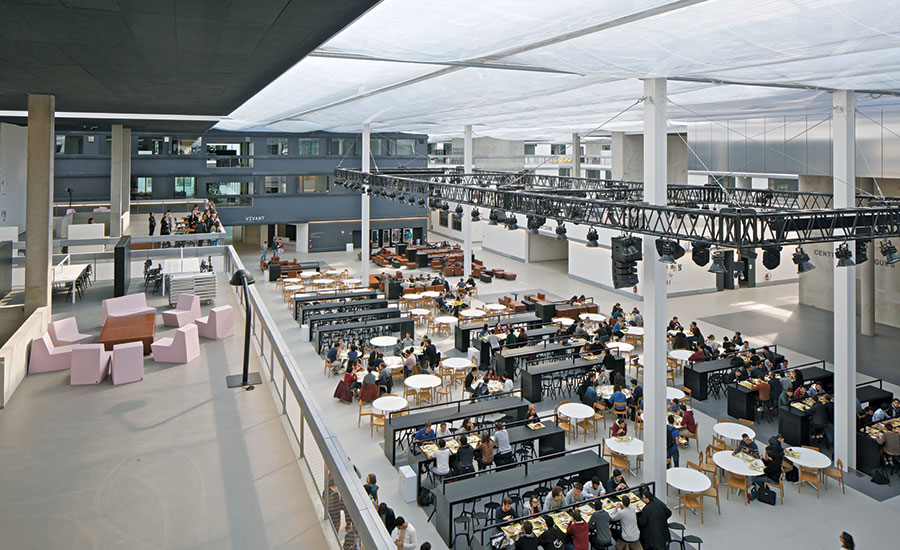
At the center of the vast complex is a three-story forum space that houses a cafeteria; above it is sound and lighting equipment used when the tables are cleared away for parties.
Photo © Philippe Ruault

Footbridges connect the different blocks on upper levels.
Photo © Philippe Ruault

The dyed-black concrete facades are echoed on some of the interior blocks.
Photo © Philippe Ruault

The dyed-black concrete facades are echoed on some of the interior blocks.
Photo © Philippe Ruault

A glass-roofed courtyard opens onto the main diagonal thouroughfare.
Photo © Philippe Ruault

The oversailing ETFE roof offers daylit spaces throughout the large complex.
Photo © Philippe Ruault

Image courtesy OMA


Architects & Firms
France remains very special in that it still believes in grands projets,” commented OMA partner Ellen van Loon at the unveiling of the Rotterdam office’s latest French opus, the 645,000-square-foot “Lab City.” The grand projet she was referring to is the 30-square-mile Saclay Campus, an industrial and higher-education “cluster” 12 miles southwest of Paris, to which the French government has committed nearly $6 billion to turn it into a world-class research-and-development hub. Currently a giant building site, Paris-Saclay will group together institutions that have long been located there—including the Commissariat à l’énergie atomique, the École supérieure d’optique, and the École Polytechnique—alongside new education-sector arrivals that are being encouraged to relocate. On the industry side, many companies have been attracted to Saclay over the years—Renault, for example, who built their Technocentre there in 1998—and newcomers are likewise being encouraged, such as energy giant EDF which last year opened a research center at Saclay (by architect Francis Soler). Within a decade, the campus will be connected to central Paris by a new metro line, and more than 18 million square feet of new building will have been added to the existing fabric.
Additional Content:
Jump to credits & specifications
One institution that was historically present at Saclay was the École supérieure d’éléctricité (Supélec), which in 2015 concluded its merger process with another engineering school, the École centrale Paris, to form CentraleSupélec. In 2012, OMA won the master plan competition for the future school’s new complex, which now comprises four buildings: Supélec’s two old structures and two brand-new edifices, one by Swiss firm Gigon/Guyer and the other, Lab City, by OMA. Occupying an enormous, almost-square plot of 508 feet by 400 feet, Lab City combines chemistry and engineering laboratories, classrooms, a lecture theater, a student cafeteria, a staff restaurant, and a language school (tomorrow’s engineers will be trilingual globetrotters, according to Hervé Biausser, CentraleSupélec’s director). Perhaps unsurprisingly, given not only this deep site but also Rem Koolhaas’s historic obsession with Manhattan’s urban grid (as his early book Delirious New York demonstrates) OMA’s Lab City is laid out on a lattice of internal streets. A convenient way of organizing a large number of disparate activities that are obliged to cohabit under the same roof, the grid could have been monotonous, but OMA has manipulated both its plan and section to produce a building of surprising—and arresting—spatial complexity.
One of the brief’s stipulations was that Lab City should be capable of expanding in the future should student numbers grow. “But I think that, if you don’t have the growth, you should be able to take advantage of the extra space you have,” says van Loon. Toward the center of the grid, the “blocks,” or interior volumes, are lower than those at the perimeter—one or two stories as opposed to three—so that if student numbers increase, new labs and classrooms can easily be added on top (all the blocks have a central service core). In the meantime, the lower blocks’ “roofs” provide informal lounge and study areas within the mega-network of internal streets and are connected to the other blocks via footbridges, all sheltered under a giant oversailing roof that unites the interstitial spaces. Realized in two layers—ETFE beneath a PTFE tensile membrane—the roof ensures abundant natural light, as do glazed louvers at the extremities of each street; the latter also provide natural ventilation. (The streets are not air-conditioned and are only heated when the weather gets very cold.) In plan, the grid has been manipulated by merging some blocks to form bars, and also by the introduction of a diagonal main thoroughfare that divides the complex in half and connects its two principal entrances at opposite corners. (Lab City is intended to be porous, with around 14 points of entry all around its perimeter.) At the site’s center, the thoroughfare widens into a three-story-high “forum” where the school cafeteria is located. Further spatial complexity is added at each of the diagonal’s extremities, one of which comprises administrative office space organized around a courtyard, while the other contains a three-story semicircular lecture theater designed with great bravura, as well as, on a fourth level, the language school, grouped around a glass-roofed courtyard, part of whose floor dramatically opens into the principal thoroughfare below.
Money was tight at Lab City—$140 million, or $217 per square foot. “We made it sober and simple, using materials that France knows how to do—for instance, concrete,” explains van Loon. “Essentially, we spent money on the ETFE roof and the auditorium.” Used as air-filled cushions, ETFE helps maintain steady temperatures while still admitting abundant light, which is tempered thanks to white fritting on its surface (van Loon says the fritting also makes the interior seem brighter on overcast days). The other element on which OMA spent a certain amount of time and money was furnishings. “We always end up designing a lot of the furniture for our projects because I can’t find what I want,” she laughs. At Lab City, OMA produced everything from lounge chairs and reading and dining tables to electrical sockets that can be handily pulled down from the ceiling. Particular attention was paid to the cafeteria, whose furnishings are intended to provide visual animation even when not in use, and which are easily cleared away so that the forum can host student parties, with a suspended technical gantry for sound and lighting equipment.
Externally, Lab City is sober to the point of severity, with black-dyed concrete, string courses, and punched-out windows marching around most of the perimeter (“Black because the existing buildings were white, and I wanted a contrast,” deadpans van Loon), set off by brushed aluminum at the lecture-theater corner, where the building fronts on an outdoor plaza. A “city” within a campus within a campus, OMA’s building plugs into its context like a piece of sophisticated hardware on a circuit board and joins a growing French trend for what one might term “austerity architecture.” Pioneered by firms such as Lacaton & Vassal, it’s an inventive approach that aims to do more with less and which, while never taking itself too seriously, achieves a hardnosed dignity and uncompromising aesthetic rigor.
CreditsArchitect: Office for Metropolitan Architecture Heer Bokelweg 149 3032AD Rotterdam oma.eu
Personnel in architect's firm who should receive special credit: Partner in charge: Ellen van Loon Project leaders: Edouard Pervès and Saskia Simon Site manager: Mauro Altana
Engineers MEP: Alto Ingenieurie Structure and facade: Bollinger+Grohmann Acoustics: Royal Haskoning DHV
Consultants Cost: DAL Fire safety: Apex Landscape: D'Ici La Scenography: Ducks Sceno Signage: Polygraphik Kitchen: Cuisine & Concept
General contractor: GCC+Rabot Dutilleul (structure and envelope) Engie Axima (ventilation and heating) Bouygues Energie Services (electrical) Gallier (plumbing) Fain(elevators) DBS (lightweight walls and ceilings) Roux Freres (wooden doors and fixed furniture) Algaflex (movable partitions) Vulcain (metal work and interior facades) Lagarde & Meregnani (floor finishes) Eliez (painting) Gielissen (fixed furniture) Air Liquide (special fluids) Delagrave (laboratories equipment) Tech Audio (scenography equipment) Froid 77 (kitchen equipment) Boscher (signage) Vallois Normandie (landscape)
Photographer: Philippe Ruault, Antoine Cardi, Vitor Oliveira |
SpecificationsStructural System Manufacturer of any structural components unique to this project:
Exterior Cladding Metal panels: QUADROCLAD honeycomb composite panels: HUNTER DOUGLAS covered with C-BRITE aluminium: COIL Insulated precast concrete wall panels: PRENORM Steel truss beams: RENAUDAT Moisture barrier: STAMISOL: SERGE FERRARI Curtain wall: Bespoke curtain wall: PARALU
Roofing Built-up roofing: Bespoke roof build-up designed by OMA and BOLLINGER + GROHMANN and ROYAL HASKONING DHV integrating multiple layers: Upper waterproofing membrane FLEXLIGHT FX 901: SERGE FERRARI 3-layer ETFE cushions: IASO Steel structure: RENAUDAT Acoustic lateral membrane SOLSTIS 88: SERGE FERRARI
Windows Bespoke aluminium frame: PARALU
Doors Bespoke doors designed by OMA: VULCAIN
Interior Finishes Acoustical ceilings: MASTER SOLO: ECOPHON LUXALON: HUNTER DOUGLAS Demountable partitions: SKYFOLD CLASSIC 55: SKYFOLD Cabinetwork and custom woodwork: Bespoke design by OMA: GIELISSEN and ROUX FRERES Custom-printed carpets: KASTHALL
Furnishings Office furniture: All loose furniture was selected by OMA and delivered by SILVERA and STEELCASE Reception furniture: Bespoke furniture designed by OMA: ROUX FRERES Fixed seating: Bespoke furniture designed by OMA: GIELISSEN Chairs: All loose furniture was selected by OMA and delivered by SILVERA and STEELCASE Tables: All loose furniture was selected by OMA and delivered by SILVERA and STEELCASE
Energy Building management system: SIEMENS |


