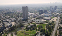
LACMA Unveils Latest Zumthor Scheme

Peter Zumthor’s latest design for LACMA still bridges Wilshire Boulevard but has concrete surfaces and a greater variety of interior art and amenity spaces.
Image courtesy Atelier Peter Zumthor

Peter Zumthor’s latest design for LACMA still bridges Wilshire Boulevard but has concrete surfaces and a greater variety of interior art and amenity spaces.
Image courtesy Atelier Peter Zumthor


Architects & Firms
Soon after Michael Govan became director of the Los Angeles County Museum of Art (LACMA) in 2006, he called Swiss architect Peter Zumthor to begin reimagining the museum’s campus, with its awkward collection of buildings of various vintages (now seven in all). The exploration began in earnest in 2008, but the museum didn’t present a scheme publicly until 2013. The institution has since unveiled four more iterations—most recently on April 5, when Govan hosted an onstage discussion with the architect. Less than two months earlier, during a talk at New York’s Solomon R. Guggenheim Museum, Zumthor had hinted about significant design changes, and by April, a packed house at LACMA’s Bing Theater awaited the latest revelations.
The initial design, in 2013, proposed a black, amoeboid building, hovering (with supporting vertical elements) above the ground. It evoked the dark, oily character of the adjacent La Brea Tar Pits, an archeological site and museum with prehistoric remains. Zumthor’s 387,500-squarefoot structure was designed to replace four existing buildings: LACMA’s three original 1965 pavilions, by William Pereira, plus a 1986 addition by Hardy Holzman Pfeiffer Associates. (The museum says two estimates placed the cost of seismic and safety upgrades for those buildings at $300 million.)
Critics and skeptical locals soon nicknamed Zumthor’s flat, curvy-edged project “the pancake,” “the blob,” or “the inkblot.” And there was a major glitch: the siting threatened the protected tar pits. To address that issue without losing square footage or galleries all on one floor—a priority for Govan—each subsequent scheme has bridged Wilshire Boulevard to a LACMA-owned parcel across the street. “We called [the original scheme] ‘the black flower,’ ” Zumthor explained from the Bing stage. “But then came the moment when we, more or less, had to cross Wilshire, and then [Michael] said, ‘You understand, an organic form cannot cross Wilshire Boulevard.’ So it had to develop urban energy.” Harder-edged versions followed, ultimately taking on a quirky S-configuration. But spanning a grand thoroughfare like Wilshire is controversial—particularly with forms resembling freeway overpasses.
And the newly unveiled version risks reinforcing that analogy with its striking muscularity and sand-colored concrete. While this $650 million scheme—for which, the museum says, it’s already secured commitments exceeding $300 million—doesn’t break radically from the previous iteration, its significant changes include greater definition of indoor spaces.
Now the exterior and interior surfaces are all exposed concrete: “real, elemental materials, not sheetrock,” said Zumthor. The main gallery level floats 20 to 30 feet above the ground, sandwiched between two massive horizontal plates: the floor plane and a deeply overhanging flat roof. Seven vertical elements— containing galleries and, at grade, a restaurant and other amenities—hold it all up.
Certain ideas have run through every iteration: the flow of a parklike ground plane beneath the building; continuous floor-to-ceiling perimeter windows; and an overall form that bends and looks back on itself and out to the city. “You always know where you are,” said Govan. Also, the project has from the start eschewed a traditional front or back (a formality that tends to relegate some artworks to lesser, rear positions). Similarly nonhierarchical, “the circulation should be like a city or park,” said Zumthor, “offering free choice and a sense of discovery, not a fixed path.”
In the variety of spaces, interior scales, and daylighting conditions, the new scheme goes well beyond its predecessors, creating four types of art venues: “meander” galleries, doubling as circulation zones, along the side-lit periphery; intimate cul-de-sac “pocket galleries”; “cluster galleries” toward the interior; and, within the vertical shafts, high-ceilinged, clerestory-lit “tower galleries”—together accommodating LACMA’s encyclopedic range of objects.


