Temple Israel of Hollywood by Koning Eizenberg Architecture
Los Angeles

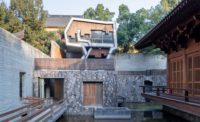
The original 1949 building features exposed concrete facades and a tiled roof supported by steel beams. Its new glass neighbor has a decidedly different character, punctuated by a wavy sunshade.
Photo © Eric Staudenmaier

Vertically retracting doors allow the chapel to open onto the courtyard.
Photo © Eric Staudenmaier

The fold of the sunshade’s aluminum panels was inspired by the weave and flow of a prayer shawl.
Photo © Eric Staudenmaier

The fretwork of the ark doors evokes Islamic screens.

The sunshade's undulant design is mimicked in the chapel’s plywood ceiling.
Photo © Eric Staudenmaier

Public spaces, including the lobby, are now able to display art and artifacts, some from antiquity, for the first time.
Photo © Eric Staudenmaier

Image courtesy Koning Eizenberg Architecture


Architects & Firms
It’s not surprising that the home of Temple Israel of Hollywood (TIOH), right on Hollywood Boulevard, was partially the work of a theater designer. The Spanish-style structure, completed in 1949, was a collaboration between architects Samuel Lunden, creator of the original Pacific Coast Stock Exchange building in Los Angeles, and S. Charles Lee, best known for his movie palaces. Grand in scale, with tiered seating for more than 1,400 congregants, TIOH’s main sanctuary is cavernous and inwardly focused, with sparse daylight filtered through small stained-glass windows. It’s a hierarchical arrangement, with the audience facing a stage, site of the altar, or bima, with its Torah scrolls and pulpit. The temple—where Martin Luther King spoke and Elizabeth Taylor converted to Judaism before marrying Eddie Fisher—tends to attract movieland luminaries, and still draws crowds in its main sanctuary for High Holy Days and big bar mitzvahs or weddings. But, by 2006, this progressive congre- gation felt a growing need to add a more casual, intimate, and participatory space for daily prayer.
Additional Information:Jump to credits & specifications
The synagogue leadership turned to Koning Eizenberg Architects (KEA) to reshape its ungainly agglomeration of post-1949 additions and, ultimately, design a chapel as both a complement and antidote to the original building. In contrast to the staid older sanctuary, with its solidity, dramatically dim lighting, and seclusion from the outside world, the new chapel needed to be luminous and intimate, with a sense of openness to the outdoors. But before creating such a place, KEA had to carve out a context for it.
Over the years, TIOH had evolved into a 2.3-acre compound with pre- and day schools, a modest library, and community and administrative spaces. But these piecemeal accretions were fragmented and poorly integrated, making KEA’s first mission to devise a master plan. The phased renovation (including the chapel) spanned a total of 15,000 square feet, opening up long sight lines, ushering in sunlight, and turning cramped spaces into gracious ones; it also accommodated modern security demands and, throughout the public areas, provided for the unprecedented exhibition of TIOH’s remarkable collections of Judaic art and artifacts. Little was done to the original sanctuary.
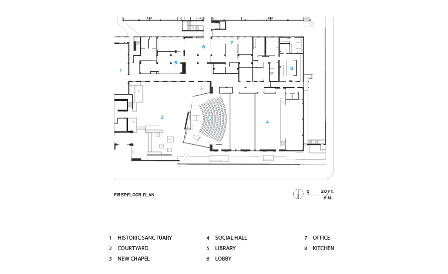
At the complex’s heart was a tight outdoor space that barely qualified as a courtyard, “more a place to pass through than to gather in,” recalls KEA principal Nathan Bishop. The master plan rerouted interior circulation around the courtyard —now enlarged and lush with fruit trees—creating a single-loaded corridor with generous windows and direct outdoor access. Further reinforcing continuity, KEA defined pathways that extend from inside out, paved with encaustic-concrete tiles whose custom-designed geometric patterning recalls Islamic-influenced Jewish arts. The project also demolished a “completely uninspired” chapel, as TIOH executive director William Shpall describes it—finally providing a courtyard large and unencumbered enough for one to read the surround- ing structures as continuous.
Across the courtyard from the 1949 synagogue, KEA’s new 2,600-square-foot chapel now projects from an existing 5,000-square-foot social hall. Inspired by the weave and flow of the tallit, or prayer shawl, an undulant, slatted-metal sunshade veils the glazed facade. The elevation’s central section is opaque: concrete stratified with small stones, collected by congregants visiting Israel over the years. With the same exposed, pebbly layering on the interior, this “sedimentary” wall backs the ark, the Torah’s repository, a key element of the altar. And within the chapel, the sunshade’s slatted language translates into a wavy ceiling of CNC-cut plywood fins, reminiscent of a chuppah, or Jewish wedding canopy. “The metaphor was very pliable,” says Bishop of the ribs, which perform acoustically while visually masking mechanical and sound systems. Underfoot, unadorned concrete paving flows from the courtyard inside, featuring casually repositionable seating, as in a living room. Adjustable in size, the chapel has motorized, ceiling-mounted partitions that can open up the entire 7,600-square-foot space (including the social hall) or divide it into two or three soundproof, acoustically balanced rooms.
Throughout the project, handcrafted and digital sensibilities dovetail, as with the ark doors, modern CNC-fabricated panels that evoke carved Islamic screens and their affinities with Jewish arts. While integrating the Star of David, these perforated wood panels abstract it within a layered fretwork. “A key question was how to make familiar icons fresh,” says KEA principal Julie Eizenberg. “This project was about new models inverting the old.”
Light-filled, the chapel plays against the original building’s darkness, contrasting an open and casual spirit with the main sanctuary’s more introverted and heavy formality. “Its’s a constant dialogue,” says Eizenberg. “The old solidity speaks of the past, whereas this sense of the ephemeral brings one into the moment.”
Amid the challenges of rethinking tradition were congregants debating “every decision,” she recalls, but in the end, they embraced the project. As one member wrote to the architects, “I love the chapel’s mix of austere and complex surfaces, the echoes of Moorish design, desert colors, and the Western Wall. There’s a sense of floating, as on an actual ark, with a wavy motion overhead. And, happily, gaps in the sunshade to see hints of blue sky and palms; the temperature, the sound, the flow of people—they’re all harmonious.”
CreditsArchitect: Koning Eizenberg Architecture 1454 25th St, Second Floor Santa Monica, CA 90404
Personnel in architect's firm who should receive special credit: Julie Eizenberg, Principal, FAIA: Project Architect; Nathan Bishop, Principal LEED AP: Project Designer; Paul Miller, AIA, LEED AP: Project Manager. Additional Team Members: Hank Koning, Principal, FAIA; Troy Fosler; Ryan Caldera; Jesse Baiata-Nicolai; Zachery Main
Engineers: Structural: Parker-Resnick Structural Engineering Civil: Barbara L. Hall, P.E., Inc. Electrical: Nikolakopulos & Associates Mechanical/Plumbing: Pullen Associates
General contractor: Sierra Pacific Constructors
Project Manager: Freeman Group, Inc.
Landscape: Pamela Burton & Company
Lighting: Oculus Light Studio
Environmental Graphics: Newsom Design
Geotechnical: GeoConcepts, Inc.
Acoustic: Newson Brown Acoustics LLC"
Photographer: Eric Staudenmaier Photography; 626.826.4258 eric@ericstaudenmaier.com
|
SpecificationsExterior Cladding Moisture barrier: Grace Perm-A-Barrier VP Other cladding unique to this project: Steel Trowel Integral Color Cement Plaster by Omega
Roofing Elastomeric: AVM System 700 Waterproofing Membrane
Windows Metal frame: Custom Steel Casement windows re-purposed in openings
Glazing Glass: 1” PPG Solarban 60 Skylights: Solatube Skylights
Doors Entrances: Storefront doors by Arcadia Metal doors: Door Components Inc. Fire-control doors, security grilles: Chase Sliding Pocket Fire Door Special doors: NanaWall Skyfold Vertically Retracting Acoustic Folding Wall
Hardware Locksets: Schlage Closers: Norton Assa Abloy, LCN, Dorma Exit devices: Corbin Russwin Assa Abloy, Von Duprin, PRL Glass Systems Pulls: Rockwood Assa Abloy, CR Laurence Other special hardware: "McKinney Assa Abloy, Schlage, PRL Glass Systems Pemko, Rixson Acoustical ceilings: Ecophon Ceiling Tiles Cabinetwork and custom woodwork: AMC Cabinets Paints and stains: Dunn Edwards Paints Acoustic: Perf Gypsum Wallboard by Pyrok Voglfuge Plastic laminate: Formica Dover White Wilsonart Iron Solid surfacing: Corian Glacier White Zodiac ""Snow White""" Special surfacing: 3Form 1” Chroma Floor and wall tile: Custom Villa Lagoon hexagon concrete floor tile @ reception, exterior entry, and hall; Daltile restroom wall/floor tile; Hakatai glass tile restroom wall; Self Leveling Floor Topping Finish by Ardex" Carpet: "Milliken Linen 2.0 Crommelin Interface FLOR Anthracite" Special interior finishes unique to this project: Oregon Lumber Prestige White Oak, Natural Rustic Grade’
Furnishings Office furniture: Haworth Compose Haworth office furniture" Reception furniture: Haworth Q_bic benches; Davis Chair Sidetable; Q-Bix Table; Haworth Collaborate Chairs; Knoll Lounge chairs & tables; Herman Miller armed seating and modular seating; Bludot ottomans and sofa; Reception Desk AMC Cabinets; Desk Paneling Knoll Textiles Imago Progeny Chairs: Haworth Very Stacker Tables: Haworth Planes Tables Other furniture: Custom Sliding Perforated Acoustic panels, AMC Cabinets; Custom Display Cases Freestanding, AMC Cabinets; Custom Display 3Form Cases Built-in, AMC Cabinets
Lighting Interior ambient lighting: Axis Beam; Intense Track Lighting; Bartco Essence; Tom Dixon Beat Pendant Lights Downlights: Coventry Caliber Lighting Exterior: Hevi-Lite, Inc.; Taxon Wallwasher; Tokistar Festoon Lighting Dimming system or other lighting controls:Lutron Grafik Eye Dimming Controls; Phillips Strand Controls 200 plus; Lutron Wireless Daylight & Occupancy Sensor
Conveyance Accessibility provisions: Added Exterior Ramp & Sanctuary Ramp (concrete)
Plumbing Include water fountains, water-saving fixtures as applicable; Toto High Efficiency 1/8 GPF Urinals; Toto Sensor Ecopower Helix Faucet; Sloan Uppercut 111 Dual Flush Flushometer; Toto Toilets; Haws 1011 Barrier Free Water Fountain |


