Taylor Street House by SAS design BUILD
Boston

Taylor Street House
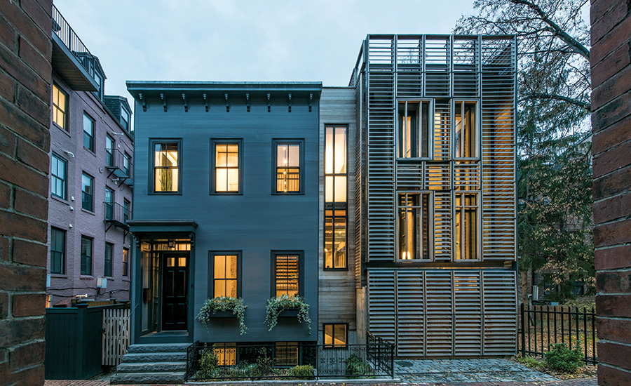
In Boston’s South End, a wood building dating to 1899 has been reconstructed and expanded with a new wing of modernist glass and steel.
Photo © Peter Vanderwarker

Taylor Street House
An exoskeleton of wood louvers covers much of the new wing, providing shading and privacy and offering a sociable nod to its older neighbor.
Photo © Peter Vanderwarker

Taylor Street House
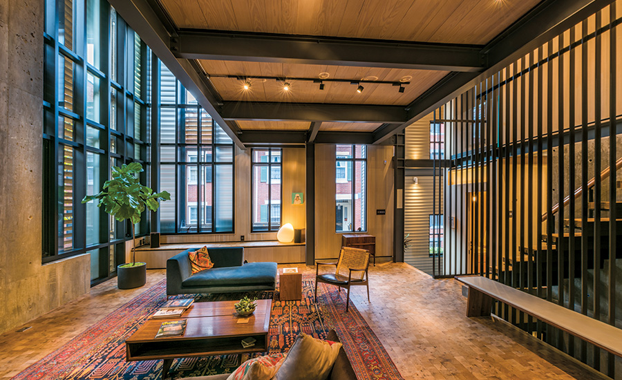
The loftlike living space looks out to neighboring historic brick houses. Materials are left uncovered and unfinished, including steel framing, raw concrete walls, and a floor of end-grain reclaimed American oak.
Photo © Peter Vanderwarker

Taylor Street House
The view from the guest bedroom down to the living space is typical of surprising overlooks and transparencies throughout the house.
Photo © Peter Vanderwarker

Taylor Street House
Social spaces are informal and flow from one to another. The owners’ period furnishings help set an intimate tone.
Photo © Peter Vanderwarker

Taylor Street House
The stair landing, with its grass-like rug from Argentina, exhibits the owners’ and architects’ passion for expressive spaces and details.
Photo © Peter Vanderwarker

Taylor Street House
Image courtesy SAS design BUILD

Taylor Street House
Image courtesy SAS design BUILD

Taylor Street House
Image courtesy SAS design BUILD

Taylor Street House
Image courtesy SAS design BUILD


Architects & Firms
The South End in Boston is a world of intimate streets lined by brick townhouses, often with swelling bowfronts and high stoops. Most houses predate the Civil War. Among residents, the preservation ethic is strong. But preservation finds common ground with modernism in the design of this remarkable house.
Additional Information:Jump to People/Products
Ramy Rizkalla, the owner, is an ophthalmologist with a passion for architecture that he acquired, he says, from having once lived for four years in New York, “with its strong design culture.” He loves this neighborhood. But he dislikes architecture that imitates the past. He’s a fan of early modernism. He likes an industrial look, with materials that are strong and bare: structural steel, raw concrete, unpainted wood, wide stretches of glass. He admires Brutalism. In the summer of 2011, Rizkalla and his partner, Cynthia Marturano, also a doctor, acquired a privately owned lot on tiny Taylor Street, deep in the heart of the South End. They found a sympathetic designer in Scott Slarsky, who was at that time working independently and today is a director in the firm of Shepley Bulfinch. Working with Slarsky and his associate Christopher Wortley (the team behind SAS design BUILD), the couple designed their glass and steel dream house at 10 Taylor.
But trouble began when the couple began to demolish parts of a vacant wood-frame house that occupied half the property. Neighbors rose in wrath, saying they’d never been consulted. Some feared that the building, which dated to 1899, was going to be obliterated. Others simply thought the new design was wrong for the historic neighborhood. The city’s landmarks commission, which had a right of review over the wood house and its half of the site, halted the project.
Perhaps what is most interesting is not the dispute, which was predictable, but the ways in which the design began to morph. As discussion flared among the owners, the architects, the community, and the public agencies, a deal was struck. The height of the proposed house was lowered by a story, the facade was set back 6 feet, and windows were reconfigured. Most important, both the owner and the landmarks commission belatedly stated that there had never been any intention of tearing down the street facade of the old house. This facade, at least, would be saved, renovated, and incorporated into the new structure.
It was design by democracy, surely a rarity in the history of Record Houses. The resulting dwelling looks like two houses standing side by side. The left half mimics the architecture of a century ago. The right side (which was not beholden to landmark restrictions) is a modernist interloper. It’s as if advocates of opposite political views were standing there holding up placards. Visitors enter the combined dwelling through a Victorian door in the reconstructed front of the old house. It’s like stepping behind a theater curtain. You can call the maneuver facade-ectomy. But that’s the charm of any historic city, where old and new are so often layered in a fascinating collage.
Once inside 10 Taylor, you’re in the interior the owners and designer always wanted. It has the bold logic of classic modernism: loftlike spaces that flow freely into one another, materials that are exposed and celebrated, and details that are both elegant and logical. One space in particular dominates: a tall volume that rises in places to double-story height and contains the public world of the house: the entry and stair hall, living and dining space, a TV room, and an elegant open kitchen. A view to a small public park next door connects occupants to the world beyond. This interior feels more like an intimate village square than a room or suite of rooms, and immediately suggests the possibility of gathering.
Materials in the living space are raw and powerful. Muscular black steel columns rise to support steel beams overhead. The metal is strong but not aggressive and measures and frames the space. Light enters through a system of unfinished wood louvers that provides shade and privacy when desired. The louvers wrap much of the new exterior like a trellis, a deliberate nod to the woodiness of the old house.
The owner laid down one rule: nothing was to be covered up. The house would wear no fancy architectural clothes, no plaster or drywall to hide the construction—not even paint or varnish on wood walls, floors, and ceilings. Most of the floor of the living space, for example, is surfaced in beautiful end-grain repurposed oak that’s left unfinished. The expectation is that occupants will wear visible pathways on it. A love of surprising overhangs and transparencies may remind some visitors of the 1931 Maison de Verre by Pierre Chareau in Paris. (Slarsky confesses the influence.)
The no-coverup rule derives from the early Modern movement of the 1920s, when that kind of stubborn honesty was a critique of what was seen as the stagey, pictorial architecture of the Victorian era. The South End interior is modern in that sense, but it is also a revival. Rizkalla collects midcentury modern chairs, and when you join the owners at the round dining table, the social nucleus of the house, you sit on classic chairs by the Danish master Hans Wegner. At 10 Taylor, the game of design is played among several pasts and presents.
PeopleArchitect: SAS design Build - Scott Slarsky, Christopher Wortley, lead designers; Maryann Upton, conceptual planning
Architect of Record: Alan Christ
Engineers: Structures Workshop
General contractor: The Holland Companies
Size: 4,200 square feet (gross)
Cost: withheld
Completion Date: April 2015
|
ProductsCurtain Wall: Kawneer
Windows: Pella
Skylights: Dayliter Skylights
Locksets: Frank Allart
Millwork: Jeong Lee Custom Cabinetry
Paints and Stains: WOCA
Wood Floor: Elmwood Reclaimed Timber
Lighting: Flos, Lightoiler, Lucifer
Bifold Garage Doors: Schweiss Doors |


