New York, New York
Crowded into one floor of an old classroom building until 2007, New York University’s philosophy department had quarters far less grand than its top-notch reputation. Its new home, fashioned by Steven Holl Architects (SHA) inside a nearby 30,000-square-foot landmark building, finally matches the faculty’s accommodations with its renown.
Like its counterparts at other universities, NYU’s philosophy department has experienced a surge in popularity during the past decade and now counts 140 undergraduate majors. SHA’s task was to convert a 118-year-old corner building, originally designed by Alfred Zucker as a warehouse and later used by the university as offices and music studios, into thought-provoking spaces for a growing department. To do this, Steven Holl, FAIA, applied notions of “porosity”—a signature concept of his that features multiple incisions and openings—to the interior of the stone building. “Rather than being preoccupied by solid, independent, objectlike forms, porosity addresses the experiential phenomena of spatial sequences that trigger emotions and joy in architecture,” he explains.
While Holl has explored porosity in projects ranging from a very large mixed-use development under construction in Beijing to furniture pieces for the manufacturer Horm, the architect thought it was particularly well suited to the philosophy project because the client had expressed fear that professors and graduate students would lose their sense of community once they spread out on a series of floors.
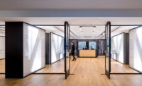
The concept can be seen in pivoting doors, such as the giant one at the entry to the top-floor faculty lounge, as well as windows in seminar rooms, which enhance connections between people and show that philosophy is neither a mute nor self-absorbed pursuit. But porosity is realized most spectacularly in the main stairwell that runs up the southeastern corner of the six-story building. The stair, which hugs a vertical shaft lined with windows on the south elevation, features a 16-gauge-steel banister laser-cut with a seemingly random series of holes and amoeboid shapes. Where the perimeter wall is not original to the building, Holl has installed a faceted wall that has been water-jet-cut with porthole-size incisions. A similar surface, made of ash-veneer ply and more densely punctuated with an array of small dots, backs up to the first wall; it faces interior offices and classroom spaces, which are double-loaded into the remaining L-shaped plan.
The designers say this centerpiece element fosters interaction in the already tightly knit community, with students and faculty skipping the elevator for the stairs and engaging in conversations on its generous landings. Project architect Edward Lalonde also notes that the client “especially appreciates that this feature has found a way to modestly capture a sense of identity.” Indeed, besides serving as the community generator for the department, the stairwell is a kind of billboard for it: SHA sandwiched T5 fluorescent lamps with acrylic, milky-white diffusers between the stair’s main walls, and at night this tall, multifaceted volume can be seen from the street, its openings shining like so many display windows or good ideas.
In many ways, the design of the philosophy-department interior seems to portray, sometimes with a wink, minds at work. On stairwell windows, the architects applied spectral film, a cheap off-the-shelf material, in vertical and horizontal strips; at midday, sunlight streams through the film and casts rainbows (a diversity of opinions?) on the old brick walls and the other windows. Ash benches designed by Holl that sit in the wide hallways of the double-loaded upper floors might evoke miniature landscapes and, by association, the Socratic method of philosophizing outdoors. Holl sees in cast-aluminum coat hooks the dot, dot, dot of ellipses, often signifying the process of getting lost in thought.
That the design’s features permit multiple readings is appropriate for a philosophy department. In fact, Holl explains that the design was originally inspired by the Austrian philosopher and sometime architect Ludwig Wittgenstein and his Remarks on Color. In that book, Wittgenstein extensively explores the multiple properties and experiences of colors, as well as the relationships between them. Holl’s predominant use of white (prismatically containing all colors, and which Wittgenstein found particularly slippery) loads the interior with meaning and encourages flexibility in interpretation. At the same time, all of the project’s apertures and moving elements initiate a social and architectural dynamism that seems just right for a place of mental gymnastics.


