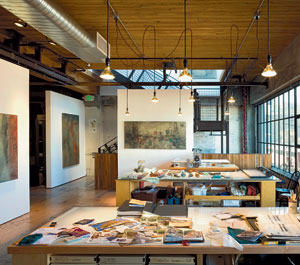
The gray skies of Seattle settle on the moody, chalk-like paintings of renowned artist Catherine Eaton Skinner in her second-floor studio overlooking the city’s Capitol Hill neighborhood. The studio is discreetly tucked into a vast former warehouse, with big northwest-facing apertures framing clouds above and neighborhood bustle below, and the building’s 100-year-old Arensberg Sons sign marching across the facade beneath her window. Although this soaring space alludes to an earlier industrial incarnation, it also features the hallmarks of its designer, Tom Kundig, FAIA, of Olson Sundberg Kundig Allen Architects, whose devotion to detail, integration of reclaimed materials, and affinity for adaptive reuse converge here.

The vision focused on accommodating multiple uses in a space that changes depending on the need. In response, Kundig divided the 3,750-square-foot studio into two bays by mounting 9x9-foot drywall panels that pivot and slide on a steel track; the track runs adjacent to a large, central wood beam, which suggested a natural compartmentalization. Now Skinner can halve the room to exhibit works, or block out daylight to maintain a particular range of light intensity while executing new projects.
The flexibility that Kundig imbues in his designs often involves mobility, specifically partitions that slide or rotate. “A lot of clients ask, ‘Do we get one of those moving thingies?’” Kundig says. “But it’s not something that I want to become a gimmick. It has to work in the space and make sense in the context of the design.” This is especially useful for Skinner, who also is an active art philanthropist and opens her studio to various organizations to hold events and retreats. “The partitions allow us to change the room for whatever is happening here,” she says. “They can be moved and it changes the entire space.” For fundraisers Skinner has opened the space up to accommodate larger crowds and for conferences, she has divided the room to create bays for separate meetings.
A “working wall” constructed of gypsum board runs the length of the east wall in the main studio space, and then pulls away from that brick surface to accommodate a utility room and bathroom. Nine-by-nine-foot sliding gypsum-board partitions at the south end create a storage area for art supplies and archived paintings.
Kundig’s pragmatic approach to Skinner’s program shaped the light plan, too. Simple conical downlights plug into ceiling outlets and hang from their own electrical cords, which loosely dangle from above. The informal design allows Skinner to move the luminaires simply by re-swagging the cords.
PeopleArchitect Principal designer: Project managers: Engineer Associate: Consultant General contractor Photographer
|
ProductsExterior cladding Window steel: Glazing Doors Metal doors: Wood doors: Sliding doors: Hardware Cabinet hardware: Cabinetwork and custom woodwork: Paints and stains: Special surfacing: Floor and wall tile: Furnishings Lighting Down lights: Exterior: Plumbing |


