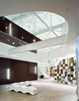
Kanner Studio
Architect Stephen Kanner converts an airplane-parts factory into the new Kanner Studio in Santa Monica
Architects & Firms
Santa Monica, California
Success has been bittersweet for Stephen Kanner, FAIA. Expanding Kanner Architects meant that Kanner, the third-generation principal of the firm, would have to move out of the Los Angeles office where he had worked since joining his father, Charles, in 1982. “It was leaving a place where I grew up. But we needed to grow and communicate better with each other,” says the architect. “And the space we found was so beautiful.” His scheme for the new workplace stresses continuity with the past by highlighting the character of the historic interior—and by reinterpreting some of the best elements of the firm’s former home, too.

The architects at Kanner previously worked in one of the oldest buildings in L.A.’s Westwood section, occupying 5,600 square feet divided evenly among storefront and mezzanine levels. The predominantly white space was “spectacular,” Kanner remembers. Its ceiling, for example, was lined with bowstring trusses the firm uncovered while reinforcing the masonry structure. But the two-story arrangement obliged the designers to run up and down the stairs throughout the day. “That was somewhat inconvenient,” Kanner admits, “and the two ground-floor spaces were separated by a tall bearing wall.” Moreover, the busy Westwood site sat just around the corner from a pair of the city’s largest old theaters, so Hollywood premieres would often hinder access to and from work.
In 2002, several years after his father passed away, a threat of displacement, though ultimately unsubstantiated, forced Kanner to seriously consider a change of address. His mother, an interior designer, happened across a furniture showroom in Santa Monica, and after piquing her son’s interest in the spot, she asked the owner if he was willing to vacate and sublease the space. He was.
The single-story, 1930s building, measuring 100 by 100 feet and featuring a single, curved corner to mark a street intersection, had been an airplane-parts factory, auto-repair shop, and home to several retailers. Except where necessities were layered on, Kanner maintained the openness of the original, hangarlike volume. Visitors and clients cross a threshold bounded by a reception desk and a row of workstations, while beyond it, conference areas and less dense working zones occupy various parts of the cavernous room. Movement among these vignettes is easy and gracious, accurately suggesting the firm’s nonhierarchical organization. When privacy or a video-projection surface is needed, employees can draw any of a series of curtains hung from ceiling tracks to create various zones.
PeopleArchitect Design team General contractor: Photographer:
|
ProductsWorkstations: Four-desk workstation pods: |

