Shanghai
While glittering new high-rises sprout everywhere in Shanghai, gems of Western-style architecture from the early 20th century can still be found throughout the city. Or at least their facades remain; their interiors are another story. 'China is very good at keeping historical things in a superficial way,' explains Lyndon Neri, partner at Shanghai-based Neri&Hu Design and Research Office (NHDRO). 'People want to see prominent buildings that hearken back to the city's Concession era''the time during the 19th and 20th centuries when foreign powers such as Britain and France administered entire districts. 'But there's no semblance of that history inside.
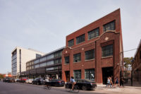
In November, Neri&Hu finished converting a former police building in Shanghai's central Jing'an district into a flagship store for Design Republic, the six-year-old retail venture that Neri and Rossana Hu, his wife and partner, founded to sell high design to an emerging Chinese middle class. Called Design Republic Commune, the project serves as an outlet for furniture and other products by both foreign and Chinese designers, including Neri and Hu themselves. Neri&Hu wanted to make a deeper connection to history here than is typical in Chinese renovation efforts. The original three-story edifice was constructed by the British in the 1910s. Over the course of its life, it served in a number of different capacities, most recently as an elementary school. Each alteration retained the Anglo-inspired facade and the basic floor plan. But after the school was abandoned about three years ago, more than one developer proposed gutting the interior and constructing a high-rise residential tower within the century-old red-brick shell.
As envisioned by Neri&Hu, Design Republic Commune is more than just a face-lift. After cleaning, repointing, and adding structural support to the exterior brickwork, the firm integrated old and new inside the building. Wood lath peeping through a plaster wall was kept as is. A variety of doors and hand-painted signs that were installed during different incarnations were retained too. The architects encased some sections of old walls behind glass like exhibitions in a museum of eroded materials. While the majority of the interior spaces look like white boxes inside a frame of exposed-brick walls, old details and finishes seep through'creating an intriguing layering of novelty and memory.
Exposing decayed materials in renovation work is nothing new. At the Majestic Theater (now the BAM Harvey Theater) in Brooklyn in 1987, Hugh Hardy used a century of paint layers and crumbling walls as key components of his design. But in Shanghai'where re-creation is often valued as highly as renovation'Neri&Hu is a pioneer in this approach. The designers previously applied it to the Waterhouse at South Bund, a 1930s Japanese Army headquarters converted into a successful boutique hotel and restaurant.
The old police station's rotting floorboards and other unrecoverable materials prevented a strict renovation there, as did a dearth of documentation on the original structure. But in any event, the firm was more interested in reinventing the building, since its interiors had been altered so much over the years. In addition to accommodating retail functions, the reconfigured venue works as a 'commune''a design center that Neri&Hu describes as 'a gathering place for designers and design patrons alike to admire, ponder, exchange, learn, and consume.' It includes retail areas, a flower shop, a restaurant, an outdoor terrace, a gallery/event area, and a one-bedroom apartment that Neri plans to use as either a hotel room or a guesthouse. A tiny satellite office for Neri&Hu occupies an attic space.
To accommodate this unusual variety of uses, Neri&Hu opened up the old building with some strategic cuts. 'This project is about the absence of things,' says Neri. 'It's about deletion more than addition.' So his team removed walls from previous renovations to expose the hidden halves of decorative facade columns, and cut doorways between rooms to allow visual and physical connections. Neri says that if it had been up to the retail managers, 'they would have blown the whole space wide open.' But because it retains individual rooms, the layout works like a museum; visitors see 'artwork' by Moooi and Tom Dixon as they tour from one 'gallery' to the next. Neri&Hu had wanted to take out all the floors in a corridor that separates the main facade from a series of boxy rooms inside. When this approach proved cost-prohibitive, the firm removed only portions of the floor at the building's entrances to create a set of dramatic double-height spaces. This allows views from one floor into showrooms above it, and vice versa.
The most significant addition'a single-story glass-enclosed space on the street side'is both new and 'renovated.' To create this element, the designers replaced four shop fronts that had been added to the historic building many years before. At first the government rejected the plan, since the old shops had not been constructed legally, and building in their footprint would also be illegal. But Neri&Hu convinced the authorities that by retaining columns that stood in the shops, they were merely completing a renovation. The transparency of the addition allows the original brick facade to be seen from the street.
Neri&Hu's work in Jing'an is very different from that at another Design Republic outlet, which opened in September in Qingpu, at the western edge of Shanghai. For that project, the firm wrapped a concrete building in a bold floral-print facade. Neri claims that Design Republic Commune is a continuation of ideas first applied at the Waterhouse. In both projects, the architects recognize the value of Shanghai's old foreign building stock and contrast it with the best in contemporary design. Such a strategy echoes the recent development of Shanghai itself, as the city tries to balance its remaining architectural treasures from a century ago with the innovative skyscrapers that have become its new image.
Clare Jacobson is a Shanghai-based design writer and editor whose book New Museums in China will be published this fall.
Completion Date: November 2012
Gross square footage: 25,800 square feet
Design Period: September 2010 – November 2012
Cost: withheld
Client: Shanghai Jinggong (Group)
PeopleClient: Shanghai Jinggong (Group)
Architect:
Design Team:
Guo Peng
Graphic team:
Product team: General contractor: Shanghai Jing’an Construction Company
Photographer (s): Dirk Weiblen |
Products
Exterior cladding
Roofing
Windows
Glazing
Doors
Interior Finishes:
Furnishings:
Lighting: Dimming System or other lighting controls: Schneider
Architectural –materials: Flooring: Oak wooden Flooring, Terrazzo, Concrete, Brick Ceiling: Concrete ,White paint, Existing truss
Architectural – Fixtures & Fittings: Kitchen (Bulthaup)
Decorative Lighting, Specified:
Interiors – Furniture, Specified:
Interiors – Accessories: Interiors – Carpet: Nanimarquina |


