Stanford, California
It’s tempting for designers to try to turn art museums into works of art themselves. But what if the client’s directive is just the opposite? A new campus museum in the Bay Area by the New York–based firm Ennead Architects may disappoint those hoping for a bigger architectural statement. However, as designed to house the 121 works of the Anderson Collection, a choice selection of postwar American art recently given to Stanford University, the 33,500-square-foot building does a good job at hiding in plain sight and allowing the art to command the attention.
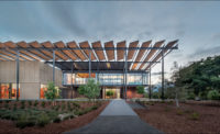
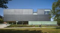
Ennead's first commission at Stanford, more than 15 years ago, was a self-effacing addition to the neighboring Cantor Arts Center, a heavy Greek Revival building. Just 40 feet away from the Cantor and its imposing Ionic columns, the Anderson Collection, by comparison, keeps a low profile. The building appears as three simple horizontal bars. The central volume, a neutral tan box, is cantilevered over a glazed ground level and topped with a small row of clerestory windows. “The massing is sympathetic to the site, and the larger second-story volume creates a covered walkway that is a modern interpretation of the campus' traditional pedestrian arcade,” says Olcott. In plan, the building has a subtle bow-tie shape.
The cladding kicks the impact of the unassuming form up a notch. Inspired by the strong California sun, the architects used folded glass-fiber-reinforced concrete (GFRC) to create an articulated surface whose shadows change during the course of the day. Looking like shingles installed horizontally, the panels have an appealing randomness.
Ennead interrupted the facade with bands of windows recessed into each side of the middle volume. Framed by zinc panels intended to play off the neighboring museum's black mullions, they help to break up the building's massing. But, unfortunately, interspersed with the windows above the main entry, the panels make it look almost as if it's boarded up.
By contrast, the interiors are open and inviting. The double-height entry is expansive and bright, thanks to a gently convex ceiling that reaches upwards to the clerestory windows around the perimeter. A grand staircase with deep treads subtly tapers up to the galleries. All the mundane functions—the lobby, administrative offices, a resource center, and bathrooms—are on the ground floor, saving the upper floor for just enjoying art.
The wall along the stair continues beyond floor level to form a balustrade for the second-floor galleries and is covered with a gray finish, to add a quiet variation to the otherwise white space. The museum director purposely kept the stairwell free of any artwork, allowing the anticipation to build as you ascend. It's rewarded by a 9-by-12-foot painting by Clyfford Still at the top. (The Andersons wanted to squeeze it into their home, but Olcott says, the house was already “jam-packed” and didn't have a wall big enough to fit it.) Upstairs, there is no designated circulation route, allowing visitors to wander and follow what catches their interest. From various points, you can see across the double-height space and catch glimpses of works in other galleries. The large canvases by artists such as Mark Rothko, Jackson Pollock, and Richard Diebenkorn have plenty of room to breathe, but the galleries themselves are modestly sized and intimate.
The free-flowing interiors have a casual quality that is heightened by the daylighting. Obviously, none of the paintings at the Anderson Collection are exposed to direct sunlight: most of the light enters high overhead through the clerestories, which modulate the sun through mechanical louvers and frosted plexiglass. The arc of the ceiling is calibrated to bounce light down into the galleries. It is lowest at the top of the stairs (13 feet) and goes up to 23 feet at the sides, making room for the 7-foot-tall row of windows. Outside, a flat white roof reflects additional light onto the bowed surface.
Olcott and his team visited the Andersons' home as part of the design process. “We were in the dining room, which was filled with fantastic art,” he recalls, “and Hunk said to us, 'This is a room where you can have a feast without having a meal.' ” Currently under construction next door is yet another art building, the McMurtry Center, which Diller + Scofidio + Renfro designed with dramatic twisting wings. Between that piquant project and the heavy Greek Revival meal next door, the comparatively neutral Anderson Collection will undoubtedly serve as a palate cleanser.
People
Owner:
Architect:
Personnel in architect's firm who should receive special credit:
Engineer(s):
Mechanical/Plumbing
Geotechnical
Civil
Electrical
Consultant(s):
Lighting:
Sustainability
Curtain Wall
Fire Protection
Signage
Life Safety
Elevator
Acoustical:
Specifications
Construction Manager:
Photographer(s):
CAD system, project management, or other software used: Size: 33,500 square feet Project cost: $36 million Completion date: September 2014 |
Products
Structural system
Exterior cladding
Metal Panels:
Stucco:
Moisture barrier:
Roofing
Glazing
Doors
Metal doors:
Fire-control doors, security grilles:
Hardware
Closers:
Exit devices:
Pulls:
Security devices:
Interior finishes
Suspension ceiling grid at Resource Center and Administrative Suites:
Cabinetwork and custom woodwork in Resource Center and Administrative Suites:
Paints and stains:
Wall finishes:
Floor and wall tile:
Carpet:
Furnishings
Reception furniture:
Office furniture:
Chairs:
Tables:
Lighting
Downlights:
Ambient Light:
Emergency Lighting:
Exterior:
Dimming System or other lighting controls:
Motorized window shades & motorized clerestory blinds:
Conveyance
Plumbing |


