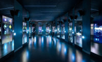
This month, a new addition opens. Though connected to the earlier constructions, it is as different from them as they were from each other. 'We wanted our building to be a quiet voice in that ensemble,' explains Thomas Phifer, architect of the new 100,000-square-foot Contemporary Art + Design Wing. Taking a reductivist approach, Phifer was inspired by the vitrines that typically house museum objects, which led to an extreme decision for a complex building type: his museum, like those display cases, would employ a single layer of glass to encase the 26,000-square-foot, one-story gallery and lower-level offices. (The new wing also links to a historic factory building renovated to contain a 500-seat facility for glassblowing demonstrations.)
The result is a pristine, frosty-white glass box with a visual simplicity that belies its underlying complexity. Thomas Phifer and Partners worked with structural engineers Guy Nordenson and Associates to create hefty but sinuous interior walls that take on much of the structural duty and house mechanical equipment, allowing the glass-clad exterior walls to be designed as a light steel frame. The 20-foot-tall cast-in-place curving concrete walls are topped by 3'-inch-wide and 4-foot-deep precast-concrete beams. Spaced 3 feet, 2' inches apart, the slender beams direct daylight from the skylight-covered roof to the floor, where the large contemporary glass works'which, unlike many types of art, are unharmed by sunlight'will sit.
The real innovation, however, happens at the facade itself, where the glass transitions from rainscreen to window'a highly unusual design that maximizes the glass size and creates a skin with very few joints.
The facade's 10'-foot-wide glass panels, on average 19 feet, 8 inches tall, are stacked three high, each one supporting the one above it and transferring dead loads to the foundation. The 140 panels were fabricated in Germany by Thiele Glas. German facade contractor MBM Konstruktionen coordinated their assembly at Thiele's factory, affixing aluminum supports to the back of the glass with structural silicone. These coat-hook-type elements fasten onto U-channels mounted on the building's exterior sheathing, facilitating installation.
Most of the perimeter walls that visitors will experience from within the gallery comprise an interior stud wall, the building frame, a rainscreen cavity, and the glass cladding, for a typical depth of 3 feet, 11 inches. But select zones consist of just 1-inch-thick low-iron glass, without vertical mullions, to provide views. These include the 'porch,' a display area along the building's northern edge with a 144-foot-long window that overlooks Corning's campus. Another large window, on the east elevation, has glass panels that are 24 feet, 4 inches tall. The PVB interlayer between the two '-inch-thick sheets of fully tempered, laminated glass features an opaque white color where it passes in front of the cavity wall. Where it is used as vision glass, it is covered by a white dot-frit pattern.
That transition, where the weatherproof enclosure goes from a nearly 4-foot-thick insulated wall to a 1-inch-thick piece of glass, required an inventive detail. To keep water out at the windows, the silicone membrane wraps the mullion at the head, sill, and jambs, and is clamped and sealed to the window perimeter. 'It sounds like a typical waterproofing detail, but it's used in a unique way because we have to drain all the water out between the joints of the glass,' says Jessica Young, a senior associate at facade consultant Heintges & Associates.
Draining water, especially from melting snow, was also a concern on the roof. But this was achieved with a series of gables, each designed as a three-hinged arch, with gutters at each trough, concealed behind a fairly traditional parapet that extends past the skylights. The skylights feature insulated glass panels'some transparent, some acid-etched for translucency'made domestically by Viracon, and a number of opaque white metal panels, that combined allow up to 450 footcandles of light inside the gallery on a sunny day.
Phifer's minimal environment offers few distractions. 'If you have a detail that shouts more than the works themselves, you've done a disservice to the works,' he says. 'Here, the poetry of the light, the systems, and the structure are all wound up together."

To earn one AIA learning unit (LU), including one hour of health, safety, and welfare (HSW) credit, read each of the articles below, and complete the test online. Upon passing, you will receive a certificate of completion and your credit will automatically be reported to the AIA. Find additional information regarding credit-reporting and continuing-education requirements at ce.construction.com, under “requirements.”
Innovations In Glass
- Straight Story On Curves
- Thick-Skinned
- Bigger, Flatter, Clearer
- Dynamic Glass
- The Future Is Crystal Clear
Learning Objectives
- Discuss glass manufacturing processes as well as fabrication options and limitations that architects should take into account while designing glazed building skins.
- Define terms relevant to glass and glazing selection, such as VLT, U-value, and solar heat gain coefficient.
- Discuss how architects like SANAA and Foster + Partners have overcome the detailing challenges presented by curved glass.
- Describe how technologies such as electrochromic glazing and double skins work to improve energy efficiency.
AIA/CES Course K1503A
Take the Continuing Education Test


