Beyond Cubed


Changes in office design give new meaning to “open plan.”
Speed, spontaneous interaction, flexibility, and collaboration describe the brief for office design today, where the “open plan” reigns. Fueled by the success of start-up tech offices, and with them media and advertising companies, casual workspace that can jolt users into fast thinking and faster acting is prompting the more sedate businesses—such as financial and law offices—to try out new kinds of flexible settings.
Open office design, as Nikil Saval points out in his lively book Cubed: A Secret History of the Workplace (Doubleday, 2014), has been around for at least four decades. While you could argue that even before that, clerks, reporters, and architects performed their tasks in rooms without walls, the notion of its being a design solution arrived much later. With the growth of middle management in the post–World War II period, the pressures of real estate induced corporate America—and its architects and designers—to try something different. Influenced by Germany's Burolandschaft (office landscape), with its open, organically arranged, and non-hierarchical layout, or Herman Miller’s Action Office I and II workstations designed by Robert Probst in the 1960s, the modern office began to take shape. Action Office II, based on three panels that could be flexibly positioned at obtuse angles, became wildly influential—but not in the way conceived by Probst. Instead, a watered-down version—fabric-covered cubicles with partitions at 90-degree angles—arranged according to a grid, was adopted. It filled the bill economically. As Frank Duffy, a British architect and expert on office planning, who has studied and worked in the U.S., notes, open planning never really caught on in Germany and Scandinavia, where work councils had formed to ensure employees have control over their environment.
Ironically, now, in the U.S., the cubicle appears to be near extinction. It has largely been supplanted by partition-free desks or long tables referred to as “benching.” It saves space and money, and arguably fits into the dynamic of changing modes of work. As STUDIOS Architecture principal and CEO Todd diGarmo points out, benching—the kind he designed for Bloomberg’s New York office—took a while to catch on. It did so, he says, “because the cubicle was expensive and needed to be upgraded with changes in technology.” The digital start-up world of Silicon Valley, diGarmo says, “doesn’t have time for this, or for hierarchy.” Benching can lead to striking interiors: in one recent example, the offices of the Barbarian Group, an interactive marketing agency with headquarters in New York, enlisted Clive Wilkinson Architects from Los Angeles to create a 1,100-foot-long (!) serpentine table that swirls around the office, swooping up here and there to create arched portals and to shelter conference areas.
A gamut of architectural features provide alternative spaces as backups to benching. In many media and design companies, the enclosed conference room has given way to glassed-in project meeting areas to encourage teamwork, add transparency, and admit more daylight. If each person’s space at a long table only extends 4 to 5 feet, the individual bench area is counterbalanced by “huddle” areas where three to four people can get together, in addition to “pods” for even smaller meetings. To foster spontaneous interaction and movement, stairs of expansive width connect two or three floors internally, such as the sculptural fiberglass one at the Intercontinental Exchange (ICE) in Manhattan conceived by STUDIOS. In some cases, the stairs take the form of bleachers, providing convenient places to sit and chat or hear group presentations as well as get from one level to another. Kitchens and quick meeting/café areas abound, and the corporate kindergarten amenities that Silicon Valley made so popular in the past (Ping-Pong tables or basketball courts) can still be found.
But does this panoply of clubhouse features get in the way of actually . . . working? An active, open office might generate excitement and foment creative sparks, but surveys, studies, and anecdotal evidence reveal that too much fun can bring with it noise, chaos, and distraction. Over the last decade, complaints of lowered concentration and productivity constantly flood the internet. The Center for the Built Environment at the University of California, Berkeley, reported in 2007 that acoustical conditions were a leading source of dissatisfaction among employees: in one study of seven office buildings, as many as 72 percent of the respondents registered discomfort with speech privacy—that is, overhearing others, or being overheard. A poll of 2,060 by Harris Interactive on behalf of Ask.com in March 2013 reported that 61 percent of the employees in the U.S. found noise from colleagues to be the major office distraction affecting productivity. (Full disclosure: this writer is preparing this article wearing a headset in a vintage “cubicle.”)
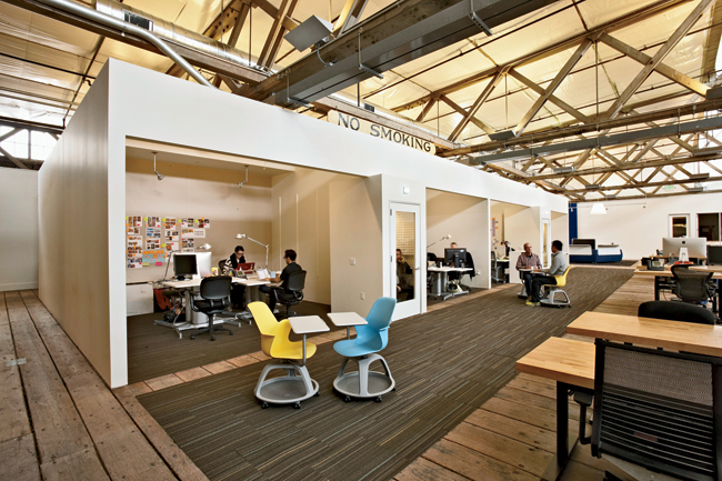
Says Douglas Burnham of Envelope Architecture+Design in Berkeley, “Some people don’t like the open plan because you can’t get anything done.” While his architectural office employs it (as do most design studios), the firm included assorted spaces for privacy as it grew and renovated. Clive Wilkinson, who designed Google’s offices Mountain View, California, in 2005, says that his firm has been addressing the backlash to too much open space “by providing a greater variety of options, like phone booths and study carrels.” For the San Francisco office of IDEO, the design-strategy firm, Jensen Architects placed white rectilinear structures on its loftlike floors to contain a row of rooms for conferences and pinup sessions, as well as acoustically sealed telephone booths.
To counter the complaints about noise and distraction and generally improve upon unenclosed environments, other architects and interior designers are systematically exploring strategies to ameliorate open plans on their own turf. Robin Klehr Avia, chair of Gensler, notes that her firm has devoted a floor of its New York offices to experimental, changeable areas, where they can test out various ideas. The firm hopes to apply its findings to its design of interiors for such companies as Condé Nast, which is moving to New York’s One World Trade Center this fall, or for Time Warner, the television, film, and entertainment company, when it eventually takes up residence in the Hudson Yards development in west Midtown.
Yet design advisors need to face certain realities. “Many say that an open-plan environment is unconditionally better than one with private offices,” observes Janet Rankin, the director of Washington, D.C.–based Lehman Smith McLeish (LSM), which has just completed the interiors for Brookfield Office Properties Headquarters, a real estate firm at Brookfield Place, formerly the World Financial Center in New York. “But you have to think about what people really need to do their jobs,” she warns. “It’s not a one-size-fits-all.” Ron Fiegenschuh, a partner in LSM, adds, “The program and the solution must jibe.”
Among those who need to be sounded out are lawyers and financial executives—legendary for wanting to hold onto their enclosed spaces. However, some are thinking differently about the actual sizes and configurations of the layout: Lauren Rottet, of Rottet Studio, says that one of her clients, the Houston law firm of Seyfarth Shaw, wanted a light-filled work environment, without the hierarchy of the perimeter rooms. So Rottet pulled the offices away from the glass wall, creating “verandas” with views of the city, and added a variety of team conference areas. By tinkering with the layout, “We were able to allow a 25 percent increase in [the number of] employees for the original floor plan while keeping the offices the same size,” she says.
Other firms, such as American Express or Unilever, are trying out “mobility” programs, where seats (and desks) are not necessarily assigned, says Joan Blumenthal, interior design director of Perkins + Will in New York. Often, as part of this mobility, only about 80 seats are available for every 100 people, based on whether members of a group spend much of their time elsewhere.
As a variant of such mobility, “co-working” venues strike many as the most flexible solution available—at least for small businesses. In New York, NeueHouse, founded by Joshua Abram and Alan Murray and designed by David Rockwell with NeueHouse Studio in 2013, has proved successful enough that the group plans to open another one in Los Angeles in 2015. NeueHouse, like many other co-working establishments (numbering about 800 in the U.S. at the moment) is membership-based, with subscription fees for the different types of spaces: a lounge-like main-floor “gallery” with library and café, where you can drop in and work on your laptop; and—on floors above—“studios,” glass-enclosed rooms with open tables for a handful or more people, or “ateliers,” totally in the open, for which you have an assigned desk. To address sound control, architect Anthony Fieldman, a former occupant whose firm, Raft, outgrew the space, is advising NeueHouse on modifications, such as inserting more acoustical materials into the studios or increasing the thickness of glass. As Duffy points out, the co-working space offers the same rubbing-shoulders benefit of 18th-century gentlemen’s clubs in England, with its similar membership admission and fee arrangement. The past still guides the future.
The only problem with the whole spate of imaginative solutions to make the open office appealing and productive is money. Telephone booths, pods, huddle rooms, project spaces, bleachers, even large enclosed sofas for small spontaneous conversations, all add costs that go beyond the benching desks. Innovative tech firms with geyser-like cash flows need not worry. But will the typical corporate firm buy into all the extras? In years to come, we may well be looking at the cube—reviled for its lousy acoustics and its uniformity, but endowed with its own storage bins, shelves, counters, and a smidgen of visual privacy—as an object of nostalgia and longing.


