Turn the clock back to 1999 and you find Zaha Hadid and her partner Patrik Schumacher working on a critical set of projects, four of which (including MAXXI) eventually got built and two that never moved off the page or computer screen.
Many museum buildings have incorporated systems that allow daylight to illuminate their galleries, but none as robustly as MAXXI, where almost every roof surface is glazed. To support such a roof above the museum’s winding galleries, whose bays average 40 feet wide, reinforced-concrete walls on either side sandwich a series of trusses. While these trusses run parallel to the gallery walls, transversal steel beams connect the walls. Originally conceived as a precast-concrete element, each of these longitudinal sections, typically six per bay, is composed of a steel truss encased in 1⁄2-inch-thick fiberglass-reinforced concrete panels. The nearly 8-foot-deep assembly, which rises
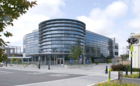
Client: Roosevelt Warm Springs Institute for Rehabilitation & GFSIC Completion Date: September 2008 Program: A new two-story, 33,500-square-foot rehabilitation center that consolidates outpatient services, which had been scattered among existing buildings on the institute's campus. The gym and lobby span both levels; the first floor includes a diabetic foot clinic and a physicians' clinic. The second floor houses a seating and mobility clinic, a rehab technology office, a wheelchair shop, and an orthotics and prosthetics clinic and fabrication workshop. Design Concept and Solution: Charged with building a new gateway to the campus, the architects wanted the design to echo the
Health-care facilities typically use isolation as a strategy for dealing with infection control, creating buildings that work as sets of departments closed off from one another.
NewYork-Presbyterian Hospital’s dense web of mostly older buildings at its 20-acre campus in Upper Manhattan is not unusual for medical complexes constructed over many decades.
Client: Northwest Community Healthcare Completion Date: May 2010 Program: An eight-story, 225,000-square-foot addition to the hospital, with an 11,000-square-foot lobby, an emergency department, intensive care, private patient rooms, and medical/surgical and perinatal units. Design Concept and Solution: The architects sought to enhance both the safety and privacy of patients while standardizing rooms for ease of care. The triangular form of the tower—whose sharp tip stands in counterpoint to the hospital's International Style campus—shortens travel distances for staff. To boost efficiency and flexibility, each room is a standard size, with a consistent layout, and is equipped to serve intensive-care patients and
Zimmer Gunsul Frasca Architects' hospital and medical office building avoids an institutional look through natural materials and evidence-based design.
In designing St. Anthony, a privately funded hospital in the wooded area outside Seattle, the architects at Zimmer Gunsul Frasca (ZGF) asked themselves, “What would you want to see in a five-star hotel?” says ZGF interior designer, Anita Rossen.