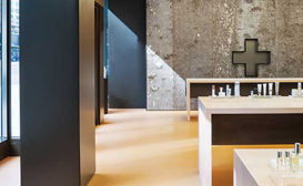
Surface Tension: A progression of materials from rough poplar bark to smooth bronze panels takes clients through a storefront shop to the inner sanctum of a dermatologist and a plastic surgeon.
Beauty may be skin-deep, but David Jameson's design for the offices of a dermatologist and a plastic surgeon reaches beneath the surface, peeling back layers of intrigue. Inspired by the structure of a tree'with its rough bark on the outside and smoother rings closer to the core' the Washington, D.C.'based architect organized the 3,770-square-foot facility as a progression of spaces wrapped in increasingly refined materials.
The art of selling: A renowned publisher curates the design of his imprint's first Milanese bookshop, creating an intimate salon that celebrates style.
Benedikt Taschen loves design. Though the German publisher is sometimes better known for 'sexy' books'as some of his titles are cheekily referred to'he is the force behind scores of monographs on the world's most famous architects and fashion designers, and gorgeous limited editions on everyone from artist Ai Weiwei to James Bond.
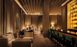
Buzz generator: The Manhattan base for a global brand reflects its youthful vibe with a pair of dynamic environments animated by bursts of color and light.
The energy-drink company Red Bull (RB) tends to engage the public in unconventional ways. As it plunges into adventurous youth culture—extreme sports, high-risk aviation feats, edgy art and music—it’s never just paying to affix its logo to a Formula 1 racecar or a radical skydive.
In San Francisco, the latest tech office has the cultural prominence a lavish restaurant or fancy boutique would elsewhere. As the battle to entice technical talent continues, designers strive to outdo the competition with their imaginative environments.
Erich Mendelsohn's Schocken Department Store in Chemnitz, completed in 1930, is well known to architects worldwide. Yet encountering the recently renovated early-20th-century landmark will be a revelation, even for those familiar with it.
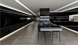
A striking mix of glossy black walls and white light, the Vegamar Selección, a wine boutique on an exclusive shopping street in Valencia, Spain, was given the black-tie treatment by architect Fran Silvestre and interior designer Andrés Alfaro Hofmann to meet the client's ambition to achieve an image of sophistication and quality.