Dutchess County Residence, Main House by Allied Works
Dutchess County, New York


Architects & Firms
“What if the architecture became a black hole?” pondered artist Doug Aitken after he was invited to plan a permanent installation for a collector’s rural property in upstate New York. “What if the house became a place where time could speed up and slow down?”
For a little more than a year, Aitken shot video of the hills, meadows, and woods around the site—as well as a sunrise or two—while the house, by Brad Cloepfil and his firm, Allied Works, was still in the design phase. He edited the scenes into a season-scrambling montage: a lingering shot of grasses in summer, a close-up of an autumn leaf, snow-covered branches, and so on in a long, continuous loop. Then he worked with the architect to project the work onto the completed house, wrapping its exterior.
Additional Content:
Jump to credits & specifications
The effect erases all but the abstract geometry of the architecture, replacing the house with glowing impressions of the landscape that have their own sense of time. “I love the idea of being there in winter, and on the structure there’s an image of a snowbank, but then suddenly, it accelerates into an Indian summer,” says Aitken.
Cloepfil’s architecture can appear equally mercurial. The project began with a 400-acre estate owned by a couple with a large art collection. Allied Works designed an “art barn” for the property to house rotating exhibitions of work from their collection, and then a guesthouse tucked into the woods. For the main house, the firm chose a site on a hill at the head of a meadow with panoramic views of the landscape and, to the west, the Catskill Mountains.
The 6,200-square-foot house is a two-story steel structure with a basement. Its two angular volumes stack on top of one another to create a squared-off figure eight—or as the firm describes it, an “orthogonal helix”—that wraps around two light wells. The form is simple, but difficult to read in its entirety from any one sight line, giving it a dynamic, shifting appearance as you move around it. “I’ve always thought about the house as a knot binding itself together with the landscape,” says Cloepfil. The structure also ties together the project’s sometimes conflicting purposes: to show the art collection—and, in the case of the Aitken work, be the art—while providing a comfortable weekend house with great views of the countryside. It’s a first-world problem par excellence, but one that the designers solved deftly.
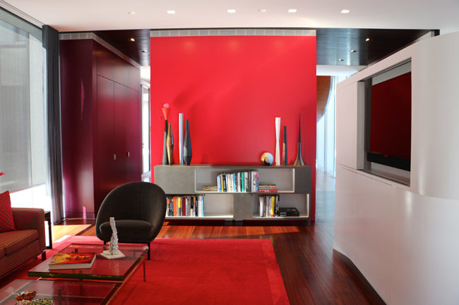
Every room contains objects from the owners’ collection and reflects their distinct but wide-ranging taste. To accommodate large-scale work, the designers placed double-height spaces—a family room, living room, and foyer—at the points where the second floor crosses over the first. At the center of the house, a formal entry opens onto a slender stair—made from wood and reflective stainless steel—that curves in counterpoint to the building’s angular form. Upstairs, a work by Mel Bochner is integrated into the glazing around one of the light wells. Strings of sequential numbers rubbed into translucent glass panes, To Count: Intransitive, 2011, is a permanent version of a performance work originally done with soapy windows. To support all of the art on view in the house, a 24-inch-high utility space between its two stories contains the electrical, climate control, and security systems needed to meet conservation—and insurance—standards.
But the house doesn’t feel like a museum. Allied Works balanced the drama of the open spaces with a restrained, domestic scale. Downstairs, a lower-ceilinged kitchen, dining room, and library slip in between the double-height spaces. Circulation flows around smaller, rectangular volumes set between rooms. They contain ancillary spaces—for bathrooms, a fireplace, storage, electrical and mechanical systems—and provide moments of compression that allow the interiors to feel open but not vast.
The three bedrooms upstairs are modest in size by the standards of a big-budget country home—the scale is more apartment than manse—though the house is appointed with a furniture collection to rival the art (Allied Works designed the beds and a dining room table). The bedrooms cantilever 40 feet over an entry court on one side and an outdoor living room with views of the mountains on the other. Michael van Valkenburgh Associates, the landscape architect for the estate, selected graphic, heavily veined marble slabs for the patios and pool deck, but the size and siting of the outdoor spaces keep the hefty material from appearing too severe.
During the design process, the tension between the collection and the architecture was most pronounced when it came to the facade, with the client asking for more wall space and Cloepfil advocating for glazing to maximize views. The compromise they found gave the building a distinctive skin. The entire house is covered in glass panels. Some are back-painted, to conceal structural bracing that supports the cantilevers and to provide interior walls for hanging art. Other panes are etched with vertical stripes. And, at key points, the glass is transparent to open commanding perspectives on the landscape.
The facade reflects the countryside and the sky on every side, contributing to the house’s slippery, mirage-like profile. Its illusory aspect is heightened when the sun goes down, and the Aitken projections turn on, overwriting the form almost completely. “The natural light and what it does to the house goes away, and this other light comes up,” says Cloepfil. “The house has this whole other conversation with the landscape.”
This is not the first country house to orchestrate its own vanishing—Philip Johnson’s Connecticut home comes to mind. But if the Glass House took Modernist transparency to its fetishistic conclusion, the Dutchess County House updates the impulse to disappear for a digital culture. Less of a transparent box, it is an iPhone screen—a magic piece of glass with a tangible material presence that also creates the illusion of expansiveness with its capacity to display seemingly boundless imagery. The house provides both architect and artist with a device for presenting their distinct responses to the site using the same glossy surface. It also gives the clients a surprisingly cozy place to spend time with the landscape—and their art.
CLOSE-UP: Lighting the Lighthouse
Doug Aitken tailored his work Lighthouse, 2007, to the geometry of the Dutchess County Residence. After projection tests with the glazing selected by Allied Works and the homeowners, the artist collaborated with the firm to position 17 custom-calibrated projectors around the site, each enclosed in a doghouse-size stainless-steel shed designed by the architects. Blackout shades lower to create near-uniform conditions on the facade, while a large portion of a basement-level electronics room is dedicated to the system that runs the piece. According to the clients, its performance can be spotty, but, they add, managing the complex technical requirements and maintenance is just part of owning an ambitious work, and the effect is well worth the effort. For Aitken, it marks a departure from his public architectural installations. Unlike his large-scale work for urban museum facades (including one at the Seattle Art Museum, also designed by Allied Works), Lighthouse is visible only to the owners and invited guests who make the pilgrimage to see it. “It’s a strangely hallucinogenic space that’s out there in the landscape like an earthwork,” says Aitken.
 |
 |
 |
| Photos: Jason Schmidt/' Allied Works Architecture (top); Brian Doyle / courtesy 303 Gallery, Galerie Eva Presenhuber, Victoria Miro Gallery, Regen Projects (above and middle) |
Size: 6,200 square feet
Cost: withheld
Completion date: 2012
PeopleArchitect: Allied Works Architecture Personnel in architect's firm who should receive special credit: Brad Cloepfil, RA ' Design Principal
Architect of record: Allied Works Architecture
Interior designer: Lisa Frazar, Studio Frazar
Landscape Architect: Michael van Valkenburgh & Associates
Engineer(s): Robert Silman Associates (structural)
Consultant(s): Lighting: George Sexton & Associates Acoustical: Jaffe Holden Other: Audio Video Systems (a/v consultant) Doug Aitken, Light-house
General contractor: Berkshire Wilton Partners
Photographer(s): Jeremy Bittermann |
ProductsStructural system Wood frame construction
Exterior cladding Moisture barrier: Curtain wall: Roofing Other:
Doors Upswinging doors, other:
Interior finishes Paints and stains: |


