Glass/Wood House by Kengo Kuma and Associates
New Canaan, Connecticut


Architects & Firms
Few architectural design problems are as tricky as adding to a building that is rigorously symmetrical. If not sensitively conceived and carefully executed, an expansion can compromise the integrity and compositional balance of the original. But such was the challenge faced by Tokyo-based Kengo Kuma for his first commission in the United States: a new wing for an almost templelike mid-century Modern house in New Canaan, Connecticut.
Additional Content:
Jump to credits & specifications
The house's original owner and designer was John Black Lee, an architect affiliated with the so-called Harvard Five ' a group of architects that included Philip Johnson and Marcel Breuer who began settling in New Canaan starting around 1940, transforming the town into a hotbed of Modernism. Lee's axially symmetrical, one-story structure, completed in 1956 and published in RECORD as part of a collection of rectangular houses [November 1957, pages 152'156], featured a large open space, about 30 feet square, which contained a central fireplace, a living room, and a compact island kitchen. This main room had a perimeter clerestory and two all-glass exterior walls, on the north and south, providing views of the wooded 2-acre property. Bedrooms, two each on the east and west, flanked the main space, with a veranda and a generous overhanging roof surrounding the house on all four sides.
The current owners, a finance executive and a lighting designer, bought the property from Lee in 1990. Soon afterwards they commissioned New York City'based Toshiko Mori to renovate the house. Mori, who has since renovated or added onto several buildings by some of Modernism's giants, made subtle but significant alterations that included raising the central roof by about 18 inches, thereby enlarging the clerestory, and replacing deteriorated wood columns with stainless steel. The changes helped make the already elegant structure seem even more delicate and graceful. Even Lee, who now lives in another house he designed a few miles away, approves. 'It was one of the most sensitive remodelings in New Canaan,' he says.
Then in 2004, the couple, who by this time had a son and a daughter, transformed the unfinished basement into a family room with the help of another New York firm, Thomas Phifer and Partners, known for ethereal and impeccably detailed structures. The space had previously been accessible only from a hatch near the front door, but Phifer designed an interior stair protected by a minimal glass balustrade for the house's southwest corner, in what had been one of the four bedrooms.
The couple had already started thinking about further expanding their living space when a tree crashed through the roof during a January 2006 storm, providing the impetus for another renovation, as well as for an addition containing a master bedroom, a more spacious kitchen, and a formal dining area. After extensive research, they approached Kuma because they liked the delicacy of his structures and found his buildings sympathetic to their surroundings. 'He has a light touch,' says the wife.
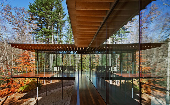
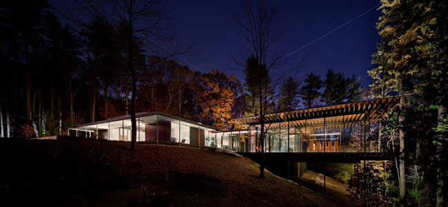
Kuma designed a transparent, L-shaped addition that sits just to the west of the original. The interior is almost entirely open, with very few walls. Instead, stainless steel mesh screens differentiate circulation space from other parts of the program. The structure is composed of steel columns only 3 inches wide and 6 inches deep, with equally minimal steel beams, and a roof supported by exposed glue-laminated spruce joists.
The project also entailed modifications to the existing house, such as the replacement of one section of solid exterior wall near the addition with glass, in order to provide more of a visual connection between new and old structures. As part of the renovation work, Lee's kitchen, which had been just inside the entrance, was removed, making the entire central zone of the older structure into an airy space for welcoming guests, like the genkan, or entryway, in a Japanese house, explains Kuma.
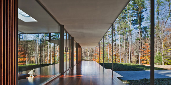
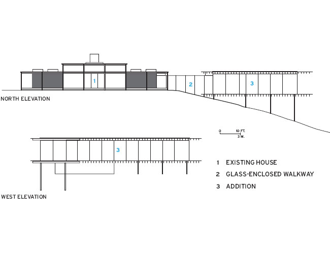
The expansion, like its mid-century neighbor, has an encompassing veranda, as well as a sheltering canopy at the same elevation of that on the original. However, the tectonic reality of these similar elements is very different. While Lee placed vertical structural components at the edges of his veranda, Kuma pulled them to the interior, behind a smooth skin of insulated, low-emissivity glazing. Although Lee concealed the roof structure behind a fascia and a drywall ceiling, Kuma's joists are left exposed with the plywood sheathing on top of them tapering to a projecting, paper-thin edge. And while Lee's pavilion is elevated just above a mostly level ground plane, Kuma's expansion is supported on attenuated columns over a steeply sloping section of the site. The newer piece feels almost like a treehouse, especially at the western end of the dining room, where the floor is 17 feet above grade.
In response to the sticky problem of joining these distinct but sympathetic expressions, Kuma created an 18-foot-long glass-enclosed walkway that gently steps down about 4 feet, following the terrain. The roof of this passageway appears to have been slipped under the canopies surrounding both new and old buildings, creating the impression that the two could be disconnected if some future owner so desired.
Although the existing and new structures have been carefully linked, Lee wishes the connection had been made without piercing the skin of the original. Even so, he says he likes the addition, especially the way it relates to the site. 'It's nicely installed in the landscape,' he observes.
And that is precisely the effect that Kuma was after. The goal of the descent from old to new, for example, 'was to create the sense of being fused with nature,' says the Japanese architect.
Even though Lee might find reason to quibble, the expansion shows a respect not only for the natural surroundings, but also for the existing built environment. It provides a new vantage point ' one lifted off the sloping terrain ' for viewing and appreciating the clarity and simplicity of the older structure. And while Kuma doesn't slavishly mimic Lee's language, the addition is clearly the product of keen observation, as well as thoughtful reinterpretation, of the piece built more than a half century earlier.
Gross square footage: Existing: 3,820 square feet, Addition 3,800 square feet, 7,620 square feet total
Completion date: June 2010
CreditsArchitect: Kengo Kuma & Associates Personnel in architect's firm who should receive special credit:
Architect of record: Gregory T. Waugh, AIA + Kazuki Katsuno
Lighting Design: Susan Leaming, Architectural lx
Engineer(s): Structural Engineer: Mechanical Engineer:
General contractor: Renovation to existing: Prutting & Company Custom Builders, LLC Addition: The Deluca Construction Company
Photographer(s): Scott Frances
|
SpecificationsStructural system Existing: Wood frame, Stainless steel columns Addition: Steel frame, Wood joists
[Renovation to Existing] Stainless framed glass; ipe louvers Roofing Five-ply coal tar pitch dressed with river gravel; lead-coated copper gravel stops Windows Custom stainless steel frame Glazing: Oldcastle BuildingEnvelope Skylights: Wasco Doors Entrances: Custom made stainless steel frame glass doors Wood doors: Custom made Hardware Closers and pivots: Rixon Interior finishes Ceiling: Plaster Chimney: Silver leaf Floor (interior and exterior:) Tongue and groove ipe Furnishings Lounge chairs, bench, folding stools, low tables: Poul Kjaerholm, Fritz Hansen Sofa: Moroso, Lowland, Signorello of Westport Sofa upholstery: Loro Piana Lighting Uplight: Custom Susan Leaming Downlight: Lighting Collaborative Task: Ingo Maurer Exterior: PSM Lighting [Addition] Metal/glass curtain wall: Custom glass curtain wall (Suntech of Connecticut, Inc.) Roofing Sarnafil Glazing Glass: Viracon Skylights: Wasco Exterior Cable Railing: Kueka Studios, Inc. Doors Entrances: Custom stainless steel frame glass door (Suntech of Connecticut, Inc.) Wood doors: Custom maple doors Closers and pivots: Dorma Pulls: Custom stainless steel Hinges: Sugatsune Levers and locks: D Line Interior finishes Floor (interior and exterior:) Tongue and groove ipe Kitchen and bath floor, bath wall, kitchen and bath counter top: Janegray sandstone, Vermont Structural Slate Exposed joists: Black Spruce, Nordic Cabinetwork and custom woodwork: Clifton A. Nelson Furnishings Dining chairs: Custom Ian Kirby Dining table: Doge by Carlo Scarpa, Signorello of Westport Informal dining chairs: Poul Kjaerholm, Fritz Hansen Lighting Uplight: Custom Susan Leaming and Satoshi Sano, fabricated by USA Illumination Dining: Custom suspension fixture, Susan Leaming and Satoshi Sano, fabricated by Catellani and Smith Downlight: Wever & Ducre, Bega, Lucifer Lighting Exterior: PSM Lighting; Hadco |


