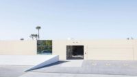
26th Street Housing
Kanner Architects' 26th Street Housing provides modern comforts to low-income tenants.
Architects & Firms
Santa Monica, California
We don’t have money for fancy materials, but abundant light and air, which can make a huge difference in your living environment, are free,” says Joan Ling, executive director of the Community Corporation of Santa Monica (CCSM). Since her organization’s founding in 1982, this nonprofit agency has dedicated itself to “preserving social and economic diversity” in Santa Monica, California, by creating high-quality low-income housing. As Ling points out, this very desirable and ever-gentrifying community on Los Angeles’s West Side relies on tourism and other service industries (with the low-wage jobs that the sector generates), yet the immediate area has not otherwise provided affordable housing for workers and their families. With 1,400 completed units and 200 more in the works, her nonprofit has successfully become one of Santa Monica’s biggest landlords.
Each time the agency converts existing buildings or erects affordable new ones, it makes a point of engaging local, design-oriented architects—including well-known firms such as Frederick Fisher and Partners, Pugh + Scarpa, and Daly Genik—whom “we can count on to deliver thoughtful, sustainable, easy-to-maintain, contextually responsive housing,” explains Ling. “The pool of architects in Santa Monica alone is phenomenal, so we have no need to go far afield.” For 26th Street Housing, one of the organization’s most recent projects [record, May 2008, page 133; July 2008, page 197], CCSM chose Kanner Architects. Though most of Kanner’s multifamily work has been market rate, even luxurious, the firm entered the low-income housing realm in 2003 with Metro Hollywood [record, July 2006, page 208], a visually playful, energy-efficient, mixed-use development that caught CCSM’s attention. “Whether our single-level units are high-end or low-income,” maintains Stephen Kanner, FAIA, president of Kanner Architects, “the spatial design principles are the same.”
The site itself, a corner parcel at the intersection of two busy commercial arteries, Santa Monica Boulevard and 26th Street, was purchased by CCSM before Kanner came on board. Economical real estate is a necessity for this agency, which cobbles together its funding from federal tax credits, tax-credit equity investments, state and city soft loans, and bank loans. CCSM favors sites, such as this one, with proximity to mass transit and jobs, introducing, as Ling puts it, “a level of sustainability … that helps reduce traffic congestion and air pollution.”
But housing along noisy, high-traffic bus routes presents architectural and quality-of-life challenges. A requirement imposed by the tax-credit funding determined that the project had to be entirely residential, thus ruling out the obvious solution of retail at street level. Additionally, the city of Santa Monica mandates “pedestrian-friendly design,” with a certain degree of transparency and permeability to passersby. Kanner addressed the dilemma of street-front units at grade by buffering them with their own small outdoor spaces, enclosed by slatted screens and planted bamboo. This solution generated the language for the entire facade.
As built, the four-story, 42,000-square-foot building, with 44 units, a central courtyard, a community room, and underground parking, meets the street with a play of solids and lightly screened voids (including balconies on all levels). At the outset, CCSM made several specific requests, including 2-to-3-bedroom units to accommodate families; as much communal space as possible; maximum air and light on the interior; low-maintenance, environmentally friendly materials; and natural ventilation and shading in place of air-conditioning. Kanner responded with a configuration of single-loaded corridors that wrap the courtyard and invite cross breezes.
Because wood would have exceeded the building’s $8 million budget and required significant upkeep, the architects simulated it with a durable cement fiber board painted brown. Flashes of bright color on balcony return walls animate street facades, finished in off-white plaster with woodlike screens and “clapboard” accents. A large, louvered, aluminum brise-soleil was painted brown and rises two stories on the west facade, a key passive-cooling feature that shades while ushering in breezes from the ocean, located only a couple of miles away.
A prime community gathering space, the courtyard provides access to all units. Here, a steel-grate stair, expressed as a sculptural element, ascends to upper-level apartments, all entered along motel-like, open-air public corridors. Inside, the units are sun-filled and environmentally attuned with floor coverings from recycled materials, low-energy lighting, paints free of (or low in) volatile organic compounds, and dual-flush toilets.
For the exterior, Kanner Architects designed a mural representing the passage from ocean to city, inspired by the existence of a wall painting on the site’s previous building, a Jewish community center.
Ling says she is pleased to recognize the site’s history—and perhaps even more important, to “see this project come full circle.” As she explains, the Jewish community center’s day-care facility helped raise “some of the people, including lawyers, who made this project happen. They’ve given back. And now an entirely new generation, 80 or so children, are growing up on the same site, ideally benefiting from it, too.”
She says she measures each project’s success “by how well it holds up physically and by tenant feedback.” After 26th Street Housing’s first year, the building remains in good condition, and she reports, many tenants have said they like living here. At the building’s opening, Kanner recalls, “I was touched—people came over and actually thanked us for creating this place for them.”


