The Jane Restaurant by Piet Boon
Antwerp, Belgium


Architects & Firms
Lunch at The Jane in Antwerp, Belgium, is not so much a meal as a four-hour performance, choreographed to the smallest detail and designed to engage every sense. An exquisitely presented menu, served in bite-sized portions, delights with magical combinations of tastes, textures, and temperatures. Its elegance, weirdness, and precision is echoed in the design of the restaurant, created within a derelict church by the Dutch studio Piet Boon.
Set on the grounds of a 19th-century military hospital recently converted into apartments, the church gives little outward sign of its transformation save for a discreet neon logo and the muted burble of music emanating from inside. Behind stout wooden doors is the former narthex, where a heavy reception desk carved from cracked, blackened timber is flanked by two tall openings leading to the 36-by-66-foot dining room.
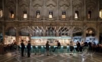
As guests enter the light-filled nave, all eyes are drawn irresistibly upward to the barrel-vaulted ceiling, proudly displaying the scars of decay and repair, and to a spectacular chandelier, 30 feet wide and 40 feet long. Bristling with 150 steel rods tipped with mouth-blown glass lamps, it hangs in the space like a giant luminescent sea urchin.
With its lowest branches just 9 feet from the floor, the chandelier celebrates the room's monumental scale while creating an intimate atmosphere underneath, where the seating arrangement retains a vestigial sense of the church's axial plan. Tables line the long walls and are double-banked down the center of the room, forming two aisles. Furniture in the middle of the space is slightly lower to the ground, ensuring good sightlines for people-watching.
The room's focus, however, is on the kitchen, prominently positioned in the former apse, where chefs stand at the pass-through like priests at the altar, sealed off behind a screen of steel-framed glazing. Silent sliding doors admit a constant relay of blue-aproned waiters from a service station at the opposite end of the room, where a matching steel and glass box has been inserted beneath the mezzanine.
Isolating the kitchen contains cooking smells and “the screams of the chef,” says lead designer Rienk Wiersma, but the enclosure also alludes to the vitrines in which churches display holy relics. More overt references to the building's history—medical, military, and religious—are found in the 15 new stained-glass windows. A panoply of vivid cartoons depicts candy-colored cupcakes and ice-cream cones alongside rosaries, the crucifixion, and icons of sickness and war: poison bottles, bandages, and bombs.
Those who look closely may also register the presence of skulls, butterflies, bubbles, and other images used in vanitas paintings to symbolize the transience of earthly life. Another memento mori appears in the form of a neon skull by artist Kendell Geers that hangs high in the apse. Reminders of mortality might seem incongruous in a place devoted to pleasure, but the works fit comfortably both with the dilapidated vault overhead and with chef-proprietor Sergio Herman's brief for a sensual, chic restaurant “with a hint of darkness,” where “fine dining meets rock 'n' roll.”
This concept is manifested more literally in the tattoo designs laser-etched into steel kitchen equipment. Such attention to material detail is evident throughout, and almost everything the diner sees is custom-made. Piet Boon adopted a curatorial role, working with other designers and manufacturers on products ranging from tableware to textiles, though sometimes, as with window designer Studio Job, maintaining a certain distance, because, says Boon's Wiersma, “the quality of the result rests on how much freedom you give.” The lighting plan, including the chandelier centerpiece, was designed by Beirut-based .PSLAB. “Of course, we could have come up with our own design,” says Wiersma, “but they are specialists, and we love their signature. They have their own craftsmen and therefore can create extraordinary custom-made pieces.”
Bringing together works by numerous hands in a building with its own powerful presence might have produced a discordant mess, but coherence is lent by a controlled palette of materials that will age well: steel, dark-stained oak, and leather. A pale sage green is used sparingly on loose furniture and quilted acoustic panels, while the pilasters and plaster moldings on the walls of the nave are unified by a coat of white. The apse, painted battleship gray, recedes into the background.
A maximum capacity of only 80 covers also contributes to the room's relaxed feel. “It was never the idea to get in as many people as we could,” says Wiersma. “Service is an important part of the experience, so we tried to keep the space as open as possible to allow easy access and create the right ambience.” Places are also found for much of the necessary paraphernalia of a restaurant. Wooden cutlery chests double as low-level space dividers, and the sommelier's bar makes a focal point in the center.
Another 30 guests can be seated around a marble-topped bar on the enlarged mezzanine. There, the material themes of the dining room are developed in dark parquet flooring and black steel lighting tracks—which are among the “ridiculous” number and variety of light fixtures installed to give uniform illumination throughout the space, says Wiersma. “At the moment, a lot of restaurants are dark, but here the ambition was to be light and bright.” A warm color temperature, enhanced by brass shades on the chalice-like table lamps and cylindrical ceiling lights, offsets the “cooler” elements of the interior, both at night and during the day.
It is this subtlety of detail that diners begin to notice once the initial impact of the space has faded. Piet Boon has created a room that is calm but sufficiently rich to sustain interest over a long sitting. Like the diverse series of flower-bedecked foams, crisp textures, and emulsions that make up The Jane's tasting menu, the parts are good but the whole is great.
| Making The Chandelier :: a .PSLAB film |
PeopleClient: Michelin star chef Sergio Herman & chef Nick Bril Owner: Michelin star chef Sergio Herman & chef Nick Bril
Architect: Designers: Piet Boon, Rienk Wiersma, Roland Kokkeler
Consultants Acoustical: Bowers & Wilkens; Buzzispace Accoustics Photographer(s): Richard Powers Size: 4,350 square feet (restaurant and bar) Project cost: withheld Completion date: March 2014 |
ProductsWindows: Studio Job (stained glass) Doors: Bod’or Flooring: Piet Boon® Flooring by Solid Floor (upper bar area) Walls: Buzzispace (acoustical material) Hardware: Piet Boon® by Formani Bar Counter: Hullebusch (‘café au lait’ marble)
Furnishings: Tableware: Piet Boon® Tableware by Serax Kitchen: Maes Inox Audio Equipment: Bowers & Wilkins |

