Art Gallery and Art Foundation Offices
Inserting a precisely detailed retreat for art into a high-rise building in the middle of bustling Hong Kong required some extraordinary measures.


Hong Kong
In a city like Hong Kong that's largely shaped by its density—where space is tight and often has to be improvised—you can wind up with surreal results. Outdoor escalators soar above streets and sidewalks. Pocket parks wedge themselves into the unlikeliest places. And in the case of a recent gallery and office renovation by Shim-Sutcliffe Architects, the project involved workers' lowering millwork through windows from the roof of a 30-story building.
Based in Toronto, Shim-Sutcliffe is known for its exacting attention to detail and spatial tectonics. But its assignment, in Hong Kong's busy Causeway Bay area, was to renovate a three-level interior in a 1980s office tower that didn't offer scope for much of either. The ceilings were low, the curtain wall unremarkable. Floor plates were crammed with elevators, fire stairs, and other service areas. The clients, a financial trader and his philanthropist wife, wanted the 48,400-square-foot space to be a fitting multi-use home for their trading firm, art foundation, and growing holdings of blue-chip contemporary art. “They wanted a place to show their collection,” says Shim. “But the existing space wasn't very nice, so we were limited with what we could do.”
You wouldn't think so, however, given how skillfully the architects mastered the constraints. On entering the 29th-floor reception area, one immediately encounters a “sense of scale and generosity,” as Shim puts it. To introduce the limited but rich material palette and precise detailing seen throughout the project, Shim and her partner Howard Sutcliffe placed a custom bent-bronze desk atop flooring of wide American-walnut planks and used 1/8-inch reveals to make the gypsum walls seem to float within the bronze trim that frames them. To the right are trading offices and, to the left, a library, while head-on is an expansive abstract painting by Chan Kuochiang, an artist supported by the clients' foundation. “We wanted art to become part of the day-to-day experience of the space,” says Shim, who collaborated on the project with Dmytriy Pereklita and Karen Mak of dkstudio, two former students of hers in Canada who are now based in Hong Kong.
To say art occupies a central place in the project is an understatement. Connecting all three levels, an existing internal stair—the core of the space—was transformed with one of artist Jim Lambie's signature striped vinyl-tape floor installations: in this case, in a bold pattern of black, white, gray, and metallic silver and gold. Shim and Sutcliffe didn't just provide a neutral background for the site-specific work but subtly augmented it by cladding the stairwell in matching bronze and bracketing the stair in impeccably crafted white oak.
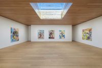
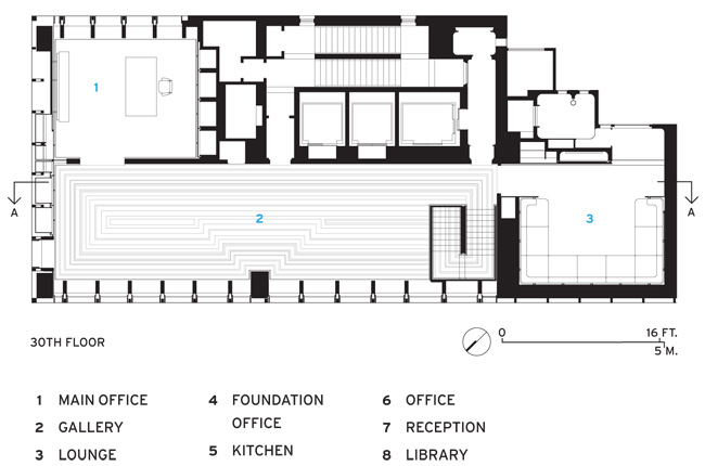
Lambie's installation continues on the 30th floor, where it flows without interruption into the project's showcase space: an 880-square-foot gallery featuring works by Damien Hirst and Anish Kapoor. Here, too, the architects' challenge was to work with the existing space, especially the span of flat, repetitive windows that runs along its length. Rather than fight the curtain wall, Shim and Sutcliffe accentuated it with 25-inch-deep white oak fins, which they placed at the mullions to project into the space. Besides heightening the rhythm and articulation of the space, the fins—which, with a seamless height of nearly 10 feet, were among the pieces that had to be lowered from the roof through the windows—give the effect of expanding the room by creating deep bays.
With their verticality, the fins also create the illusion of greater height. They appear to extend above the ceiling, for which Shim and Sutcliffe devised a continuous surface. “We wanted a ceiling that didn't have smoke detectors, sprinklers, and so on; we wanted a totally clean plane,” says Shim. This plane also curves to accommodate a hidden LED system that evenly washes light onto the adjacent wall and artworks.
Such attentiveness to detail remains consistent throughout the project. On the 30th floor, for example, you see it in the clients' office, with its American-walnut ceiling, bronze-clad storage wall, and antique furniture (including a massive fireplace that also had to be hoisted through the windows) and in the lounge area covered with Josef Frank'designed fabric. It continues down to the foundation and firm offices and a kitchen on the 28th floor.
Meanwhile, black-granite floors, curved white-oak paneling and custom bronze uplights fit together like pieces of a puzzle in the bathrooms. “We fitted them out like a boat,” says Shim, expanding on the ship-in-a-bottle metaphor. Elsewhere, diaphanous films were applied to windows to manipulate and blur some of the views to the outside. Great pains were taken to frame the views within the project. Overall, the interior is a rigorous composition of gaps, reveals, precision joinery, decisive lines, and meticulously finished materials, softened by the occasional curved element.
“We wanted to create a sensual experience, no matter what size the space,” says Shim. “It was about accepting what we couldn't change and then elevating it a bit.”
Architect: Shim-Sutcliffe Architects — Brigitte Shim, Howard Sutcliffe, partners
Executive Architect dkstudio — Dmytriy Pereklita, principal in charge; Karen Mak, project manager; Nathan Dykstra, Andrew Lau, project team
Engineers: Siu Yin Wai & Associates (structural); Krueger Engineering (m/e)
Lighting: Suzanne Powadjuk
General Contractor: Decca CLI Design
Size: 48,400 square feet
Cost: withheld
People
Architect:
Executive Architect:
Engineers:
Lighting:
Client:
General Contractor:
Size:
Cost: |
Products
Windows:
Frosted Acrylic Sheets on windows:
Ambient Lighting:
DownLights: |


