North Carolina Museum of Art
Shedding Light: Thomas Phifer and Partners turns a simple structure into a stunning expansion of the North Carolina Museum of Art.
Architects & Firms
Raleigh, North Carolina
Tom Phifer said that he wants his new building for the North Carolina Museum of Art (NCMA), in Raleigh, to disappear into the landscape. By saying so, he is daring you to take a closer look, knowing full well that his first museum, like the art that hangs on its walls, will stand up to the scrutiny.
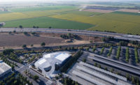
From a distance, it looks hardly more than a warehouse, an impression that did not sit well with some locals, who for endless months during construction could see only a squat concrete box. Certainly they would have preferred the bold civic gesture, a splashy concoction to bring attention to the Raleigh community. But the focus here is on the art, and the visitor’s interaction with it. So while the museum’s strong permanent collection, which occupies all the galleries, is not teeming with masterpieces like those of some larger institutions, under the soft light of day, it shines.
Three decisive elements transform what might easily have passed for an ordinary shed into this stunning house for art. Massive aluminum panels, arranged like pleats, clad the precast-concrete wall panels of the steel frame structure. A series of courtyards and reflecting pools cuts into each face of its rectangular form. Topping everything is a spectacular array of coffered skylights that combines with the glazed courtyard openings to bathe the galleries in controlled natural light and bring the outside emphatically in.
And since the one-story structure has no place for a soaring atrium or grand staircase, de rigueur in museum buildings both Classical and Modern, Phifer’s singular gesture is to demarcate the main entry with a steel-and-glass canopy beside an allée of American elms. Just past the threshold, the visitor is immediately confronted with art, the reception desk slightly askew. While this entry shares an outdoor plaza with NCMA’s existing Edward Durell Stone building, now home to temporary exhibitions and offices, visitors can access the new building, which is free to the public, from its courtyards as well. “There is a brilliant new thinking about buildings for art,” says NCMA director Lawrence Wheeler. “Ours reflects these democratic values.” (Security cameras monitor the building and grounds.)
It’s a way of thinking that leaves visitors to experience the art, both inside and scattered throughout the surrounding landscape (NCMA’s museum park, the largest in the country, includes a popular outdoor amphitheater by Smith-Miller + Hawkinson and artist Barbara Kruger) on their own terms.
Happily, the exhibition galleries, laid out over 65,000 square feet according to a 26-foot module, do not follow a tightly controlled path of strict chronological or thematic sequences. The fairly open floor plan allows visitors to weave in and out of them, passing by the figurative sculptural works that delineate the building’s spine. Curators take advantage of this freedom to experiment with how they display the art. Devorah Sperber’s After the Mona Lisa 2, a 2005 work that recreates da Vinci’s famous portrait with 5,184 hanging spools of thread, is an unexpected delight beside works from the Italian Renaissance. In another gallery, Josef Albers’s colorful, mid-20th-century studies for Homage to the Square are juxtaposed with American Impressionist Frederick Carl Frieseke’s The Garden Parasol from 1910.
Of course, everything looks good beneath the ceiling’s 360 oculi, the building’s only sculptural element and the source of the glorious daylight that shines down on the collection. Phifer took Louis Kahn’s skylight detail in the Kimbell Art Museum as a point of departure, finalizing the ellipsoid shape of the NCMA’s ceiling coffers after numerous light studies conducted by Arup’s London and New York offices. A local boat builder advised on resin technologies for the fiberglass vaults, which rise 5 1⁄2 feet above the ceiling plane.
While sunlight shines down, it by no means pours in. North-facing louvers and removable scrims limit the amount and type of light that penetrates an oculus and reaches an artwork. Three layers of curtains do the same for light coming in from the courtyard openings. Photocells on the roof measure daylight; the information they gather is used to adjust track lighting within the galleries.
These efforts control the quantity of light inside the museum, but the quality of light is undeniable, particularly as it changes over the course of a day. Outside the museum, the changing light produces equally dazzling effects on the 25-foot-high anodized aluminum panels, which at times appear golden, their jagged outline clearly visible, while at other times they seem to dissolve completely.
This is not groundbreaking stuff. But the sum of these small but thoughtful moves erodes boundaries between building and landscape, outside and inside, and even between different genres of art. By avoiding the all-too-easy tendency toward architectural bravado—to the dismay of some—and instead focusing on good design, Phifer has created something beyond just a remarkable building. It is a remarkable place.


