Denmark
In museum circles, curators and artists are well known for kvetching about architects who compete with the art on view by foisting major design statements onto willing clients. Small wonder that when Steven Holl entered an invited competition in 2005 for the Herning Museum of Contemporary Art in central Denmark, he took seriously the admonition from Holger Reenberg, the director of the museum: “Do everything you want as long as it doesn’t compromise the art.”
The museum, known by its coy (in English) acronym HEART, occupies 10.4 acres of Birk Centerpark, a singular art museum, sculpture park, design school, and office building enclave that was once the home of a shirt factory.
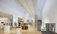
Holl’s abstractly conceived, 60,278-square-foot structure leaves alone the art galleries totaling 15,812 square feet. Two discrete precast-concrete volumes form the inner core of the museum, one for permanent exhibitions, the other for temporary ones, and movable walls of lightweight construction allow art to be displayed in orthogonally arranged spaces. The architectural whammy occurs above the hang, so to speak. Here the roof fills out the gestalt, with five white tubular shells bending and twisting to create convex ceilings that billow over the galleries and perimeter areas containing the lobby, bookshop, offices, café, library, and an auditorium for concerts. On the exterior, convex and concave walls echo in the elevation the curves overhead. Although the exterior white walls, made of poured-in-place reinforced concrete, seem rather blank from afar, up close you find the surface rutted with creases. To achieve this thickly textured effect, the architects had trucks drive over vinyl mesh tarp, then staple-gunned the wrinkled material to plywood forms for the pour. When the concrete dried and the tarp was yanked off, “you had wrinkles with no repetition,” says Holl.
Much has been said about how Holl’s convex roof elements look like shirt sleeves, sliced and folded, and how the wrinkled exterior concrete resembles shirt fabric — both quite apropos of the products of the manufacturer who founded the original Herning Art Museum on the site. Aage Damgaard, owner of the Angli shirt factory, established in 1939, was also an art collector who liked to invite artists, including the Italian conceptual artist Piero Manzoni (1933—63), to take up residence at his factories. In the mid-1960s, Damgaard set up a factory in Birk on the outskirts of Herning, and his collection of Manzoni’s works formed the core of the museum that opened in the factory building in 1975 when production moved elsewhere. Backing up the Angli factory, designed in the shape of a round collar by C.F. Møller in 1965, are landscaped parks by Carl Theodor Sørensen that repeat its circular forms as a series of grand and intimate outdoor rooms. The complex soon attracted a design school (TEKO, as it is called), now housed in a series of rectilinear structures built between 1998 and 2004, plus a smaller museum, large-scale sculptures, a carpet factory, and office buildings. A prototype house designed by Jørn Utzon in 1970 and distinguished by large, scupper-shaped roofs, sits near Holl’s museum — one more element of this idiosyncratic physical context.
In spite of the visual resemblance of the roof to shirt sleeves, Holl shrugs off the catchy provenance.
He argues the roof’s design really derives from his desire for daylight to enter the interstices of spaces between the tubular arms, then bounce off the ceilings’ white plastered curves to cast a soft, ethereal glow for the artworks displayed below. The openings take the form of clerestories composed of two layers of sandblasted channel glass with translucent insulation sandwiched between—somewhat like the glazing Holl used in the Bloch Building of the Nelson-Atkins Museum in Kansas City, Missouri [record, July 2007, page 94]. A two-way-spanning steel-truss structure supports the curved forms, which are covered with a white roofing membrane on top, with steel hangers connecting the curved to the flat portions of the roof. “We worked closely with the structural engineer [Niras] to create large-span galleries where we could balance curved roof sections that sit on precast-concrete elements,” says Noah Yaffe, Holl’s associate in charge. The team designed the outdoor landscape to repeat in reverse the curved shapes of the roof: Rounded berms frame reflecting pools that filter the rainwater. Since the budget was tight ($20 million), Holl donated $20,000 of his fee so that a geothermal system could be installed for slab cooling (heating is provided by the district). In addition to inserting heating and cooling tubes in the concrete floors, the architects achieved additional energy savings by using a displacement ventilation system.
The imaginative intersection of art, light, and architecture offers a fittingly dramatic setting for the exhibitions, and not surprisingly, the museum recently received one of the Royal Institute of British Architects’ International Architecture awards for 2010. But nothing is perfect — or at least certain aspects need to be addressed in such an innovative project. For example, the clerestories often have been blacked out with shades since the opening last fall, owing to curatorial concern about daylight levels for the paintings. Visitors (including this observer) have found the entrance not legible enough as a portal to the museum, and Reenberg notes it is hard to tell if the museum is open, since no parking is permitted in front. While the interior circulation through the galleries is clear, and the outdoor piazza welcoming, visitors may not be as easily drawn to walk around the entire exterior of the building, partly because concave walls don’t inflect one’s steps around a corner. (Admittedly, cold weather often dampens such a desire.) Essentially, the integration of the building and land is a visual one best seen from the air, not a kinesthetic one experienced on foot. Here, the interaction of the pedestrian with the art inside the museum takes precedence.


