Maggie's Centre by Rogers Stirk Harbour + Partners
London

Maggie’s Centre is an oasis of calm within a bustling neighborhood. Its roof structure blocks views of Charing Cross Hospital, which towers above it.
Photo © Jane Smith

Each step toward the entrance of the building moves one away from the din. Much attention was paid to creating entry circulation that would be welcoming but maintain patient privacy.
Photo © Jane Smith

A fully enclosed exterior courtyard just outside the center’s kitchen provides visitors with a sheltered place to rest or have a conversation.
Photo © Jane Smith

The center is built around its kitchen table. This relaxing, well-lighted gathering point is perfect for the cups of tea and informal conversations that help make visitors feel welcome.
Photo © Jane Smith

Work spaces on the second floor are located on balconies and reached via bridges in order to allow daylight to flood the first floor of the building.
Photo © Jane Smith

The center’s head, Bernie Byrne, describes interior spaces, such as this sitting room, as “fluid.” Visitors and groups can rearrange furniture as they wish.
Photo © Jane Smith

The entrance to a courtyard is located next to the kitchen table. A cutout in the building’s exterior wall provides the only glimpse into Maggie’s Centre from the plaza.
Photo © Jane Smith

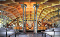
The steel diagrid roof structure is supported by interior columns, allowing it to cantilever over the low-iron glass exterior walls.
Photo © Jane Smith

Image courtesy Rogers Stirk Harbour + Partners

Image courtesy Rogers Stirk Harbour + Partners

Image courtesy Rogers Stirk Harbour + Partners

Image courtesy Rogers Stirk Harbour + Partners


Architects & Firms
In 1988, an extraordinary Scottish woman named Maggie Keswick Jencks was diagnosed with breast cancer. She was a mother, a scholar who wrote and lectured about Chinese landscape gardening, a world traveler, and the wife of designer and critic Charles Jencks, not to mention an accomplished landscape designer in her own right. After surgery, and a five-year period of remission, the cancer returned. This time an aggressive strain attacked her bones, bone marrow, and liver. Maggie was also outgoing, articulate, and an often-published writer who was willing to try an extraordinary range of treatments and strategies as she fought for her life. She won a second period of remission, but finally succumbed to her disease in 1995.
Toward the end of her life, one of Keswick Jencks’s doctors invited her to write an article about what she experienced for his medical journal. Her essay, “A View From the Front Line” (downloadable at maggiescentres.org), is a highly personal account of her life with cancer, coping with surgeries, confusion over the efficacy of treatment options, and the despair of life coming to an end. Not the least of her concerns was her experience that the cold, sterile institutions where cancer patients receive treatment could not give people the warmth and support they need in these challenging times.
Keswick Jencks had what all designers have: a drive to analyze and improve the world around her. During the last few months of her life, she and Charles worked together to conceive of a different kind of place for patients. It would be a place near a hospital, where patients and family members could walk in without an appointment and immediately be welcomed into a caring community of cancer-support specialists, other patients and their families, and survivors. Visitors could receive informal personal counseling, gain information about insurance benefits, participate in individual and group therapy, and learn about such things as nutrition, stress reduction, and other kinds of therapy. Above all, the design of the centers would not resemble a hospital. They would be small-scale and emphasize open space, daylighting, and selective use of color, plants, and landscaping. A year after Keswick Jencks’s death, the first Maggie’s Centre opened in the shadow of Edinburgh’s Western General Hospital. In the ensuing years, six centers have been built, there are four interim centers, and another four are in development. These are almost entirely funded through donations. Several were designed by prominent architects such as Frank Gehry and Zaha Hadid.
Rogers Stirk Harbour + Partners’ Maggie’s Centre London is a gift to the emerging genre. The building is tucked into the northwest corner of the grounds of Charing Cross Hospital. Although the neighborhood is far from the middle of London and composed primarily of pleasant brick-and-stucco row houses, the spot is anything but serene. A few feet to the west runs Fulham Palace Road. It carries heavy car, bus, and ambulance traffic, and is described by William Wimshurst, Rogers Stirk Harbour + Partners’ project architect for Maggie’s, as “one traffic jam, all day long.” To the east, the hospital’s gray, 1960s-era, 15-story concrete tower looms over the site.
The vibrant red-orange of the Maggie’s building the firm created provides worthy opposition for what otherwise could be an extremely oppressive environment. One approaches the center by crossing a courtyard inserted between a few of the site’s mature plane trees. The only hint of what’s inside is a glimpse of an enclosed outdoor courtyard visible through a cutout in the south wall of the building. One passes it, turns 90 degrees, and then another 90 degrees to reach the protected entry. The effect is to become, with each step, more and more isolated from the hustle and bustle of London, a process that Wimshurst describes as “accepting the hug of the building. We’re trying to create a domestic, calm feeling.” Inside the door, it is readily apparent that much attention has been paid to relating to the mind-set of a person coming to Maggie’s for the first time, who may be fighting emotional conflicts that can prevent them from seeking the help that they need. “One of the things we noticed when we were looking at the first Maggie’s in Edinburgh was that it sometimes took people three tries before they came into the building. By actually coming into the building, you’ve had to overcome fear and the recognition that you actually have cancer,” he says.
Bernie Byrne, the head of the center, adds, “Maggie’s is very homey, and works very much at a more human level than most institutional architecture. The fact that we don’t have a reception area allows people to be equal. Ideally, the first time you come here, someone from staff would see you come in and would be there to meet you.” To help eliminate that clinical appearance, there is no signage anywhere, not even on bathroom doors. “When you go to someone’s house,” she adds, “you don’t look for a sign. You ask your friend where it is.”
Even on a gloomy January day, the building is warm and full of daylight. The first and second levels are entirely open to each other, and most of the exterior walls at the second level are glass; the steel diagrid roof structure sits on columns and simply cantilevers out over them. Staff and fund-raisers’ work spaces occupy balconies and are connected from one side of the building to the other by bridges, so no walls block the daylight. Each corner of the second story of the building has an exterior deck.
The red-orange coating slathered on the exterior stucco walls is not used indoors, although it is visible through some windows. Instead, warm tones from the birch paneling, Siberian larch trim, and polished concrete predominate. Wimshurst notes that chemotherapy often drains the color from people’s skin, and so they have avoided greens, blues, and beiges. The concrete floors also aid the effectiveness of the radiant heating system. “When people go through chemotherapy, it is sometimes quite difficult for them to regulate their body temperature, and often they feel quite cold,” says Wimshurst. “The concrete’s mass helps maintain that constant warm temperature.”
A kitchen occupies the central space on the first floor. It is furnished with a counter, racks of tea bags and mugs, and a large kitchen table visible from almost any point in the building. In the winter, a woodstove radiates heat. “We know that there are three elements that crop up time and time again when people get a cancer diagnosis,” says Byrne, “and those are social isolation, helplessness, and hopelessness. What the kitchen table does is provide a forum for people to meet. They can choose to be either an active or a passive participant in anything that’s going on. So you can sit there with your cup of tea and read the paper, and also listen to what’s going on, or you can actually be part of the conversation.”
As one steps away from the kitchen table and toward the perimeter of the building, Maggie’s breaks down into secondary spaces: a large courtyard adjacent to the kitchen, two winter gardens, three large sitting rooms, and several more intimately scaled rooms designated simply as personal spaces. There is even a tiny corner room, called the “snug,” whose two glass walls face the courtyard.
In 2009, Maggie’s Centre London won the Stirling Prize, which surprised some who associate Rogers Stirk Harbour only with large projects with exposed cables and polished stainless-steel components. In contrast, Wimshurst says of Maggie’s, “These details are very simple, to actually reflect the type of building we were trying to do. It’s one of the smallest buildings we have done in a long time. So often practices lose that touch, and it’s nice to show we can still do it.”


