Plenty of bad buildings hide behind their facades. Like an amateur stage design where a paper-thin painted streetscape creates the illusion of a grand setting, a promising building exterior can often veil quite ordinary or unpleasant spaces. Sometimes, however, the opposite is true. For a new building on a historic market square in Mainz, Germany, a false front conceals a bold design. The illusionist in this case, Massimiliano Fuksas, is not necessarily the perpetrator of the deception.
Additional Content:
Jump to credits & specifications
The Roman architect has wrestled with the complexities of designing under the burden of history before, but the Mainz project presented him with an unusual challenge—how to merge a completely contemporary design with a historic facade (or series of facades). As it turned out, the existing facade, however charming, was a fraud. Destroyed along with 80 percent of Mainz’s architecture during air raids in 1945, the buildings in question were hastily rebuilt in 1955 with a simple facade, only to be “retrofitted” with a facsimile of the original—itself an 1890s replacement of Gothic architecture—beginning in 1979. For better or worse, thorny questions about reconstruction are being addressed in cities across Germany with different results (see article on Berlin’s Neues Museum on page 58).
Following a 2003 competition win, Fuksas was charged with designing a mixed-use development behind this new “old” facade. The buildings that had stood there—housing a rundown cinema and apartments—were to be demolished to make room for the new shopping center and housing complex.
But salvaging the facade while razing the rest of the building proved impossible, and further complicated a preservation case that was already on shaky ground. It was just as conceivable then to design an entirely new building, facade and all. The town opted instead for what could be considered an extreme measure. It would rebuild the rebuilt, though never landmarked, facade.
On this go-around, preservationists sought to create an even more authentic facsimile of the original facade. Stone window mullions were added on the upper floors, a doorway arch on the first floor, and a fresco bearing the family crest of the first market owner on the stepped gable portion of the facade. While those efforts were under way, Fuksas’s studio ensured that interior floors matched up more precisely with the facade than in the 1979 version, but the architects focused on the rest of the building facing the narrow, winding streets behind the square. (Mainz is one of the few rebuilt German cities to maintain its medieval grid.)
“I wanted to keep the skyline of the city with the roof, but I didn’t want to do a vernacular roof—not at all,” says Fuksas. Though the new, singular building is bigger overall than the series of smaller buildings that were torn down, Fuksas retained a similar scale. “Without the right proportions, it would feel fake.”
The sloping, folding roof wraps the building like clothing over a body. Fuksas employed a similar strategy with other recent projects, including the Milan Trade Fair [record, August 2005, page 92] and the Zenith Concert Hall near Strasbourg [record, August 2008, page 98], but maintains that his is not an exploration of surface or skin, but rather of materials—glass in Milan, textile in Strasbourg, and now ceramic, or terra-cotta, in Mainz. “I’ve always been inspired by Arte Povera and using materials in different and interesting ways,” says the architect.
Thousands of 2-inch-wide, painted white ceramic bars clad the upper portion of Fuksas’s facades. (The ground level features glass storefronts.) The bars are rhythmically arranged on an aluminum framework, with large gaps that reveal the substructure beneath, containing openable windows and insulated metal panels. Boxy windows are also randomly inserted between bars. The varying degrees of opacity and transparency, coupled with the cadenced spacing of the bars, create a striking overall effect. “It was crucial that we used ceramic,” says project manager Jan Horst. “The imperfections in the enamel make each bar unique and create delicate light reflections.” Several sections of the ceramic-clad framework mechanically fold open to reveal terraces embedded within the sloping roof.
Fuksas carried the ceramic cladding over to the walls of the main interior space, a multilevel atrium, at the building’s core. Entered from the market square or one of two side streets, the atrium is exposed to the elements, with natural light, wind, and sometimes rain sneaking through from the partially open roof. Within the atrium, three soaring columns emphasize the entirety of the space, which spans from the basement to the glass roof and beyond.
Retail spaces occupy the first two levels and the basement, which is accessed by escalators at the center of the atrium. Sandwiched between those shops and the 19 apartments of the upper floors are several offices. Two large openings in the slab of the fourth-level patio allow residents views to the shopping center below. It is both a private building with a very public space, and a public building with very private space.
While Fuksas’s studio challenged itself with the complicated roof geometries and a slanting atrium wall, the awkward apartment interiors resulting from the meeting of the pitched roofs and small windows of the “old” facade with the new was beyond its control.
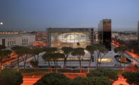
As bold as Fuksas’s design is, it also embodies a certain amount of restraint compared with some of the architect’s other projects—including his cloudlike congress center in Rome’s modern EUR district, currently under construction. “I’m not afraid of context,” Fuksas asserts. “But I don’t think you can build in the center of a city without paying attention to what is already there. I tried to find an expression of a building that is contemporary but is looking in some way at the past.” Perhaps, instead of re-creating what was, this approach will suffice to heal the scars of history for future architectural projects in Germany.
CreditsArchitect Studio Fuksas
Interior designer:
Competition Plants: Engineering:
Project Structure general: Plants: Engineering: Electrical Services:
Photographer |
SpecificationsExterior cladding Metal/glass curtainwall: |


