Yale Art and Architecture Building
The problem of adding onto an icon.
To recognize a masterpiece in a lovely building is no great feat; the trick is to spot one in an object as insolent, as splendidly belligerent, as Paul Rudolph’s Art and Architecture Building at Yale. Few did so when it opened in 1963; it seemed willfully provocative, as if its baffling spatial sequences and corrugated concrete walls were expressly devised to repulse understanding, let alone affection. As it happened, it existed in this shocking form for only a few years before it was mauled beyond recognition. Now the A&A has been restored by Charles Gwathmey of Gwathmey and Siegel, and with great brilliance; his achievement is to reveal just how great it actually is.
Most architecture is conceived incrementally, advancing from plan to section to elevation, but the A&A seems the expression of a single massive thought, its components neatly folded into one another to make a compacted unity. It can no more be separated into structure and space than can a cavern. Such a degree of resolution, rare when it was built, seems almost inconceivable today.
Gwathmey restored its large sheets of glass, reopened its long-closed vertical light shafts, and—most satisfyingly—recreated the open configuration of the architecture studios, with their grand archipelago of platforms and mezzanines. Where original features could not be recreated, his substitutions have been uniformly impeccable, as with the restored but now energy-efficient lighting scheme. Even those changes that compromise the original spatial order—such as the simplification of the main gallery’s sprawling stepped floor—have been as sparing as modern building codes allow. In every respect, this is a model restoration.
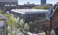
The addition is another matter. Rudolph deliberately left the A&A “open-ended toward the north,” as he wrote in Architectural Design in 1964, so that it might “grow in that direction forming a future courtyard.” He anticipated an enlargement of the studio spaces, however, and not a new building for the history of art department, with all its attendant seminar rooms and offices. This complicated Gwathmey’s task immeasurably. Buildings are rarely as complex as the A&A, whose 10 floors ramify into 37 distinct levels and sublevels, and whose ceiling heights range from 28 feet to just over 4 feet. To make matters worse, the addition would obstruct the A&A’s crucial northern light (so that the historians who would illuminate art are at the same time, and in quite literal fashion, obscuring it). All this forced Gwathmey to design as a contortionist, bobbing and weaving to let the light pass, and reaching over to grasp the A&A whenever possible.
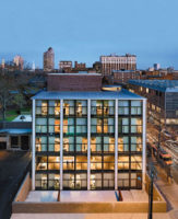
This programming aspect has been handled imaginatively. Gwathmey has opened up the original art library into the addition at basement and ground level, adding compact shelving and nearly doubling its capacity. The main lecture hall, by far the finest of his spaces, wrapped on three sides by classrooms and offices, perches atop the new circulation desk. Above the third story, the building pulls apart to coax light into the A&A and to make room for a small (and rather forlorn) green-roofed plaza. The divided building continues for another four stories, in the form of a service stack to the rear and a main office block to the street, which contains the rows of monastic cubicles of the faculty offices. These are stacked in the north side of the building in the manner of ice-cube trays, the only passage of regularity in what is otherwise a spatial jigsaw of a building.
In their own way, Gwathmey’s zinc-clad elevations are as clever as his planning, which is unfortunate, since cleverness is perhaps the last quality one would wish to flaunt next to the A&A. It is not only the odd little flourishes that seem gratuitous, such as the angled monitor that lights the second-story conference room, pointed upward like a wandering lazy eye. Nor is it the jaunty way that the white limestone bay swings into space, parodying the strenuous display of structure in Rudolph’s building like a clown lifting spurious weights next to a genuine weightlifter. It is that these features are placed arhythmically; they neither express the spaces within nor establish a coherent set of relationships on their own terms. They are what no architectural feature should be, verbose but not articulate.
It is possible to add to a masterpiece, but one must first know why it is a masterpiece. Much of the sheer visceral force of the A&A is achieved through contrast with its surroundings, especially Louis Kahn’s adjacent Yale Art Gallery, whose very “neutrality,” Rudolph observed, made his building “much more plastic.” It would be asking too much for Gwathmey to match the emotional intensity of the original A&A. A product of its time, its existential energies—its almost sadomasochistic sensibility, its concrete tormented with hammers—cannot be retrieved and should not be feigned. Perhaps Vincent Scully was right to propose that the facade be made entirely of glass. In the end, Gwathmey stumbled over his insistence that his building “present its own iconic presence in the overall composition.” Next to this leviathan of American Modernism, this is one icon too many.


