When I was a kid (though not a mere child), I defended Edward Durell Stone’s much maligned Gallery of Modern Art at 2 Columbus Circle when it opened in 1964. It had that recherché white marble cladding with an arcade and loggia outside, and rich walnut and macassar ebony paneling within. Thick, jungle-red-carpeted stairs took you up to intimate galleries at half-levels, where a soigné and surreal art collection, including Gustave Moreau’s Salome Dancing Before Herod (1874–76), awaited. At the top of the museum was the Gauguin Room, with tapestries à la Gauguin, where you could dine on (then) rare Polynesian cuisine in a grasscloth-lined Modernesque setting overlooking Central Park. You would hardly notice the dreary Coliseum to the west, where the Time Warner Center looms today.
At the time, an older, wiser architect tried to explain the errors of my judgment: The monument to Huntington Hartford’s hothouse nonabstract art collection just “didn’t work.” My point about the gallery being designed by the same architect as the venerated Museum of Modern Art (MoMA) didn’t fly. In the years between MoMA (1939) and the Gallery of Modern Art, Ed Stone had gone over to the dark side. Proving I was ultra-naive was Ada Louise Huxtable’s pronouncement in The New York Times that it was a “die-cut Venetian palazzo on lollipops.”
With a spunky prescience, I, in turn, pronounced: “Mark my words, in 50 years it will be revered as historic.” Even though Stone’s opus was not given the time of day by the New York City Landmark Preservation Commission (LPC) when the Museum of Arts and Design decided to totally overhaul it some 40 years later, I must say the kid in me felt somewhat vindicated by the five lawsuits over its future that started in 2003. But I wasn’t on the front lines: Since Hartford had given the gallery up in 1969, it had lost its plush interiors, comfy Modern furnishings, and outré artwork. It needed the gesamtkunstwerk shtick to make it the quirky, kitsch period artifact it had been—but by then it was only a grotty concrete hulk plopped atop lollipop columns.
Even so, it is reprehensible that it never got a fair and full hearing at LPC, despite valiant efforts by Landmarks West, the Historic Districts Council, and the New York chapter of Docomomo. As expected: Mayor Bloomberg’s interest in architecture begins and ends with big new developer buildings. By denying it even a hearing, LPC damaged its stature and integrity.
Surprisingly, architecture critics took uncharacteristic stances: Ada Louise Huxtable, a longtime advocate of preservation, came out for Allied Works’ radical renovation, excoriating preservationists for “nostalgia” and “trendy revisionism.” The late Herbert Muschamp of The New York Times, who often pooh-poohed preservation causes, wanted to save this symbol of the “emerging value of queerness” in the New York of its day.
Clearly, this is a no-win case: The new scheme would have to be beyond fabulous to make opponents forget the bloodshed. Though Brad Cloepfil’s concept of cutting through concrete bearing walls to dematerialize the opaque structure was ingenious, the facade still looks drab. Cloepfil hoped the ivory, glazed, terra-cotta rain screen would make it luminous. But while the north facade has a sheen, it lacks glitter and gleam, since it receives no direct rays of light. And on gray days, forget it. This is all the more poignant because the museum plays a significant urbanistic role due to its prominent if eccentrically shaped site, seen from four sides. Moreover, with the concave entrance facade terminating the sweeping arc of the new Time Warner Center, it needs to provide proper punctuation. To do so it needs more … well, pizzazz. Like the old days.
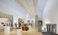
Keeping the lollipop columns intact was arguable structurally, but by Cloepfil’s partially masking them with glass on the outside, they look like half-forgotten remnants of a tear-down. Inside, their Moorish profiles add a jarring note. To be sure, the gallery space benefits from the new loftlike, open plan, and makes a strong case for gutting the old innards. Now you can really see the works on display (which may or may not be a good thing, depending). But the memorable spaces are Stone’s below-ground auditorium and its lobby, on which Cloepfil performed a sensitive interpretive restoration. He brilliantly reconstituted the billowing curves of the metal disk ceiling, kept the walnut walls, and restored the bronze doors to recreate the once-chic and shimmering ambience. On the ninth floor, where the restaurant is planned, Cloepfil filled in the loggia so that the restaurant gains about 4 feet in depth. And now, with the controversial crossbar of clear glass, a knock-out view of the park view can be taken in. I’m on the side of the crossbar: In New York, any view is far too rare for restaurants; to block out even a portion of the panoramic vista of Central Park framed by skyscrapers is loony—and bad business.
So now the crossbar forms a giant “H.” It does indeed ruin the architect’s composition. But it is meant to be, no? The “H” acts as a ghostly reminder of the museum’s first client, Huntington Hartford, and while we’re at it, the client of this incarnation, Holly Hotchner, MAD’s indomitable director. And just wait: In 50 years, it will be declared a landmark.


