Glasgow, United Kingdom

Building directly opposite Charles Rennie Mackintosh's famed Glasgow School of Art, as Steven Holl has done, is simultaneously a plum job and the commission from hell. Mackintosh's school (1897-1909) is the building where Arts and Crafts met Art Nouveau, incorporating modern construction techniques while channelling the historic Scottish Baronial style. It is such a rich, clever, eccentric building, a touchstone for so many architects. But the problem is the same as the opportunity. In this exalted company, the critical eyes of the world are bound to draw comparisons.

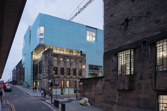
It helped Holl that his site was previously occupied by unsuitable School of Art buildings from 1963 to 1980, including a Brutalist tower. Some people wanted to preserve them but their demolition was not too controversial.  However, Holl elected to keep another pre-existing building at one end of the site, the stone-clad inter-war Assembly Building which was – and is again – the home of the bar, event rooms and offices of the student association. This was a generous decision as its incorporation takes a large bite out of the city block that would otherwise have been available: the Holl building sails over and partly absorbs it, dropping a structural leg and a slice of new façade over its flank.  The old building’s interiors have been renovated by jmarchitects,  Holl’s Glasgow collaborators who teach at the school as well as practice. The two buildings do not connect internally.
 
The new building is clad in translucent pale-green, laminated glass with open joints and concealed stainless-steel brackets, and is as reticent as any building of this considerable bulk could be. Articulated with a long set-back terrace and an entrance recess, but otherwise almost detail-free, it is like a full-scale foam model. This was a deliberate tactic by Holl, a Mackintosh enthusiast whose rationale is to make a building that is the negative of its famous, finely-detailed neighbour and that defers to it aesthetically.  Where the Mackintosh building has what Holl calls “thin bones and a thick skin” (steel frame clad in stone) his Reid Building (named for the outgoing School of Art director Seona Reid who commissioned it) is the opposite: thick, concrete “bones” inside, faced with a wafer-thin skin. The interiors of the Reid building are as open and social as the Mackintosh building is partitioned and intimate.  But they both share large, high, north-lit studios which in Holl’s case are arranged along the back of the building, where the horizontal bands of angled glazing create a freer, more satisfying elevation than the front. The east and west flanks look sliced off sheer, as if with a hot wire.
 
My experience, on arriving and seeing the building for the first time, was  initial disappointment at the mute exterior, followed by a steadily growing appreciation of the virtues of the interior. Disclaimer: builders were busy replacing faulty glass panels on the outside when I was there, and the planted terrace and street landscaping were yet to be completed, so I was denied the full external effect.
 
The School of Art wanted a lot of accommodation on the site – for its design faculty, for a student dining hall and events space, for workshops, and for a public gallery. Holl achieved all this by sinking a lecture hall and workshops below grade, bringing daylight down into them from glass lenses in the sidewalk, and by going just as high as he dared.  The overall mass of the building rises to the level of the roof ridge of the Mackintosh building across the street, while three big light funnels project a little higher still, to 88 feet above datum.  These are the defining feature of the building, the “driven voids of light,” as he and his design partner Chris McVoy describe them. But although the new building may not technically loom over the old, it looks as if it is standing over its older sibling. This happens partly because of the viewing angles in this hilly city, but also because Mackintosh’s careful detailing breaks down the apparent bulk of his building, while Holl’s smooth, blocky facades do not perform the same service.
 
The design concept of the “driven voids of light” is wholly successful. Developed with structural engineers Arup, these elements are smooth-finished, cast-in-place concrete tubes that punch through the building, sloping toward the south as they rise from the ground level to the top and making a return angle as they go from the ground to the basement. The voids spill out into surrounding spaces via openings at various levels. One has a circle of seating at its base, making  it feel like a Turrell “skyspace.” The voids act as markers, helping you orient yourself within the building as the circulation route of ramps and stairs loops to and fro. Perhaps, as one student I met pointed out, there is a certain lack of privacy in the way the spaces interweave: the studios are much more public than they are in the Mackintosh building.  But that too is intentional: students and faculty from different design departments are meant to encounter each other rather than work in isolation. The spaces are satisfyingly varied, including a purely architectural look-out chamber accessed by steps from the corner of a studio, looking south over the city. Overall, there are some wonderfully spacious daylit studios, especially at the top where the view is to the north. The double-height dining hall on the second floor gazes directly across at the parent building.
 
The interiors are finished industrially, mostly white-painted cast-in-place concrete and plaster-finish partition walls with occasional timber and metal details.  At a construction cost of $50 million (including fees) with a gross area of 123,350 square feet, this is not a lavish building. Internally it feels just right: externally its brittle slickness at present feels odd in tough old shipbuilding Glasgow. But give it time: gently glowing at night, Holl’s hilltop lantern could become something of a cultural beacon too.
 
Hugh Pearman is the architecture critic of The Sunday Times (UK) and the editor of the RIBA Journal.

People


Products