Workshop Kitchen + Bar
A Temple to Good Taste: A design team embraces a building's Colonial roots while infusing the restaurant inside with a new flavor of tempered minimalism.


2) Reception
3) Main dining
4) Bar
5) Dining alcove
6) Kitchen
7) Corridor
8) Dry storage
9) Office
10) Mechanical
11 Existing restroom
12) Passage

2) Reception
3) Main dining
4) Bar
5) Dining alcove
6) Kitchen
7) Corridor
8) Dry storage
9) Office
10) Mechanical
11 Existing restroom
12) Passage


Architects & Firms
Palm Springs, California
If A carpaccio of octopus, tender and razor thin, with notes of mellow olive oil, tangy citrus, and smoky piment'n, could be translated into restaurant design, you might end up with the Workshop Kitchen + Bar in Palm Springs, California. Though the interior bears little resemblance to the translucency and lightness of the octopus, this starter, often topping the restaurant's menu, shares an essential approach with the architecture.
Like that dish, the design is precisely executed, relying on a few well-chosen ingredients, harmoniously combined, with each one singing through. Both the architectural and culinary styles temper minimalism with deep, familiar tones. And much the way tiny florets of pickled cauliflower accent the carpaccio, bringing out underlying flavors, the lighting, designed by .PSLAB, plays against SOMA's industrial-chic interior and the historic El Paseo Building housing it.
This 1926 Spanish Colonial landmark, with terra-cotta roof tiles, a courtyard, and a lofty main space rising to a wood-trussed cathedral ceiling, has been home to art galleries, the city council, a movie theater, and a furniture showroom. The surrounding desert resort town of Palm Springs, an epicenter of emerging Mid-Century design, attracted Hollywood glitterati and architecture by Richard Neutra and John Lautner. It's still design-focused, but with a retro, primarily 1950s flair. Now vintage Modernist furniture boutiques line stylish Palm Canyon Drive alongside the Workshop.
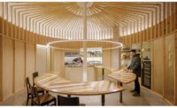
Over its threshold, though, is another world. Monolithic booths, “side chapels,” cast in sleek concrete, flank the surprisingly intimate, basilica-like main space, where a 34-foot-long concrete communal table runs down the central aisle beneath the 27-foot-high peaked ceiling. At one end of the axis, a daylit dining alcove offers a table for 16; at the other end, the nave descends a few steps into the mystically lit bar area (or is that the altar?). Not surprisingly, couples have begun booking the restaurant and its courtyard for weddings. But what makes this striking though potentially stark interior unexpectedly warm are its unusual, well-balanced proportions, its rhythms of new against old, and a lighting scheme that deftly seasons it all.
The Workhop is chef-owner Michael Beckman's first restaurant. To create a backdrop for his market-to-table, Mediterranean-inflected New American cuisine, he sought architects who would, he said, “respect and enhance, not mask, the beautiful Colonial bones” of the 3,500-square-foot space. With co-owner Joseph Mourani, a Beirut-based restaurateur who was Beckman's classmate at culinary school in Lyons, France, he enlisted design talent with a decisive Lebanese twist: SOMA, a small, youthful firm with offices in New York and Beirut, and .PSLAB, lighting designers/manufacturers headquartered in the Lebanese capital.
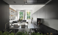
In pairing new and existing architectural elements, SOMA's strategy was counterpoint. So the contemporary concrete insertions play against cadences of old wood trusses and clerestory windows, without touching ceilings, walls, or other original features (though only the exterior is landmark-protected). Tall booths accentuate the hall's verticality—and also effectively reduce its width, giving the communal table a more congenial zone.
A goal was to vary intimacy levels within the 98-seat restaurant, says SOMA lead designer Steven Townsend, who likens the booths to “cabanas around a hotel pool: you're in your own little villa watching the show, but still participating in the larger scene.”
Spatial logistics required cast-in-place concrete, while budgetary constraints inspired architecture performing double duty as furniture. Leather upholstery and the bar's gypsum ceiling (thinly concrete-coated) soften the acoustics.
Besides laid-back crowds—men in shirtsleeves or black T-shirts, women in summery dresses, and occasional diners in shorts and flip-flops—the lighting also mellows (and sparks) the mood. .PSLAB met SOMA's industrial aesthetic with exposed, yet warm, halogen bulbs and parallel arrays of black conduits, as in the bar and alcove. LED strands glow at the bar's base and behind bottles; a tabletop variation on the black multi-conduit theme illuminates the booths; and a long line of custom fixtures resembling light-tipped microphones hangs from the ridge beam, down near the communal table, acting almost like a canopy over it.
With a glow on the food and a din of conversation filling the Workshop, a meal might end with Meyer-lemon tart and gingered beet sorbet—echoing the architecture in its zest-inflected earthiness and play of contemporary elements against an old classic.
Sarah Amelar is a contributing editor of RECORD.
Architect: SOMA — Michel Abboud, principal
Size: 3,500 square feet
Cost: $875,000
Completion date: October 2012
People
Architect:
Architect of record:
Engineers:
Client:
Lighting consultant:
General Contractor:
Size:
Cost:
Completion date: |
Products
Kitchen entrance door:
Acoustical ceilings:
Paints and stains:
Hardware: Schlage;
Floor and wall tile:
Chairs: |


