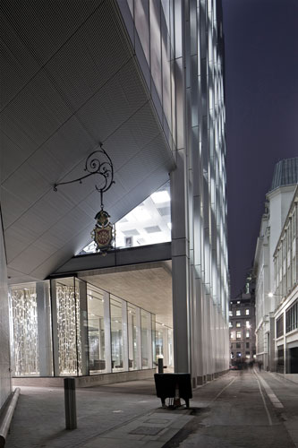
New Court Rothschild Bank
Banking on History: OMA tucks a new home for London's storied Rothschild headquarters into a tight site in the city's financial district.


Architects & Firms
London
A sense of tradition endures in “The City,” London's historic financial district, despite years of economic turmoil. Bankers may have abandoned the bowler hat and sometimes even the necktie, but not the well-cut Savile Row suit. And if you turn off King William Street, a few steps from the venerable Bank of England, onto the narrow medieval St. Swithin's Lane, you'll encounter another kind of bespoke: a work of custom-tailored contemporary architecture so artfully stitched into the tight urban fabric that it seems a perfect fit.
The Rothschild family has occupied this discreet plot, called New Court, since 1809, and its new headquarters is the fourth building the private bank has constructed on the site. The last—a 1960s six-story office block—was inadequate for the rapidly expanding staff, and in 2006, OMA won an invited competition to design a building that could accommodate the entire Rothschild team under one roof. The former building was razed to make way for the new.
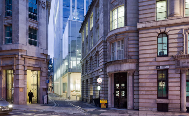
Unlike much new London architecture, this is not an iconic object: So densely built is the neighborhood into which OMA's glass-and-steel frame structure is inserted that there's no way to capture the entire building in a photograph. Jammed up against a curvaceous dark-glass office building by Foster + Partners that Londoners have dubbed “Darth Vader's Helmet,” the new Rothschild bank is so close that the two buildings “are kissing,” says Ellen van Loon, the OMA partner in charge along with Rem Koolhaas. Tucked behind the helmet is a Queen Anne house, now a private club.
But for OMA, this intense pressure turned into a creative virtue. What's especially significant about the design is the brilliant—even virtuous—gesture to its urban context. The architects have generously carved an open forecourt out of the first floor, so as you amble down St. Swithin's Lane, a view is suddenly revealed through the new bank building into an ancient churchyard and the back of St. Stephen Walbrook, a 17th-century gem by Sir Christopher Wren (it was his own parish), with a copper dome and a sublimely simple spire—an intimate vista that was obscured for generations.
To create the 140,000 square feet that the Rothschild bank required on the small odd-shaped site was, of course, an enormous challenge. The building had to be tall—and in London, where a “right to light” law has been on the books since the 17th century, that meant getting permission from all the neighbors (there were 16 separate legal agreements). The building's footprint is shaped roughly like a fat “T”: The scheme is based around a central block, composed of 10 floors of open-plan offices (and a roof garden), with three adjoining “annexes” wedged in that contain private offices, meeting rooms, and the circulation core. Atop the central block, a small tower, the Sky Pavilion, juts up two double-height spaces with views of the city. At 246 feet high, the building's been dubbed a “mid-scraper.”
The knitting together of old and new runs continuously through the Rothschild design. Unlike most curtain-wall systems, the load-bearing steel columns are strongly expressed on the exterior, while inside, the expansive glazing is treated as flush. The steel columns on the ground delineate a transitional layer of space from the public street to the semiprivate forecourt. The effect is rather like the portico of a classical building, emphasized by the wide travertine steps up to the forecourt. A library-archive sits across the court from the main lobby, decorated with a witty nod to the Rothschild roots: Portraits of the five brothers, who each headed a branch of the family, appear etched into the glass front of the reading room.
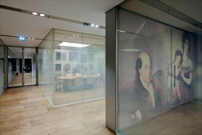
The interior spaces are serene, crisply detailed, and quietly embellished with a variety of rich materials. In the capacious lobby, hung with ceiling-to-floor curtains by Petra Blaisse, is a wall of metal mesh, which also lines the elevators. Up on the light-filled private banking floors, laid with traditional oak, the designers artfully deployed a few antiques from the Rothschild collection: Old portraits in heavy gilt frames crowd together on a wall sheathed in aluminum, and some paintings inspired a scrimlike treatment on the glass walls enclosing conference rooms. Custom black-and-white tapestries echo history while looking contemporary. “We tried in certain ways to play with English traditions but in a modern way,” says van Loon.
From the dramatic event space at the top of the Sky Pavilion, you can look out across “The City's” skyline at the crazy quilt of architecture from every era—from St. Paul's Cathedral to James Stirling's No 1 Poultry to Foster's Gherkin—that makes up modern London. In such company, this clever, urbane new building may not have an iconic look, but it more than holds its own.
Completion Date: November 2011
Size: 140,000 square feet
Design Architect: Office of Metropolitan Architecture
People
Design Architect:
Local Architect:
Consultants: |
Products |


