Clyfford Still Museum by Allied Works
Denver




Architects & Firms
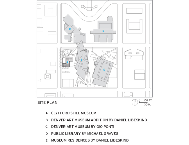
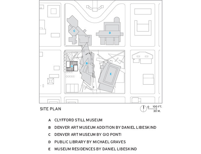
Surrounded by a gaggle of noisy architectural neighbors, the new Clyfford Still Museum in Denver makes itself heard by speaking softly but clearly. Instead of the thunderbolt lines of Daniel Libeskind's addition to the Denver Art Museum next door, the quirky massing of Gio Ponti's 1971 North Building for that museum across the street, or the grandiose Postmodernism of Michael Graves's Public Library a block away, Brad Cloepfil's two-story Still museum is a calm haven for viewing the work of the pioneering Abstract Expressionist who died in 1980.
Additional Content:
Jump to credits & specifications
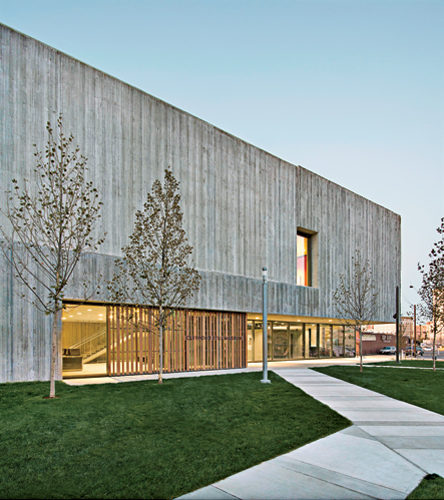
A poured-concrete box relieved by bands of glass and screens of vertical wood slats, the 28,500-square-foot museum sits behind a small grove of plane trees that are expected to grow to the same height as the building. The grove separates the museum from the hectic setting, providing a peaceful transition from sidewalk to entry. As the trees fill out, they will serve as a natural veil, conveying the idea that this piece of architecture isn't about iconic form-making or striking street presence. Cloepfil and his team at Allied Works Architecture had a different goal: to create a richly textured, well-lighted environment for showcasing the work of a talented but cranky artist who all but dropped out of the art scene during the last 30 years of his life (see sidebar). According to Still's will, his collection of 2,400 of his artworks was to be given to an American city that agreed to keep it together and provide a permanent home dedicated to only his work. After his death, his widow spoke with a number of different cities, finally selecting Denver in 2004—though the North Dakota–born artist had no connection to the mile-high metropolis.
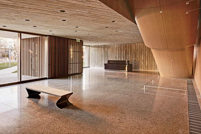
To connect the building to the earth, Cloepfil looked to geology. “I wanted the building to have a mineral quality,” says Cloepfil. “The idea was to make one body with a simple form that opens up as you move inside it,” he adds. At first, he imagined cladding the building with obsidian, and even used charcoal for his initial models. Eventually, he shifted to poured concrete, using wood formwork to create a range of effects—from a smooth finish touched with the wood's fine grain to a rough “corduroy” surface with projecting fins. The contractor created the fins by beveling the sides of some of the formwork boards to leave gaps; when the boards were pulled off, parts of the fins' outside edges broke off to produce a jagged surface. The fins' irregularity is an essential part of their character. Cloepfil also varied the spacing between the boards to create varied visual rhythms and to change the texture of the large concrete planes.
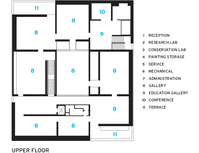
Driving everything was the need to light the galleries to best show off the art. “My main concern was making the paintings look amazing,” states Cloepfil. So he placed all the museum's nine galleries on the second floor and brought daylight into six of them from above. To diffuse the light, he suspended a perforated, cast-on-site, concrete screen four feet below skylights. A beautiful object in its own right with oval perforations and sensuous lines, the screen dapples daylight and captures it in ever-changing ways while protecting the art from direct sunlight. (Read more about the daylighting scheme.) Corduroy-concrete walls on both the outside and inside of the building play a similar role: catching sunlight as it changes during the day. “I wanted the body of the building to feel like the source of light,” explains the architect.
On the ground floor, Cloepfil arranged a pair of painting storage rooms and a conservation lab along a two-story-high corridor lined with exhibits on Still's career. Large glass doors allow visitors to see the paintings on storage racks and to peek into the lab. Still dictated in his will that the museum not include a café or bookstore, so the building is free of the usual commercial spaces that often distract attention from the art.
“What struck me about Brad's approach,” recalls Dean Sobel, the museum's director, “was that he started by going to the places where Still grew up—Alberta and western Washington—not by looking at the paintings.” The long, flat plains, river gorges, and low light informed Cloepfil's design, helping to shape the interplay of light and shadow and the balance between compressed spaces such as the low-ceilinged reception area and expansive ones like the 17-foot-high skylit galleries.
As he has in many of his other buildings—such as the Museum of Arts and Design in New York City and the Wieden + Kennedy headquarters in Portland, Oregon—Cloepfil set up an intriguing dialogue between solid and transparent, insinuating light into what at first appears to be a mostly opaque building. By inserting narrow, two-story spaces between some of the galleries, he provided views down to the first-floor corridor and across into other galleries. He also carved out a pair of second-floor, screened terraces where visitors can go for breaks from viewing art. As a result, light seeps into the building in many different ways, and what seems in plan to be a simple nine-room grid turns out to be much more complex as you move through it. “Inside, the building feels big, even though it isn't,” says Sobel.
With Libeskind's building looming directly behind it, the Clyfford Still Museum stands its ground thanks to a muscular concrete structure and richly textured envelope. But what makes the building truly memorable is the way Cloepfil animated its squat volume with a series of fluid spaces dressed in filtered daylight and proportioned for viewing the iconoclastic artist's dramatic works.
ARTIST PROFILE:
Painting big with an ego to match
Speaking of his own painting, Clyfford Still once warned, 'Let no man under-value the implications of this work or its power for life'or death, if it is misused.' He dismissed most art as 'symbols of obeisance to'or illustration of'vested social structures, from antiquity through Cubism and Surrealism to my then immediate contemporaries, [which] were impaled and their sycophancy exposed on the blade of my identity.' Wow. Such megalomania makes Julian Schnabel or Damien Hirst seem positively modest. But is it bragging if you can back it up? Because back it up is what Clyfford Still almost certainly did.
Still (1904'80) was part of the Abstract Expressionist school that made New York the capital of the art world in the late 1940s and '50s. But he wasn't particularly Expressionist. He didn't pour paint on canvases on the floor as did Jackson Pollock, nor tuck glimpses of human figures and landscapes into visceral skeins of paint like Willem de Kooning. Instead, Still carefully crafted large, ripped-edge, subtly undulating fields of contrasting, full-strength colors on vast areas of canvas. (Some measure more than 9-by-12 feet.) He fussed with the edges of his tapering forms in an epic struggle to have it both ways, compositionally (and existentially): shapes that never end versus shapes that must inevitably end.
Critics considered Still—along with Mark Rothko and Barnett Newman—to be part of a style called the “Abstract Sublime.”
Still formed his identity from his upbringing on farms in western Canada and Washington state. He never wanted to be anything other than an artist and began by depicting laborers. But over time, he abstracted those figures into more universal forms that finally melted into the paint of which they were made. By 1945, he'd gone totally abstract. Still lived for a time in New York where he occasionally found himself among the boozy Abstract Expressionists who hung out at the Cedar Tavern in Greenwich Village. But he hated what he called the 'competitive atmosphere' of the New York art scene and moved to rural Maryland in 1961. There, he developed the odd habit of painting near-duplicates of many of his big canvases, which partly explains why he was able to hold on to an astonishing 94 percent of his output. These 800 paintings and 1,600 works on paper now constitute the collection of the new Clyfford Still Museum in Denver. Is the work of this sublimely cantankerous painter strong enough to justify a monographic museum that will never exhibit the work of anybody else? On the basis of having seen, repeatedly over the years, that selection of Still's work in the public domain, my answer is an emphatic yes. — Peter Plagens, painter and art critic
Cost: $15.5 million
Completion date: November 2011
Gross square feet: 28,5000 sq.ft.
PeopleOwner: Clyfford Still Museum
Architect: Allied Works Architecture Personnel in architect's firm who should receive special credit:
Allied Works Architecture
Engineer(s): KPFF – Consulting Engineers, Structural
Consultant(s): Landscape: Reed Hilderbrand Associates Lighting: Arup Architectural Concrete: Reginald D. Hough FAIA Building Envelope: Simpson Gumpertz & Heger
General contractor: Saunders Construction
Photographer(s): Jeremy Bittermann and Raul J. Garcia/Courtesy Clyfford Still Museum
Renderer(s): MARCH
CAD system, project management, or other software used: Vectorworks |
ProductsStructural system Cast-in-place architectural concrete
Exterior cladding Rainscreen: Stained Western Red Cedar rainscreen walls Wood: Stained Western Red Cedar window and terrace screens Other cladding unique to this project: Board-formed architectural concrete walls
Windows Wood frame: Stained mahogany windows by Dynamic Architectural Windows & Doors
Glazing Glass: Skylight glazing byOldcastle BuildingEnvelope, Window glazing by Dynamic Architectural Windows & Doors Skylights: Aluminum framed skylight system bySkyline Sky-Lites
Doors Wood doors: Stained mahogany doors by Dynamic Architectural Windows & Doors
Interior finishes Cabinetwork and custom woodwork: Custom casework Paneling: Stained Western Red Cedar wall cladding Special interior finishes unique to this project: Ground & polished concrete floors, Stained white oak wood flooring
Furnishings Reception furniture: Allied Works-designed lacquered reception desk and retail kiosks Other furniture: Allied Works-designed wood & glass staircase, Allied Works-designed painted wood exhibit casework and Allied Works-designed steel gallery benches and lectern
Lighting Downlights: Gallery Lighting by Lite Lab |


