Ed Roberts Campus


Architects & Firms
Berkeley, California
With its grand roof canopy and sweeping entry plaza, the Ed Roberts Campus welcomes everyone into its fold. The 82,500-square-foot building, which sits atop a Bay Area Rapid Transit (BART) station in a scruffy part of Berkeley, sends a powerful message of inclusiveness to the diverse groups of people who work in and use it, as well as the neighborhood around it and, indeed, the world beyond. As the new home of 10 organizations serving people with many different kinds of disabilities, the center caters to the specific needs of people who have been shut out of buildings in the past or brought in through the backdoor ramp. But its architecture speaks to everyone, using a design vocabulary that emphasizes the universal, rather than the particular.
Many people walking by or heading to the BART station have no idea the building provides offices and meeting spaces for groups helping individuals with special needs. That's exactly what these groups like about it. "We didn't want it to look institutional, like a hospital," states Dmitri Belser, executive director of the Center for Accessible Technology (CforAT) and president of the Ed Roberts Campus (ERC). Of the 10 tenant organizations, seven are ERC partners and serve on the board of directors. "We wanted it to be open to everyone," he explains. "Buildings that shut us off from others imply there's something shameful about having a disability," says Belser, who is legally blind. One piece of evidence pointing to the building's broad appeal is the story of a local couple with no disabilities who liked the place enough to rent it for their wedding in June.
The project began in 1995 right after Ed Roberts, an activist for people with disabilities, died. The first student with significant disabilities to attend the University of California at Berkeley and the first disabled person to serve as California state director of rehabilitation, Roberts inspired and led a movement to bring handicapped Americans into the mainstream of society. To honor his legacy, many of his admirers decided to create a place where some of the groups he influenced could come together and carry on his work.
Instead of looking for an architect with expertise in accessibility, the ERC searched for one who could deliver good design. In 1999 it interviewed a number of firms and ranked San Francisco'based Leddy Maytum Stacy Architects (LMSA) second. But after working with its first choice for a couple of years and not being completely satisfied, the client switched to its backup led by principal William Leddy. "Bill Leddy got it immediately and took the time to educate himself in the needs of the building's users," says Yomi Wrong, executive director of the Center for Independent Living, an ERC partner organization. "He drank the Kool-Aid," she adds with a laugh.
"This client group was incredibly committed and tenacious," recalls Leddy. "They had this dream that was such an ambitious stretch for them. None of these organizations had ever raised much money before, but here they were putting together a $47 million project." Some of the money came from the city of Berkeley, some from federal transportation funds (because the campus adjoins a mass transit station), and much of the rest was raised by the ERC partners.
Although many people think of Berkeley as a place populated by students, well-off liberals, and foodies with palates trained at Chez Panisse, the city has some less affluent areas. South Berkeley, where the ERC is located, is one of those neighborhoods, in part because the construction of the Ashby BART station in the early 1970s left a large hole in the urban fabric. "This was an unloved part of town," states Leddy. Facing Adeline Street, a main artery connecting Berkeley with Oakland, the ERC fills an urban void, acting as a low-rise, civic building block. It helps stitch a residential neighborhood on its east side to the more commercial activities along Adeline on the west.
CONVERSATION WITH Susan Henderson
Disability Rights Education and Defense Fund
"From the very beginning, it was clear to us that this building was about developing the best design for everyone," states Susan Henderson, executive director of DREDF, a national civil rights and policy center founded in 1979. "It wasn’t just a place where we met code." Trained in anthropology and business, Henderson found the design process "exciting," even though it involved long meetings on bathroom stalls and door knobs. Because some people on the building committee were blind, the architects had to develop new ways of communicating their ideas. So they devised solid models and tactile floor plans printed on embossed paper that people with impaired vision could explore with their fingers.
"Sometimes there were disagreements among people with different disabilities," recalls Henderson. "But we always found a solution." For example, when people in wheelchairs said they hated the raised bumps in flooring that help the blind find their way around, the architects specified grooves recessed in the floor instead.
What works for specific groups, though, often works for everyone, she explains. The central court with its tables and chairs has proved to be as enticing to visitors without disabilities as those with. The ERC has also found it can generate revenue renting out its meeting rooms and even its lobby, where one bride walked down the ramp to be wedded to her groom.
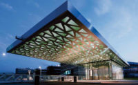
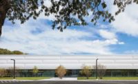
Despite all these urban design moves, the building elicited a significant amount of local opposition ' in part because of its size and in part because of the special needs of the people it would serve. Responding to neighborhood concerns, the ERC agreed to reduce the building's height from three to two stories. To break down the long Adeline Street elevation, LMSA varied the materials and facade treatment and carved out a central plaza where cars can drop off people without slowing down traffic. An open-frame steel canopy cantilevering 30 feet out toward Adeline brings daylight down to the entry plaza, while ip' wood screens the north and south portions of the facade. The wood elements echo the shingles found on many houses in the area.
"Our focus on mission-driven work made us a good fit for this project," states Marsha Maytum, another principal at LMSA. The firm has designed a number of low-income and affordable housing projects, along with schools, sustainable workplaces for organizations such as the Thoreau Center and the Natural Resources Defense Council, and cultural facilities for the California Shakespeare Theater and the Bay Area Discovery Museum.
The ERC clients asked the architects to take a "visionary" approach to the building, recalls Leddy. "They wanted it to be a case study of integrating universal and sustainable design, one that could be replicated by others and flexible enough to evolve over time." So the architects mostly used economical, "off-the-shelf" components and avoided expensive new technologies such as infrared wayfinding devices. As these technologies become more widely available and less expensive, they can be added to the building.
While universal design ' a somewhat vague set of principles aimed at creating buildings, interiors, and products usable by nearly everyone in society ' has been applied to individual homes and certain residential projects, it has rarely been attempted at such a civic scale, says Leddy. The architects did a lot of basic research, a process made more challenging by the continually evolving nature of the field. "Standards for universal design are changing all the time," says Leddy.
CONVERSATION WITH Yomi Wrong
Center for Independent Living
"This building has raised the bar," states Yomi Wrong, executive director of the CIL, the largest tenant at the ERC. "Organizations from other cities and countries want to come here and tour it." Wrong, who uses a wheelchair, is an engaging tour guide, explaining how the building has improved the efficiency and morale of her staff, how its connection to a BART station has increased the number of people using her group’s services, and how its architecture entices even people without disabilities to come inside. "The ramp is the most stunning part of the building," she exclaims. But it also provides her with peace of mind. "It’s empowering to know I can get out on my own and not have to rely on anyone else."
"We weren’t really sure how well the building would work," she says, because it had to accommodate a lot of different kinds of people. But she has become a believer, as she has discovered how easy it is now for her to get into and move through the building. "I’m able to get everywhere now." She also says the building makes an important statement about her organization. "It says we’ve grown up and become more established, more prominent."
Universal design goes beyond the rules set out by the Americans with Disabilities Act (ADA) of 1990 by accommodating groups of people not covered by the act, such as those without the use of their arms or those with sensitivities to chemicals, explains James L.E. Terry, chief executive officer of Evan Terry Associates, an accessibility consultant on the project. "While there are some buildings designed for specific groups that have accessibility features not found at the ERC, I don't know of any that has as many features in one place," he says.
Instead of viewing universal design as a set of rules constricting the architecture, Leddy saw it as "just good design." He adds, "I don't want architects to think of it as being something different or something they need to be certified in."
To help themselves understand the scope of universal design, the architects broke it into six categories: 1. the physical environment (including the way people approach and arrive at the building, move through it, understand its organization, and engage with its life-safety features); 2. the visual environment (including daylighting, electric lighting, visual contrasts, and wayfinding); 3. the acoustical environment; 4. the thermal environment (including natural ventilation and filtered outdoor air); 5. the electronic environment (including security, communications, and digital access); and 6. the chemical environment (including using materials that don't emit volatile organic compounds or other toxins).
Many of the things LMSA did at the ERC to help people with disabilities, such as using daylight to assist the blind with wayfinding, are good for everyone. For example, the architects brought sunlight into a covered central court through a set of circular skylights and used long skylights and clerestory windows along second-story walkways. Likewise, specifying operable windows wherever possible and nontoxic materials creates healthier indoor-air quality, which helps everyone, not just people sensitive to chemicals.
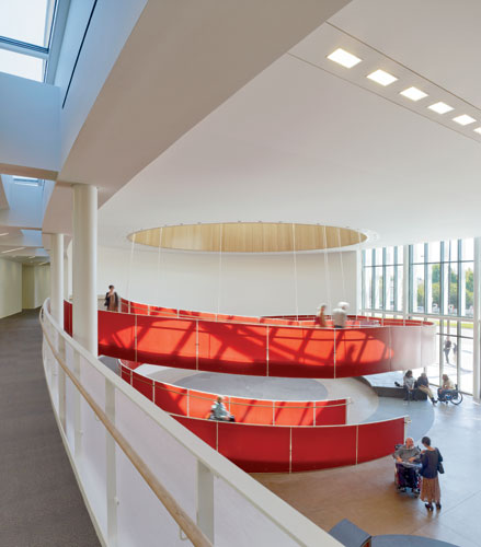
Leddy and his team even treated elements that might at first seem to be clearly aimed at disabled people ' such as the building's 56-foot-diameter ADA ramp adjacent to the lobby ' as design opportunities rather than code-compliance problems. So instead of tucking the ramp off to one side, the architects celebrated it as the building's iconic element and put it front and center. The helical ramp with its translucent red resin balustrade panels is suspended from cables attached to its inside radius, so it seems to float when viewed from other parts of the lobby or the central court. A large skylight with boards of warm bamboo lining the light well sits above the ramp.
By making the ramp 7 feet wide, the designers created enough space for two people in wheelchairs or a person in a chair and one on foot to descend together without having to break off a conversation.
CONVERSATION WITH Dmitri Belser
Center for Accessible Technology
"This building tells our story," states Dmitri Belser, executive director of CforAT, an organization that trains disabled children and adults to use computers and helps companies, libraries, and government agencies make their websites accessible to everyone. "Look at the ramp," he continues. "Bill Leddy took something that most architects would see as a necessary evil and made it the proud focus of the building." The ramp, though, is more than just a powerful symbol. It encloses a space that the ERC uses as an exhibition area where history, art, and the politics of disability rights come together. It also works well in moving people with all kinds of disabilities from upstairs to down. The day after the ERC opened, a smoke emergency occurred and firefighters came racing over, recalls Belser. "They got here pretty fast, thinking they would need a lot of time to get people out of the building. When we told them everyone had already gotten out on their own, they couldn’t believe it."
The building serves a number of critical needs, explains Belser. "It fosters collaboration between the various agencies here and it gives the disability community a real presence." He says the building has helped his organization develop a national profile and gives it greater credibility with foundations and other agencies that provide grants.
Some design decisions, though, involved "dueling disabilities," which meant that helping one group might disturb another. For example, the highly textured floor surfaces that visually impaired people use as directional clues can be uncomfortable for those in wheelchairs. And the hard surfaces that wheelchair users like to roll on can create acoustical problems for the hard of hearing. Working with the various user groups, LMSA made trade-offs in some instances and found compromises in others. The firm developed textured floor surfaces that are more gentle on wheelchairs than the typical raised "buttons" and supplemented these with contrasting colors. It specified concrete floors in the public spaces with the most wheelchair use, but angled walls to diffuse sound and used a special stretch fabric on the central court's ceiling to absorb sound. In general, the architects tried to create a quiet environment, but they used acoustical accents ' such as a fountain at one end of the court ' to provide wayfinding clues for the blind.
Many of the accessibility features are fairly simple, but rarely used in other buildings. For example, in elevators and elevator lobbies, control buttons near the floor can be pushed by wheelchair users with their feet if they can't reach the usual set with their hands. Double-sided elevators allow wheelchairs to exit without having to turn around. Automatic doors with long-range card readers provide hands-free access. And signage at different heights ensures that everyone can see where to go, no matter if they are in wheelchairs or standing.
Restrooms are always an important issue for disabled people. To accommodate different needs, the building offers a range of bathroom options, including stalls with hand-grips on the left and others with them on the right, and some large enough for a caretaker to help out.
Most offices have occupancy sensors to turn lights on and off automatically, which helps disabled people and saves energy, too. The sensors, along with plenty of daylighting, operable windows, and other green components, make the building perform 15 percent better than California's strict Title 24 energy code.
But Leddy's goal for the ERC was a lot more than assembling a laundry list of strategies and features in one building. "It's a social justice issue," says the architect. "How do we make architecture open to everyone? It's about celebrating diversity, not just accommodating disabilities." He cites the story that Louis Kahn told about building a beautiful bench into a stair landing, so an old man walking with his grandchild could rest for a moment without calling attention to his infirmity. Leddy says he approached this building as he would any other, searching for "the poetic and aesthetic aspects that would make it attractive to everyone."
Completion Date: November, 2010
Size: 135,000 square feet (gross); 82,500 square feet (occupied floor area)
Total construction cost: $36 million (warm shell, including site work and transit interface)
Architect
LEDDY MAYTUM STACY Architects
677 Harrison Street
San Francisco, CA 94107
T: 415.495.1700
F: 415.495.1717
PeopleOwner: Ed Roberts Campus Architect Personnel in architect's firm who should receive special credit: Engineer(s) Consultant(s) General contractor(s) Photographer(s) Renderer(s) CAD system, project management, or other software used: AutoCAD |
ProductsExterior cladding Roofing Glazing Doors Hardware Interior finishes Furnishings Lighting Conveyance Plumbing |


