Cambridge Public Library
Legible and Luminous: William Rawn’s pristine glass box for the Cambridge Public Library quadruples the size of the original historic building.


Architects & Firms
Cambridge, Massachusetts
Anyone who doubts the relevance of libraries in the age of e-readers, amazon.com, and the iPad should visit the new central branch of the Cambridge Public Library (CPL), in Cambridge, Massachusetts. They will find patrons borrowing the latest James Patterson thriller, parents reading to small children, people taking advantage of the free Wi-Fi, and community groups using the building’s meeting spaces.
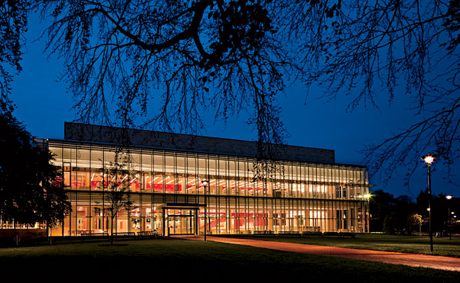
To more appropriately respond to the granite-and-sandstone original, the architects created a three-story, steel-framed structure with a crystalline glass facade, 180 feet long and 42 feet tall. Rawn’s building serves as the library’s main entry, meeting at grade a surrounding grassy 4-acre city park revamped by landscape architect Michael Van Valkenburgh in tandem with the library’s expansion. The new transparent building provides a foil for Van Brunt & Howe’s library — a solid, bearing-wall object with its first floor elevated several feet above the ground. “The best way to honor the old building was with one that was genuinely contemporary,” says Pamela Hawkes, FAIA, an Ann Beha Architects principal.
One of the major impediments to realizing the design team’s vision for a dematerialized structure was the glazed facade’s southwest exposure and the associated potential for heat gain and glare. This orientation was practically a given, according to the architects, because of the proximity of a public high school bordering the park and a city requirement that the front facades of the new and historic buildings align.
To preserve the concept of transparency and ensure the thermal and visual comfort of the occupants, the CPL project team devised a double-skin curtain wall of low-iron glass [Architectural Record, July 2009, page 102]. Its two layers, supported by a structure of vertically oriented Vierendeel trusses detailed to be as unobtrusive as possible, define a 3-foot-wide cavity that acts as an insulating jacket: Dampers at the wall’s top and base can be opened or closed, depending on the season, to vent or retain the warm air that collects within. The cavity also incorporates internal shading devices that shield the library interior from direct sunlight while allowing indirect light to penetrate more deeply.
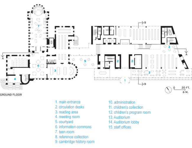
Behind the pristine glazed wall, the atmosphere is more like an appealing book emporium than a public library. The first- and second-floor slabs cantilever 15 feet from structural columns to define a reading area at the building perimeter with unobstructed views of the park. Beyond, the collections are displayed in open shelves. And on the first floor, patrons are permitted to eat and drink (except at computer terminals) and chat. “We were going for a cross between a bookstore and a library,” explains Flannery.
Dividing the new building’s roughly rectangular floor plate nearly in half is a circulation zone, defined by a lipstick-red wall, ceiling, and terrazzo-clad grand staircase. The eye-popping color, visible from the park especially at night, contrasts with more subdued and natural materials such as schist and maple. Daylight further enlivens the space, entering not only from the double-skin facade, but from multiple directions, including from a skylight over the stair.
The mood is altogether different in the reading room of the historic building, which visitors reach by way of a bridgelike, glass-enclosed connector. Here they find a vaulted, oak-bookshelf-lined space, with newly restored WPA-era murals illustrating themes relevant to books and libraries, such as the history of papermaking and printing and the development of the Dewey Decimal System. The room’s other plaster surfaces, which had been white for decades, are now, after paint analysis, returned to their original earthy palette of terra-cotta, ocher, and olive. The result is the kind of pleasingly cocoonlike environment that one would expect from a late-19th-century reading room.
One of the more surprising spaces in the historic building is the teen lounge, occupying what had been the second and third levels of the library’s stacks. Architects have inserted an aluminum-grid ceiling, with mechanical systems visible above, and left the brick walls exposed, maintaining the almost industrial feel of this former back-of-house area. According to Flannery, the room is regularly full to capacity after school with students doing homework, surfing the Internet, and reading while sitting on restaurantlike banquettes or stretched out on beanbag chairs. “We worked hard to make sure that popular and lively programming was housed in the old building,” she says.
This room is an example of imaginative adaptive reuse, and it also typifies the approach that has made the CPL project a success: The architects have managed to provide spaces, within both the new and old structures, with a variety of distinct characters that appeal to a broad spectrum of users. At the same time, they’ve found a way to greatly expand a historically significant building without compromising its relevance.
People
Architect
ASSOCIATE ARCHITECT (Historic Building Architect)
LEAD ARCHITECT
ASSOCIATE ARCHITECT (HISTORIC BUILDING ARCHITECT)
Architect of record
Associate architect(s)
Interior designer:
Engineer(s):
MEP Engineer:
Civil Engineer:
Consultant(s)
Lighting:
Acoustical:
IT and A/V/:
Facade Consultant:
General contractor:
Photographer(s)
Chuck Choi
CAD system, project management, or other software used: |
Products
Structural system:
Metals:
Steel Construction:
Exterior cladding
Metal/glass curtainwall: (Historic Building) Novum
EIFS, ACM, or other:
Roofing
Metal:
Tile/shingles:
Other
Windows
Aluminum:
Glazing
Skylights:
Doors
Metal doors:
Wood doors:
Fire-control doors, security grilles:
Hardware
Closers:
Exit devices:
Interior finishes
Suspension grid:
Cabinetwork and custom woodwork:
Paints and stains:
Wallcoverings:
Paneling:
Plastic laminate:
Special surfacing:
Floor and wall tile (cite where used):
Resilient flooring:
Carpet:
Furnishings
Reception furniture
Chairs:
Tables:
Upholstery:
Lighting
Downlights:
Exterior:
Controls:
Conveyance
Plumbing |


