Dallas Center for Architecture
A winning competition entry provides a highly visible buzz for the new Dallas Center for Architecture.
Dallas, Texas
Peter Doncaster, AIA, Booziotis & Co.
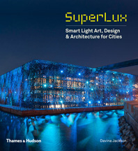
How do you grab the attention of motorists hurtling along on their evening commute in an auto-centric city like Dallas? How about creating an enigmatic sequence of intense colored light reflecting out toward the expressway from behind the window wall of an adjacent office building? This is the concept behind the new Dallas Center for Architecture (DCfA). A more difficult question to answer is: How to pull it off?
When their collaborative scheme was selected in a competition for the DCfA offices in February 2008, Peter Doncaster, AIA, of Booziotis & Co. in Dallas; Nicholas Marshall, AIA, of nodesign in New Orleans; and Gabriel Smith, AIA, of Thomas Phifer & Partners in New York, wondered just that. “Our concept was that there was an object inside,” says Doncaster. “And we knew we wanted it to light up—but that was it.”
The 7,400-square-foot project for the DCfA, an alliance formed by AIA Dallas and a handful of allied organizations, encompasses the ground floor of an unremarkable 1980s low-rise building. In addition to spaces for staff and support services, some areas must accommodate the public for exhibitions, lectures, and gatherings. While the location might lack in aesthetic distinction, it fulfilled AIA Dallas’s desire to expand the chapter’s public outreach by providing an expansive window wall that looks out on the neighboring Dallas Arts District. That adjacency is now partially obstructed by Woodall Rogers Freeway, a below-grade thoroughfare that skirts the northern perimeter of downtown. But plans are currently being developed for decking over the freeway to create a three-block-long urban park. This will encourage pedestrians to walk from the Arts District to the DCfA offices for public events.
The first step was to specify a light source, so the design team turned to Suzanne Branch of LUM Architectural Lighting Design Consulting in Dallas. Although the architects had T8 fluorescents in mind, Branch steered them toward color-changing LEDs, and then collaborated with Doncaster on mock-ups of materials for the luminous wall. They picked a translucent, acid-etched glass to wrap two meeting rooms. Eleven-foot-tall segments of the glass are installed in narrow-width facets to compose what the architects call the “crinkle wall.” Initially the team considered two parallel walls of glass, with LEDs installed between them, but that proved too costly. Instead, they sandwiched 40 custom-fabricated fixtures, spaced from 18 to 30 inches apart, within the crinkle wall and contiguous sheer white drapes. The fixtures, situated at the top of the wall, each contain 36 50-watt LEDs capable of emitting any color of the spectrum (16.7 million unique combinations) that work in concert on a preprogrammed “show,” such as a “sunset” that modulates from vibrant orange to blood red to deep purple. According to Branch, the knit voile fabric is a fortuitous compromise because it can be pulled back to maximize daylight, and closed in the evening when the intensity of the LEDs would make use of the room impractical.
Branch also specified the lighting for other areas in the office suite. “We were working to achieve LEED certification, so energy was a big issue. We did a number of things to help with that,” she notes, including the installation of automatic dimmers that adjust interior light levels according to the amount of available daylight. In the gallery space open to the public for periodic exhibitions, she used 20-watt ceramic metal-halide lamps on a track system.
All the consultants, including Branch, provided pro bono services. The three architects split $5,000 for their first-place competition entry. And while the project was not built precisely as submitted, Gensler principal Ted Kollaja, AIA, who served as the owner’s representative, is pleased with the final result. “The ultimate success” he notes, “has been proven by the unsolicited demand for participation by the allied organizations and other groups to use the space for meetings and special events.”


