Pacific Place Lobby


San Francisco
Atlanta-based developer Jamestown wanted its Pacific Place office building, at 22 Fourth Street in downtown San Francisco, to appeal to young tech workers with a lobby similar to that of a hip hotel. The existing entrance was clearly problematic. It was extremely long and had a bland corporate vibe, as expressed by generic drywall and marble. So the offices of STUDIOS Architecture and boutique firm Sand Studios collaborated to visually condense the seemingly endless 165-foot-long expanse, using a variety of lighting schemes to define distinct spaces.
The two firms decided to reimagine the long passageway as a series of individual rooms, using lighting and texture to give them personality. 'We wanted to bring the long, relentless space down to a tactile scale,' says Sand Studios principal Larissa Sand, who created the architectural elements and custom lighting, while STUDIOS addressed the shell.
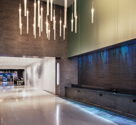
The corridor naturally divided into five segments defined by its structural bays. The design team created three distinct spaces: a lushly planted vestibule, an intimate caf', and a glowing reception area. At the entrance, the architects gave the facade a modern facelift, replacing an existing aluminum-mullioned curtain wall with point-supported glass. A series of steel-plate planters in varying lengths are stacked to create a floor-to-ceiling living wall. Gently illuminated with integrated LED lighting, these trough-like boxes extend outside through the glass and cantilever as much as 18 feet to give the building a distinctive street presence. Facing the living wall, a 24-foot-wide-by-10-foot-high indoor waterfall designed by Sand doubles as an unusual projection screen. Sand worked with Obscura Digital to project serene video of koi, whales, and more abstract footage. She also designed a chandelier composed of randomly spaced frosted-glass cylinders, intended to represent a cloud.
Separating the vestibule and the caf', as well as the caf' and reception, are two transition areas, simply lit with recessed lights and wall washers in order to place the focus on the main spaces. The walls of these two passageways are decorated with abstract black-and-white murals (a series of blown-up images by photographer Richard Barnes, of migratory starlings, dubbed Murmur). 'The idea was to alternate between expansion and contraction,' says Griffin.
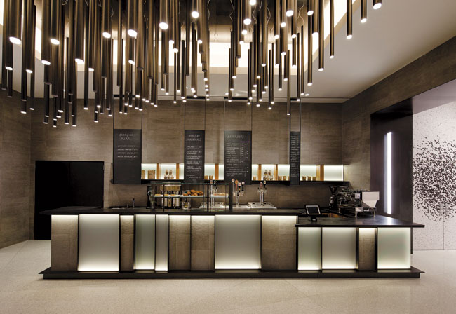
To make the most of the long space, the design team created the cavelike caf' halfway along its length. Here a lighting installation by Sand, comprising more than 100 rough steel tubes, defines a lowered, curving ceiling. The lamping'programmed to go on and off in a pattern that mimics light reflecting off ocean waves'has a subtly dynamic quality. Sand also gave the space a strong sense of materiality, with a long banquette made of maple wood reclaimed from old barns, a back wall tiled in lava stone, and a counter clad in interspersed panels of textured gray glass and textured limestone.
Deep into the building, at the end of this long tunnel, the building's occupants are greeted by a luminous backlit wall that frames four elevator doors. The wall was originally conceived as a simpler affair composed of point-supported blue glass, but Sand proposed a more visually interesting combination: a grid of cold-rolled steel is fitted with panels of blue glass that are individually illuminated from the bottom to create gradations of color. 'The way the LED strip lighting was integrated into the design of the frame gives so much depth and texture to the wall, for very little expense,' says Sand. 'It feels like the apse of a cathedral when you finally arrive here.'
People
Client:
Owner:
Architect:
Personnel in architect's firm who should receive special credit:
Engineers:
Consultant(s):
Digital Projection: Obscura Digital
General contractor:
Photographer(s): Size: 3,700 square feet Cost: withheld Completion date: November 2013 |
Products
Exterior cladding
Doors
Interior finishes
Wall tile: Terroxy Epoxy Resin
Furnishings
Lighting |


