Uniqlo
Enlisted to craft an understated yet visible Shanghai flagship for Uniqlo, Bohlin Cywinski Jackson teamed with Candela Lighting Design to transform a quirky existing structure into a lustrous icon for the popular Japanese brand.


Architects & Firms
Shanghai, China
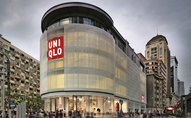
Shanghai’s Nanjing Road is the center stage of the city’s shopping culture. Its eastern end features a pedestrian zone with towers of neon signs competing for attention. Its western side has dramatic storefronts for high-end brands, including a brightly lit five-story suitcase for Louis Vuitton. In between, the Uniqlo global flagship store, designed by Bohlin Cywinski Jackson’s (BCJ) Seattle office for the popular Japanese clothing retailer, is a subdued player, without flashy lights or multistory logos. Instead the building relies on restrained architecture and lighting to make a quiet statement amid the noise, like a supporting actor stealing the scene with a simple gesture.
“We were interested in differentiating this building from what was around,” says Robert Miller, BCJ principal in charge. “I think people respond to subtle clues and discovery.” These subtle clues start at the new facade attached to an existing steel-reinforced concrete frame structure. A metal skin with a fluid pattern of perforations wraps the center three floors of the five-story building. By day, Shanghai’s typically gray sky gives the skin a solid appearance. By night, fluorescent lamps set inside the expanse of window frames reflect light off the back of display shelves and through the perforations. The reflected light produces a striated effect, suggesting the textiles of the clothing inside. This novel approach was created in part as a response to restrictions at the site that prohibited exterior lighting and mandated the original glass facade remain.
The building, said to be a former music school, brought additional challenges. BCJ addressed its triangular floor plan by arranging display areas and circulation into discrete lines and taking advantage of the rounded primary corner along Nanjing Road to create an entry rotunda with mannequins encased in clear cylinders that circulate on a track above. A white palette allows the colorful goods to “shine.” Such design choices were made to emphasize the Uniqlo brand. “Our product is very simple,” says Hiroshi Matsuoka, Uniqlo store design manager. “We asked the architect for a minimal design so that our product stands out.”
Lighting designed by Seattle-based Candela underscores the unpretentious scheme. Both ambient downlights and track lighting focused on display shelves are recessed into ceiling slots for an organized, clean look. A constellation of small LEDs, set into the ceiling at the ground level, continues out to a subway exit that runs through the building. Spotlights track the rotating mannequins at the rotunda entrance and radiate onto the street, while horizontal bars of translucent acrylic resin in the escalator’s metal wall panels reveal slits of white light, which draw shoppers up through the 32,292 square feet of retail space on three floors.
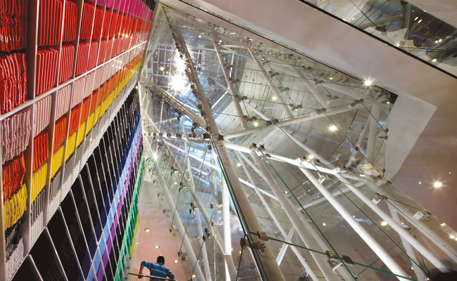
Within this quiet backdrop, the design does allow for a bit of drama. “Uniqlo was looking for 1,000 lux (or 100 foot-candles) for general lighting,” says Lauren MacLeod, Candela senior designer. “It’s a huge challenge when you start with that, because then when you want to really punch focal areas, your light levels have to be that much higher.” To help MacLeod achieve that punch, the architects inserted a hollow glass-and-steel “shard” through the floor plates, bringing the dramatic light and views to each level. Mannequins travel up and down through this jewellike tube on theatrical rigging, and directional spotlights at its base rotate, move to music, and change color and beam pattern.
With such varied lighting features, the architects thought they should be “green.” According to MacLeod, all of the lamp sources are energy efficient — ceramic metal halide, fluorescent, and LED — and come from a local manufacturer.
The combination of a Japanese client, an American design team, and a Chinese contractor working with a limited budget and a three-month construction schedule could be the plot for a tragedy. Instead, says Miller, the Uniqlo story ends with “a soft spot right in the heart of the neighborhood.”
People
Architect:
Engineers:
Consultant(s):
Other:
Photographers:
Renderer:
CAD system, project management, or other software used: |
Products
Contact name and phone number should we have additional questions on specifications
Structural System
Exterior cladding
Glazing
Doors
Interior Finishes
Furnishings
Lighting Ceramic Metal Halide ETC Source Fours ParNEL spotlights single high powered moving light stand at base (programmed to rotate, change color, beam pattern, strobe, and move to music) Rotunda Lighting: Similar to the Glass Shard lighting with moving lights that pan, rotate, strobe, change color and beam spread, lighting the rotating mannequins as well as the pavement outside the store entrance. Light Box: simple fluorescent striplights inside the existing window frames to light the back walls of the display units provide an even glow. Interior Lighting: recessed slot in the ceiling containing track lighting to illuminate the floor to ceiling shelving (perimeter) recessed downlights (general illumination)
Add any additional building components or special equipment that made a significant contribution to this project |


