Boston, Massachusetts
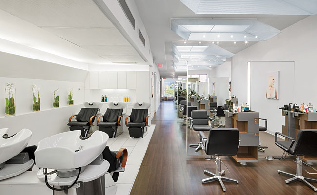
After more than 20 years at Vidal Sassoon, styling hair and managing operations in London and North America, Peter Bradley teamed with Sassoon colleague Dirk Diegel to launch an upscale establishment in Boston, where the German-born Diegel had been based for 14 years. Dubbed “a salon that transcends trends and celebrates individual beauty,” the pair’s two-year-old eponymous business makes its home on the second floor of a typical row house in the city’s tony Back Bay neighborhood. The spare yet comfortable space, designed by Studio Luz Architects, not only communicates the owners’ mission; it provides a well-lighted, functional arena for the precision haircuts and meticulous color treatments performed by the shop’s numerous stylists.
Gallery-quality, shadow-free illumination with accurate color rendering was among the clients’ top priorities. Architects Hansy Better Barraza and Anthony Piermarini, Studio Luz coprincipals, anticipated a challenge when they first saw the 1,200-square-foot floor-through site, a former spa that had been sectioned into a warren of closed rooms. But as the interior was being demolished, they discovered three skylights blocked off by the existing ceiling in the back half of the 92-foot-long space, which becomes the building’s top floor at that point. (The front of the shop has two floors above it.) “It was a great discovery!” notes Piermarini — one that would define the overall design strategy.
Once the work crew cleared the debris, Barraza and Piermarini devised an open, gallerylike setting divided by function, layering it with a finely detailed yet subtle palette of materials and light. Style stations feature floating, edge-lit mirrored partitions that provide gentle ambient light via T8 fluorescent tubes behind milky polycarbonate panels. MR16 track fixtures wash poster-size photos and luminous white walls. Undershelf LED strips highlight artfully packaged beauty products on custom wood display cases, and T8s, now concealed in coving, brighten the pristine wash/massage area without glaring into customers’ eyes.
The architects kept window walls unobstructed so daylight streams into both ends of the space, enhanced in the rear by the newly exposed skylights. To maintain a balanced quality of light throughout the long, narrow expanse — and into evening hours — they worked with a local fabricator to develop a series of nine analogous light boxes measuring approximately 3 by 5 feet that adapt to the quirky configuration of the skylights, as well as to the housing for T8 fluorescent fixtures — blurring the distinction between the two.
According to Piermarini, these hybrid luminaires installed above the style stations are meant to create the perception that there is a skylight above each one, although only four actually benefit from the real thing. The success of the illusion is in part due to the imperceptible blending of the sun’s rays with the 4000 Kelvin color temperature of the lamps positioned across or to either side of 1⁄8-inch frosted polycarbonate diffusers (and housed in the faux and actual skylight boxes, respectively). It is also the result of the architects’ flair for texture and incorporating whimsical elements into their work; in this case, 15-inch-high trapezoidal translucent screens that frame the skylight apertures above the work areas. Made of delicately perforated, 16-gauge steel, these scrimlike enclosures — carefully shaped and configured to follow a precise perspective line from the entrance through the gallery’s elongated corridor — produce an optical moiré effect as onlookers gaze through them. “They also add a dynamic, sculptural quality to the space,” adds Barraza, doubling as visual dividers that obscure hot spots from the track lights around them.
“The lighting in the salon turned out great,“ notes Bradley. Designed to engage customers immediately upon entering the shop, Studio Luz’s seamless integration of architecture and lighting is never overpowering, or gratuitous.
Its design for the Bradley & Diegel Salon not only fulfills the clients’ desire for an open environment where people can work effectively, but does so with an understated drama and effective illumination scheme that celebrates this unique creative team’s stylish oeuvre.
PeopleArchitect: Hansy Better Barraza LEED AP, AIA - Principal Engineer(s): Structural Engineering: General contractor: Metal Fabrication: Photographer |
ProductsStructural system Exterior cladding Roofing Windows Glazing Doors Wood doors: Sliding doors: Hardware Closers: Exit Devices: Interior finishes Paints and stains: Plastic laminate: Floor and wall tile: Resilient flooring: Furnishings Other furniture Lighting Fluorescent in Style Station Skylights: Task lighting: Plumbing |


