Q+A: Robin Standefer and Stephen Alesch
Roman and Williams founders Robin Standefer and Stephen Alesch, on their redesign of the Royalton Hotel Lobby.

Photo © Nikolas Koenig

Photo © Nikolas Koenig

Photo © Nikolas Koenig

Photo © Nikolas Koenig

Photo © Nikolas Koenig

Photo © Nikolas Koenig

Photo © Nikolas Koenig

Photo © Nikolas Koenig


Architects & Firms
New York, New York
Robin Standefer: On a pure aesthetic and numbers level, people really weren’t coming to the Royalton lobby anymore. I think the client, Morgans Hotel Group, had known that the Royalton needed to be refreshed. They had chosen someone who had worked with Starck before to redo the guest rooms, so they were being true to the original vernacular of the hotel.
You offered two proposals for renovating the lobby. Did one hem more closely to that vernacular?
RS: They had very different approaches, but both required Morgans to really rethink the design. Obviously we kept the program the same, that was a mandate. But we presented really cohesive designs that made them go, Whoa!
We said, Ian [Schrager] and Philippe were brave in the first place, and if you really want to do this, then you have to be brave again and say that it’s time to move on. The whole ethos of the place was about transition, disposability.
Morgans agreed with you ultimately, but the opinion wasn’t universal.
RS: I think Ian and Philippe coined the boutique hotel with this work, it redefined the hotel experience. [And] never underestimate people’s level of nostalgia. People say that modern architecture isn’t laden with all that memory, but it is. It comes from people’s hearts. It comes from making out with someone, from a bachelor party, I don’t care what the space looks like.
At the same time I realize that a hotel lobby does not always have a limited lifespan if it has a spirit that communicates with the core and the shell, like [Arne Jacobsen’s] SAS Hotel. There, there was an iconic quality worth saving. I don’t think the Royalton lobby was enough of a comprehensive statement: When it opened, I was 25, and I remember going into that lobby and the chicness and excitement came from the glamorous, sexy crowd. But the design felt thin, it didn’t have enough detail and richness in its execution. Stephen felt that way soon after, too. We didn’t know we’d be designing for a living, but still we wanted to create things that had more memory and strength.
How did you inject those qualities in your redesign?
RS: For both Philippe and Roman and Williams it’s a very challenging space. The space has no windows, it’s so narrow, there are these pits. Programmatically it’s terrible.
There definitely was an interest in having an international layering of culture, and that was something that really spoke to that part of Manhattan—a certain level of sophistication, of tactility, or collisions—because I think that part of New York is that melting pot. But Stephen and I don’t work an individual concept. We do not like the word concept. We talk about an experience we want to have. Stephen and I really believed there was an experience that could be gleaned from the Royalton that wasn’t being taken advantage of.
How would you describe that experience?
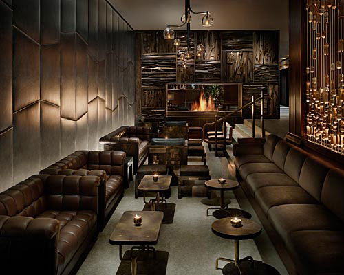
RS: It’s about comfort, it’s about great intellectual conversation. We imagined someone from the UN meeting someone from the Bar Association meeting an actor—this interesting combination of people. People were coming from all over the world, and we wanted to give them the sense of a residence. The fireplace was a huge icon for us, to draw people and to see it from the street.
So it may not have been your concept, but the fireplace was an important first move.
RS: The fireplace was a big move for us. You have to break up this incredibly endless corridor with something dramatic and powerful. We came up with this fireplace, because we wanted something that was very grounded and strong, because the previous design was so light. We wanted the precise opposite. It’s elemental in terms of its natural materials. And Stephen sketched the fireplace like a piece of art, like a Brancusi in the middle of the lobby, which becomes a conversation piece.
You also stuck to the blue family.
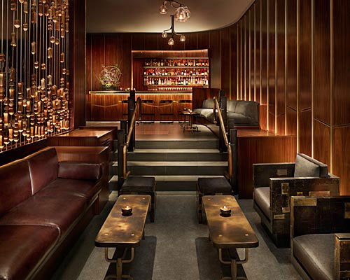
RS: Morgans asked to keep the blue. Instead of using bright blue, we picked a more watery blue. We then started working with brass paneling, because it doesn't have to be plated—a lot of chrome and nickel is often over brass, which we don’t appreciate so much—and then we started to think, Where do those international layers come in? We looked at African rosewoods and other elements, like this incredible 60-foot screen, actually the exoskeleton of a building from central France. The French were inspired by African geometries and shapes. We are not super-conceptualists, but we follow a story. It’s a little like theater.
In walking through the lobby a few weeks ago, I picked up a feeling of classic cinema, of occupying a romantic Gotham. Every surface is placed in stark relief from the next.
Stephen Alesch: There is a difference between the three walls of the theater stage and the camera pan of film. The Royalton has a wow factor, looking down that original runway. Our first instinct was to separate it into intimate spaces, so that a ‘camera’ could pan from scene to scene.
And how do the scenes come alive?
RS: We really want people to interact. They may look onto the runway, but Stephen also drew banquettes into the plan. We basically covered over the steps so you can have a U of seating. Because otherwise you can’t have a conversation in the round.
SA: There are still tons of opportunity to sashay down that runway, but there’s a lot more emphasis on being with your groups of friends.
RS: To me the cinematic quality is about the romance. You have an experience and relationship with the present, the past, and the future at the same moment in cinema. We wanted you to be able to have that range of experiences here.
You both have had extensive experience working in film. How would you say the Royalton lobby expresses the evolution of your body of work?
RS: I won’t know for a year. This is the first public space we’ve completed, and right now we’re doing a number of hotel and restaurant projects. They represent different parts of our agenda, our personalities, and vision. I think it’s most interesting to ask that question in a year when those projects are out and we have a body of hospitality work. Right now the tasks and needs of those jobs seem totally and completely individual.
SA: This project is a big exploration into modern forms and simplified forms—
RS: —which we don’t do as much. We tend to do a lot of vernacular forms. It was great that we found our language here, but then again we’ll find others. We like things that may be extrapolated, but don’t get repeated.


