Donald W. Reynolds Center for American Art and Portraiture
Hartman-Cox Architects preserves and innovates in its renovation of two Smithsonian icons.
Architects & Firms
Washington, D.C.
The Smithsonian American Art Museum and National Portrait Gallery share a National Historic Landmark building in downtown Washington, D.C., recently renovated by local firm Hartman-Cox Architects and renamed the Donald W. Reynolds Center for American Art and Portraiture, in honor of a generous gift from the Donald W. Reynolds Foundation. Besides the two museums, the center is home to the Lunder Conservation Center, Luce Foundation Center for American Art, Nan Tucker McEvoy Auditorium, and the Robert and Arlene Kogod Courtyard, which Norman Foster has recently covered with a glass canopy.
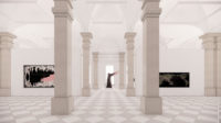
The center’s home is a work of art in its own right, as well as a case study in the vicissitudes of 19th-century architecture. The former Patent Office Building was built in phases between 1836 and 1868 by three different architects: Robert Mills, Thomas U. Walter, and Edward Clark. Following a devastating fire 10 years after completion, parts of the building’s four Greek Revival wings were given a Victorian overhaul by Adolf Cluss, and in 1958 the structure was gifted to the museum after preservationists rescued it from impending demolition. The galleries chart the evolution of building methodologies from solid masonry to cast-iron construction, and the shift from the sober Doric order to Victorian excess.
Prior to the Hartman-Cox renovation, much of the building’s architectural majesty was hidden from view, and it had fallen into disrepair. The exhaustive undertaking, a coordinated effort of 14 consultants, has restored the interior’s original luster and added 50 percent more square footage as well as much-needed auditorium space. The project, explains Mary Kay Lanzillotta, FAIA, who headed the team with Warren Cox, FAIA, entailed a top-to-bottom upgrade, visually unifying spaces varied in size and texture, matching the various collections to the character of each gallery, and staying on the good side of the National Planning Board, the U.S. Commission of Fine Arts, and the Council on Historic Preservation. “Literally every widget got reviewed,” Lanzillotta says.
Infrastructure proved to be one of the first challenges, she notes. “Solid masonry construction leaves no elbow room along the floors or ceiling, so accommodating new HVAC and electrical wiring was like crocheting the building together.” The designers also replaced all 550 window sashes with ones of durable mahogany supporting insulated glazing, about which Lanzillotta comments, “The sashes had to be adjusted to fit the frames, which weren’t square: Nothing in the building is plumb, true, or level.”
A historic structure report helped rank spaces in order from most to least intact so the architects could focus on preserving what was reparable—a process that involved restoration, recreation, and improvisation. They exposed painted-over white marble walls, freshened-up decorative painting and stained glass, and cleaned careworn marble pavers. Encaustic tiles were fabricated in England to match the great hall’s few salvageable originals. Replicas of the top floor’s oculus skylights, removed in the 1960s, were re-created from photos. Because chandeliers in the Cluss-designed triple-height former library were undocumented, replacements were replicated from a period catalog.
In addition to refurbishing structure and surfaces, Hartman-Cox addressed life-safety issues, adding railings to various staircases and lining low balconies with glass balustrades. “Such details are invisible enough to let the architecture shine, but also assertive enough, from certain angles, to be identifiable as deliberate interventions,” Lanzillotta says. In that spirit of historiography, the firm left traces of the building’s past life exposed, such as the initials carved into one of the Lincoln Gallery shutters and a panel of decorative woodwork in the great hall that had been whitewashed in the 1960s. “We treated the building like a grand old lady who’s allowed to show her age.”
New amenities address contemporary needs as well as the changing nature of art institutions. The basement was excavated to make way for the 346-seat Nan Tucker McEvoy Auditorium, which now lies beneath the courtyard. Although the design is stridently contemporary, with streamlined chairs and a grid of louvered millwork, Hartman-Cox retained a connection with the past by choosing vertical-grain hemlock, commonly used in the 19th century, for walls, chairs, and doors.
Replacing the former library on the third floor, the new Luce Foundation Center is a study area showcasing Venetian glass, Gilded Age items, WPA paintings, and marble busts in salon-style open storage displays and pneumatic drawers whose hefty weight necessitated double reinforcement of the historic Peach Bottom slate floors. Just beyond is the Lunder Conservation Center, where the public can watch specialists gild frames and repair torn canvases behind glass walls. In this way, the renovation better displays the artwork and the architecture, but also the inner workings—curating and restoring, education and exhibition—of a contemporary museum, bringing a national historic treasure into the 21st century.


